Betterment is a large consulting agency that deals with financial management and automating money services. The company is headquartered in New York, and as of April 2021, it already had $ 29 billion in assets under management and more than 650 thousand customer accounts.
The brand is a major leader in the financial investment and process consulting market. Therefore, the company’s identity must also be at its best to correspond to high positioning and an impeccable reputation.
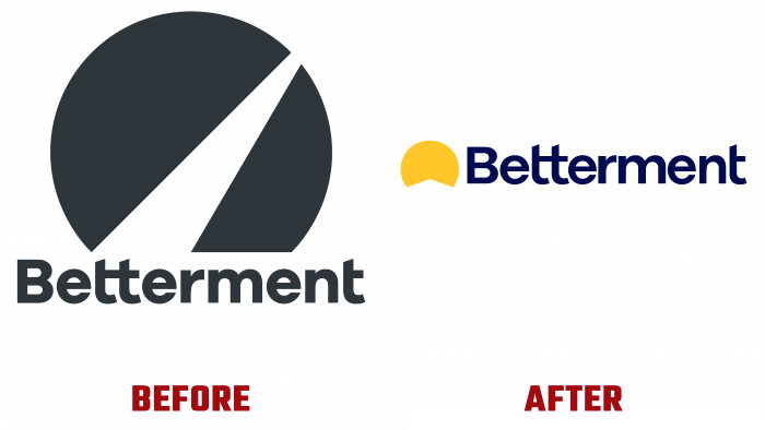
The company once had a simple, harmonious logo without bright highlights. A simple font with connected letters t in the title indicated that the company did not intend to complicate the life of its customers and wanted simplicity and straightforwardness in its relationship with its target audience. An icon that represents a failure, an unfinished dark circle, or an almost semicircle with an imitation of the road to the goal. The triangle, which forms a gap in the circle, perfectly shows perspective, dynamics, and growth by striving to the upper right point.
It works well enough that both the logo and the chosen font look coherent and complementary.
But in connection with the idea of updating the visual image, a new concept of “path” has appeared. Now the path to success, enrichment, to a new promising and prosperous life is the path to the sun. The circle became yellow-orange, a very pleasant shade. A triangle again appeared in the gap, which symbolizes a straight road. The font was left the same except for the color. A rich and deep dark blue evokes the idea of rationalization, comprehension, and a balanced approach to work.
The correct message is broadcast to the public with a new logo. It can be expressed this way: if you want to be successful and financially literate, to understand the intricacies of investing and various monetary transactions, approach this with all attention, seriousness, and a sense of a positive result.
Matching colors, beautifully adjusted and enlarged font – all this makes Betterment better in graphic design. It is not enough to be an expert in your field. It is also important to be able to present yourself to the public to win over, inspire confidence, delve into the audience’s problems, and give hope for solving problems with your appearance. The art of visual presentation is especially necessary for narrow-profile companies that provide legal services, deal with economic, social, and technological aspects.
Therefore, through the logo, the company’s message must be perceived adequately and be transparent, simple, and understandable to any client.
In the situation with the change of the Betterment logo, only positive growth, brand development, and prospects for expanding the audience are seen. The well-designed design of Trollbäck + company gives hope that the brand’s subsequent activities will be successful and positive.


