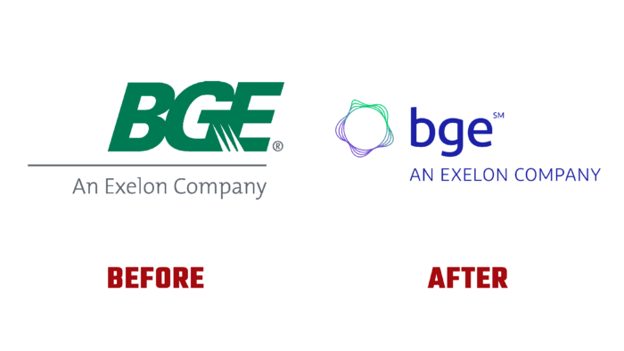
BGE – The Baltimore Gas and Electric Company has completed its transformation with the spin-off of Exelon. In the company’s history, this was a significant milestone that required some changes, including in its visual identity. By supplying safe, reliable, and affordable energy, the brand has long established its reputation as a solid and responsible company. All ongoing changes are focused on delivering a cleaner and brighter future for every client and community, all with one goal in mind: Path to Clean. This means aiming for zero emissions by using the latest energy solutions. As a result, the new visualization not only provided information about changes and perspectives. By updating the logo changing corporate colors to more informative ones, the brand was able to demonstrate its place in the company, pointing to the driving forces of current improvements. At the same time, the visualization confirmed the brand’s desire to improve the quality of service.
The new visualization provided a single link to Exelon and five other businesses. It reflected the collective commitment to the obligatory satisfaction of the needs of each client. The process of a complete change of identity is designed for several years, which is caused by the need to reduce the burden on customers to zero. The company’s new symbol is a conditional display of energy in the form of wave symbols located around a circle with negative inner space. The sign is made in a mixed color scheme, which is presented in a gradient transition of new corporate colors – from lilac to light green, which in a sense provides an echo with the brand’s historical colors.
To the right of the “energy” sign is the name, in lowercase, round, and sans-serif. Its powerful and attractive effect has a huge impact on the memorability of the logo. The font is easy to read in any size, both in typographic and digital media. Below it is the phrase – AN EXELON COMPANY, executed in thin font in the same lilac shade. Size ratios of fonts provide the required visual perception of real relationships in the structure.
The logo is made in compliance with modern requirements. Its conciseness ensures ease of remembering and brand recognition. The use of modern technologies ensured the clarity and high-quality reflection of the logo and all shades of the color palette.


