The Big 12 logo is as sharp as a blade and elegant as a jeweler’s fine creation. The emblem demonstrates the teams’ unity, their equal rights, and the transparency of relationships within the association. United is ready to stand up to any competitor.
Big 12: Brand overview
In 1994, a significant transformation occurred in college athletics with the creation of the Big 12 Conference, a union forged from four Southwest Conference teams joining forces with the existing Big 8 Conference. This new alliance brought together prominent universities such as Oklahoma, Texas, Nebraska, Colorado, Texas A&M, and Missouri, setting the stage for a powerful collegiate sports conference.
With the inaugural season kicking off in 1996, the Big 12 showcased its prowess in football, basketball, baseball, and other sports. This marked the culmination of efforts to enhance competitive edge and financial stability in response to the shifting dynamics of conference alignments.
Throughout its formative years, the conference distinguished itself by claiming numerous national titles in key sports, with member institutions like Texas, Oklahoma, and Kansas consistently achieving top national rankings and securing their spots in postseason competitions.
The landscape of the Big 12 underwent significant shifts in the 2010s, marked by the departure of Nebraska and Colorado, followed by Texas A&M and Missouri in 2012. These movements underscored a period of adjustment and realignment, ultimately leading to the inclusion of TCU and West Virginia, which helped reestablish the conference’s composition.
In a move towards further expansion, the Big 12 announced plans to welcome Houston, UCF, BYU, and Cincinnati, aiming to increase its membership to 16 teams by 2024. This decision highlights the conference’s ongoing adaptation and growth, nearly three decades after its inception, ensuring its continued relevance and competitiveness in the collegiate sports arena.
Meaning and History
The conference was founded as the Big 8 and was a union of Missouri Valley colleges. In 1994, four more teams from Texas, which had left the SWAC conference, joined them. The emblem of the new association was built by analogy with the previous Big Eight sign. Subsequent rebrandings revolved around the number 12, although the number of teams in the group continued to change.
What is Big 12?
An association of university sports teams. It consists of 10 universities from Oklahoma, Iowa, Kansas, Texas, Virginia, and Utah. It is part of the first division of the NCAA. The organization’s headquarters is located in Texas, as 5 out of 10 teams are based in this state. It consisted of the North and South Divisions until 2011. It includes participants in 13 women’s and ten men’s sports.
1994 – 1996
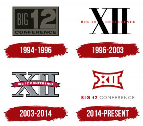
The first emblem of the conference was a transformed logo of Big 8, where the number 8 was replaced by 12. Like a screen prototype, the image resembles a sports scoreboard with a rectangle in the center. The figure resembles a sports field for games like football, basketball, volleyball, etc.
In the center of the screen is written Big 12. The font of the inscription is narrow and thin enough to focus attention on the large and massive number 12.
A white border surrounds the field, with “Conference” written at the bottom. American college sports are governed by the main National Association NCAA, which includes three divisions or levels. The first division consists of 33 conferences (groups of teams), one of which is the Big 12.
The image is surrounded by a clear black border, reminiscent of the lines of a playing field. The closed perimeter indicates unity. Internal competitions are held between members of each conference, and the winner advances to national games. Therefore, teams are linked not only territorially but also as competitors.
1996 – 2003
In 1996, the Big Eight ceased to exist legally. Until then, it was considered that the eight had simply expanded by including four members of the Southwest Conference. In ’96, all 12 teams, leaving their previous groups, legally formed a new one.
The young association’s logo was transformed to remove its connection with past unions. The emblem became a large Roman numeral XII. Straight lines emphasized the group’s strength and stability. Elements resembled various sports equipment: bars, parallel bars, hockey sticks, and golf sticks.
Each number in Roman numerals was formed compositionally, using various combinations of I, X, and V. Therefore, the choice of this format underscored the theme of merging and joining teams.
Another reason for the Roman numeration is the analogy with the strength and preparation of the conference’s athletes, similar to Roman wrestlers. In ancient Rome, there was a culture of sports. Athletic competitions, fistfights, and gladiator battles took place. The life of military legionnaires consisted of a harsh system of training. The famous Olympic Games also received Roman numeration. Therefore, these numbers became the foundation of the sport’s emblem.
A red inscription with the full name “Big 12 Conference” runs through the center of XII.
2003 – 2014
The 2003 logo shows designer work. The voluminous gray numbers look very stylish. The sign appears to be made of metal, demonstrating the participants’ strength and achievements. The image is crowned with a red winner’s ribbon, on which the association’s name is written in white capital letters. The logo creates an atmosphere of celebration and award-giving.
2014 – today
The conference underwent a major reorganization from 2010 to 2013. Two participants, Colorado and Nebraska, left, and some teams considered joining the Pac-10. After lengthy turmoil, the members could agree and preserve the group, albeit in a smaller composition.
The changes were reflected in the new 2014 logo. The white number 12 indicated the renewal of participants and entirely new rules. North and South Divisions were annulled, and the distribution of revenue and television contracts changed. Texas A&M was replaced by Christian University TCU, and West Virginia University replaced the Missouri team.
The inward bend of the number demonstrated the reduction of member participants to 10 and the association’s flexibility, ready to change depending on circumstances.
The bold red outline of the number indicated a fighting spirit and aspiration for expansion.
Font and Colors
The basis of the logo includes red and white shades.
- White indicates fair play and adherence to competition rules. The shade also underscores fair financial distribution, initially a stumbling block for the conference.
- Red emphasizes the participants’ athletic qualities: speed, strength, and endurance. The color conveys emotions and the intensity of passion that players demonstrate on the field. Participants are ready to fight fiercely and tirelessly for victory.
The font of the inscription has some solemnity and elegance.
