In 1924 a brand of Australian beer appeared in Milton. There was an immediate excitement in Queensland because such a quality product could not be ignored in the leading bars and pubs of the region.
The long tradition of using the symbol of crosses to denote ale is a recognizable chip in the brewing business. In 1878, the brand name was used in XXX Sparkling Ale.
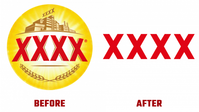
The famous design association Landor & Fitch took up the idea of rebranding the company. Either they got tired of the over-detailed old logo, or the color background looked too variegated. Anyway, the company decided to update its visual image.
And what is interesting, it was decided to reduce the logo – from more to less. First, nowadays, the tradition of minimalism is the most actual. Secondly, to avoid losing face among competitors, it is necessary to transform the brand all the time. That’s why the new logo represents “Queensland pride.”
The three dark red letters, which are encircled by a thin white outline on a bright yellow background, stand out in the best way. It makes you want to try the beer because it’s juicy, delicious, and appealing. They took this color scheme for a reason because, at a subconscious level, it whets the customers’ appetite.
As for the old logo was round, like a bierdekel, and had different additional graphic images, like ears, letters, and a brewery building.
The brevity and reduction of visual details create a “just what you need” atmosphere.
Now connoisseurs of strong ale can safely enjoy their favorite drink in bars without being distracted by the minutiae that are usually written on beer cans. Only strength, only hardcore!


