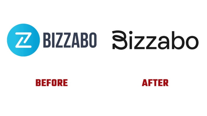
In its modern update, new solutions for managing B2B marketing events are presented by the American company Bizzabo, a leader in this field. Founded by Boaz Katz, Alon Alroy, and Eran Ben-Shushan, it has offices in New York, Tel-Aviv, Kyiv, London, and Montreal. Leveraging immersive in-person, virtual, and hybrid experiences, the Bizzabo Event Experience OS is a data-rich, open platform that empowers executives to manage events, engage audiences, build communities, and achieve better business results. This ensures the absolute preservation of confidentiality and security for all participants. The application’s success is confirmed by a large number of the world’s leading brands that entrust their tasks to Bizzabo. Its community includes corporate organizations, financial institutions, creative agencies, and large-scale technology companies, including those from the Fortune 100 list. Developing and improving, following modern trends, the platform has undergone a dramatic change in its identity, recently introducing it to its users.
A dynamic logo was designed using eye-catching scribble lettering technology that blends harmoniously with the sans-serif Rebond Grotesque. It was whimsical and reflected the brand’s friendly and upbeat nature, versatility, and hybrid aspects. To improve the visual impact on the user, a new color palette has been added that is bright and cheerful, which is a dramatic departure from the traditional clichés of tech blues. This atmosphere is supported by human photographs and whimsical illustrations that capture the true spirit of the platform’s hybrid events. The Rebond Grotesque typeface was effectively paired with a serif variant, Galaxy Copernicus. The latter was used for headlines. Their combination emphasized the humanity of the brand, reinforcing its hybrid concept.
The new logo has served to create interest and appeal, where the font’s funky loops can be interpreted as twists and turns awaiting a real event in terms of connecting with people. Achieving such visual popularity became possible due to the abandonment of the desire to make the logo especially informational, without trying to put in it understandable and accessible information about what the brand is professionally engaged in. Visually, the created wordmark looks quite nice. The quirkiness of the font and its execution were a major signal of the company’s optimistic nature, supporting the application’s simplicity and efficiency, aided by the pleasing combination of the font family.


