The London-based Black Mums Upfront, a brand launched in 2020, brings together moms who support each other, share experiences, and have fun together. This team intends to declare publicly: we are mothers, we are different, cope with stereotypes, motherhood is freedom and creativity. Listening to their podcasts, many myths are debunked, and changes in the perception of mothers, who are different from other members of the population, become an inevitable reality.
The designers of W + K in London took over the transformation of the visual creativity of the group so that Black Mums Upfront was not only heard. But it is also visible. The stand-up idea was at the heart of the new logo, and I must say, it goes well with the brand name.
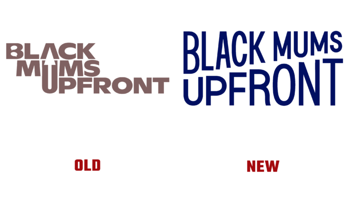
The logo consisted of three words that descended from left to right, like a staircase. An arrow could be seen in the gap between A and U as if indicating a rise.
But what a winning option was offered this time! Escalation, increasing tempos, or increasing volume are shown. The elongated yellow letters, simultaneously reduced and enlarged in different directions, create dynamism and contrast. Thus, the team’s originality is shown, the idea of stand-up, an increase in the audience, and a lot of other points. Geometrization and font size look aesthetically pleasing.
The brand will undoubtedly become more visible and popular with the new logo so that the team can be congratulated on an effective rebranding.


