The largest labeling software company Loftware has unveiled a new look after integrating with Nicelabel, a labeling solution provider. The corporate brand now extends to the entire Nicelabel product line.
Now it is one global brand, which is beginning to recuperate after a busy year for the company, which is now reflected in vigorous activity and sales growth.
The new brand becomes a source of inspiration for the further ascent to the market Olympus. The company now positions itself as a global, innovative, modern company that combines personality and diversity.
The revision of the company’s values broadened the horizons of possibilities; therefore, in the graphic design, there appeared something that was not there before – uniqueness.
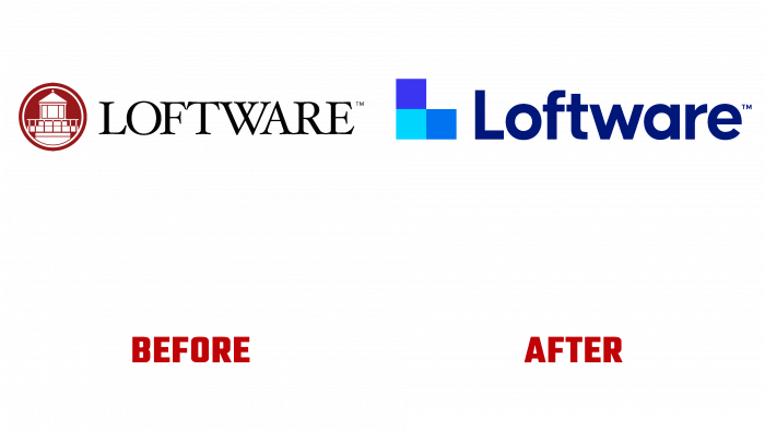
Previously, the Loftware logo looked like a lighthouse icon in white and dark red. The lighthouse is taken in a circle with a white frame inside the burgundy. The title is written in a simple formal font with many serifs. There was also a trademark icon at the top of the last letter of the brand name.
The name is written in dark blue letters; the font is already sans serif, soft enough. And the symbol looks like three cubes assembled into the letter L. These geometric shapes are created in different shades of blue: turquoise, sky blue, and bright lapis lazuli. There is also a trademark icon.
Now the bright corporate logo is an adornment of the corporate identity of the strengthened brand, which gives hope for the popularization of the company in the world market.


