The BMO logo speaks of monumentality, solidity, and reliability. The sign is as if imprinted on a granite slab. Any cataclysms will not move it. In the center of the emblem, a warm heart “beats,” and the ongoing processes of increasing money are seething.
BMO: Brand overview
| Founded: | 1817 |
| Headquarters: | Canada |
| Website: | bmo.com |
Meaning and History
BMO has become famous for its high-profile advertising campaigns and unconventional approach to branding. It often changed slogans to fit the spirit of the times. It also had its mascot: a lion named Hubert. The unusual symbol appeared in 1911 but only made a splash in the late 1950s when the Leo Burnett Company’s designers created an original cartoon character based on it.
The bank also has an official coat of arms with a shield, a beaver, two Indians, and a ribbon with the inscription “CONCORDIA SALUS.” In the original version, the indigenous people were sitting with their elbows on a shield. However, the leaders demanded “do everything right” because the supporting figures must follow heraldry’s rules.
The BMO name on the current logo was once the ticker of a financial institution on the New York and Toronto stock exchanges. Major shareholders are used to calling the bank “bee-mo,” so no one ever doubted that the merger should bear the name BMO Financial Group. Although the employees themselves sometimes abbreviated the phrase “Bank of Montreal” to “B of M.” This became especially noticeable when the post-war emblem appeared with the words “MY BANK TO A MILLION CANADIANS” (above) and “B of M” (below) on a black and white shield.
What is BMO?
This is a shortened version of the name of the Bank of Montreal. It is the oldest and one of the largest banks in Canada and has long been a monopolist in the financial market. It appeared in 1817 and grew quickly, buying up competing companies and expanding its services. Its network has more than 1.4 thousand branches at home and in the United States.
1817 – 1822
At the moment, during this period of the company’s development, the brand’s logo and emblem are unknown.
1822 – 1920
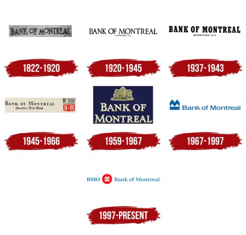
One of the first logos contained the phrase “BANK OF MONTREAL,” written in thin letters with long serifs. Both “O” s looked like a perfectly circular ring and were above the line level. The base color was black, but sometimes gray and white shades appeared if the word mark became the basis for the metal sign.
1920 – 1945
Thin and tall serif letters were retained, but there were also certain differences. For example, the font is now the same: the small “O” has disappeared, and in its place, a full-fledged letter has appeared, matching in size with the rest of the characters. At the bottom, the designers placed the year the bank was founded—”1817.” The inscription has been aligned to the center. The logo’s color is monochrome.
1937 – 1943
This period was dominated by the bold type logo, with each letter resembling a large block character. To maintain optimal readability, the developers have increased the inter-letter space. The wide geometric glyphs were provided with rectangular serifs and colored black. The lower inscription remained smaller than the upper one.
1945 – 1966
In 1945, there were dramatic changes in the identity: next to the full name of BANK OF MONTREAL, a message appeared that this was a real Canadian bank, and a semblance of a text shield was placed on the right. The inscription was arranged so that it formed a pentagonal shield with a red bottom, where, for the first time, the abbreviated form was indicated – “B of M.” The fonts in all lines were different: italic with an imitation of personal handwriting, grotesque thin and bold, with needle serifs. There were no two duplicates.
1959 – 1967
The emblem has become monolithic to emphasize the banking institution’s reliability, strength, safety, and longevity. To do this, the designers enlarged the letters, painted them white, and added a gray-yellow shadow on the right side, which made the inscription three-dimensional. At the top, they placed a composition that consisted of two Indians sitting to the right and left of the oval shield. He personified the benefits received by the indigenous population from the bank. At the bottom was a cornucopia, from which fruit fell.
1967 – 1997
In 1967, the CEO of Arnold Hart Bank introduced a new logo called M-Bar. Canadian Hans Kleefeld, who works for Stewart & Morrison, invented the original design. He created an unusual symbol consisting of a large letter “M” on a rectangle. Notable was that the figure had a clear square shape, as indicated by the trimmed edges of the “M.” The blue icon complemented the same blue inscription, “Bank of Montreal.” The font had no serifs this time, and the lowercase “t” and “r” were connected at the top.
The M-Bar was supposed to be a banner of change because, in 1967, a new Bank Act was released that allowed the organization to provide mortgage services to clients. This inspired management to launch an aggressive marketing campaign by redefining the Bank of Montreal’s strategy and identity. The reorganization coincided with the financial institution’s 150th anniversary.
1997 – today
The familiar M-Bar symbol was renewed when the bank’s subsidiaries merged under the BMO Financial Group brand. The designers made it white and placed it in a red circle. Individual BMO trademarks used this badge even earlier (at the end of the 20th century) but only became widespread in 2002 after the restructuring.
The Bank of Montreal logo is now light blue and has small, sharp serifs. The word “BMO” appears on the left to emphasize the overall history of all units. In the short version of the logo, the designers remove the bank’s old name, leaving only the main identifiers: the ticker and the symbol in the circle.
BMO: Interesting Facts
The Bank of Montreal (BMO), established in 1817, is Canada’s oldest bank and a key figure in the country’s financial sector.
- Canada’s First Bank: BMO started to help Montreal merchants with commerce, marking the beginning of its long history in Canadian banking.
- Going International: In 1885, BMO opened an office in London, becoming the first Canadian bank to expand internationally. This shows its early vision for global banking.
- Technology Leader: Always ahead in technology, BMO was among the first in Canada to offer ATM banking in the 1960s and online banking in the 1990s, aiming for customer convenience.
- Growth Through Acquisitions: BMO has grown by joining forces with other banks, such as its significant move in 1984, acquiring Harris Bankcorp, which increased its presence in the U.S.
- Supporting Communities: Known for its philanthropy, BMO contributes to education, healthcare, and the arts, showing its dedication to making a positive impact.
- Championing Diversity: BMO is recognized for its commitment to diversity and inclusion, promoting gender equality, and supporting LGBT+ communities, earning it accolades as one of Canada’s Best Diversity Employers.
- Bicentennial Celebration: In 2017, BMO created a special $10 banknote to celebrate its 200th anniversary. While not legal tender, this note celebrates the bank’s long history.
- Art Patron: BMO holds a significant art collection featuring Canadian and Indigenous artists, underlining its support for the arts and cultural heritage.
- Sports Sponsorship: In sports, especially soccer, BMO supports teams like Toronto FC and CF Montréal. It is on BMO Field in Toronto, highlighting its role in promoting Canadian soccer.
From its early days in 1817 to the present, BMO’s story is one of innovation, strategic growth, and a deep-rooted commitment to the community and the environment.
Font and Colors
The financial institution’s current logo is called the M-Bar roundel. It is based on the M-Bar symbol and dates back to 1967 when Hans Kleefeld (the famous creator of The Toronto-Dominion Bank, Johnson & Johnson, and Air Canada logos) created another masterpiece. He did not experiment with complex shapes but placed a stylized “M” on an elongated rectangle. In the early 21st century, designers depicted this icon inside a red circle to represent the brand’s transition to a new identity.
Both parts of the lettering (“BMO” and “Bank of Montreal”) are easy to read because they are in Emona SemiBold. This serif typeface, created by the French typographer Franko Lui, has long serifs and contrasting stroke thicknesses.
The rondel base is bright red (shade # ED1D24), and the text is light blue (Ocean Boat Blue # 0079C1). Blue has been the official color of the bank since Hans Kleefeld designed the M-Bar. Striving to be the first in everything, BMO even began to call itself “First Bank Blue.”
FAQ
What is BMO’s slogan?
In 2014, BMO updated its brand promise to “Making money make sense.” This change was part of a campaign highlighting the human touch that makes the brand unique. The bank introduced the tagline, “We’re here to help,” inspired by the Harris campaign from 2006 and chosen with employee input.
The tagline shows BMO’s commitment to providing personalized and supportive financial services. It reflects the bank’s dedication to helping customers navigate their financial journeys confidently. The brand builds trust and strong relationships by emphasizing human interaction and support.
The slogan reminds customers that the brand is a partner in helping them achieve their financial goals.
Is BMO a Bank?
Yes, it is a bank. In particular, the Bank of Montreal is a leading financial institution in North America. The brand operates with a clear purpose: to “Boldly Grow the Good in business and life.” This purpose shapes its strategy, drives its goals, and reinforces its commitment to positively impacting society.
BMO focuses on three key areas:
- Thriving Economy
- Sustainable Future
- Inclusive Society
The company offers various financial products and services, including personal banking, commercial banking, wealth management, and investment services. With a strong presence in Canada and the United States, the brand serves millions of customers and operates numerous branches and ATMs.
What is BMO known for?
The company is known for its innovative approach to personal finance. It offers digital products, tools, and resources to help customers make real financial progress. Because of these efforts, the brand is a leader in the Personal Finance category.
The brand has developed online and mobile banking tools that give customers easy access to their accounts. These tools include budgeting features, spending trackers, and personalized financial advice, helping users make informed financial decisions.
It provides resources to help customers understand financial concepts and manage their money. These resources include articles, videos, webinars, and interactive tools on budgeting, saving, investing, and credit management.
The company offers various financial services, including personal banking, commercial banking, wealth management, and investment. This allows banks to meet the needs of individuals, small businesses, and large corporations.
What does the BMO logo mean?
The logo, known as the M-Bar roundel, has a special meaning. The top part of the logo is shaped like a side-cut “M,” representing the first letter of “Montreal” in the bank’s full name, Bank of Montreal.
Below the “M” is a rectangle, symbolizing stability, durability, and constancy, which are essential for a financial institution. This design reflects BMO’s connection to its Montreal roots and commitment to providing reliable financial services.
The M-Bar roundel embodies the brand’s values and heritage. The “M” highlights the bank’s identity and origin, while the rectangle represents BMO’s promise of stability and reliability.
What is the font of the BMO logo?
The logo’s font is Emona SemiBold, which is used for both inscriptions. Franko Lui designed it with a geometric shape, high contrast, and long, thin serifs.
Emona SemiBold gives the logo a modern and professional look. The high contrast in the font enhances readability and makes the logo stand out.
Franko Lui designed Emona SemiBold to balance elegance with modernity. This balance matches the bank’s values and mission to offer reliable financial services. The font’s clean lines and precise shapes convey stability and trustworthiness.
