 BMS (Bristol Myers Squibb) Logo PNG
Medical brand logos should represent support and compassion. The visually simple logo of BMS (Bristol Myers Squibb) fully meets these requirements, as it symbolizes customer focus and love for people. The company lends a helping hand to all who need it, offering effective drugs for the treatment of various diseases.
BMS: Brand overview
The historical predecessors of BMS (Bristol Myers Squibb) are two companies, Squibb and Bristol-Myers. The first was founded in 1858; the second appeared in 1887. For a long time, they developed separately, created new medical drugs, and competed in the market of antibiotics. As a result of their merger in 1989, a powerful and successful corporation, Bristol-Myers Squibb, was formed. It is one of the leaders of the international pharmaceutical market and is among the largest manufacturers of medicines in the world. The company owns numerous research centers in different states, where drugs for cancer, AIDS, hepatitis, diabetes, and other diseases are invented.
Meaning and History
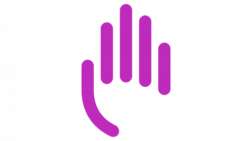
Before the Bristol-Myers and Squibb corporations merged, each had its own logo. They were used on the labels of drugs sold under their respective brand names. For example, Squibb’s products featured an ancient building with three columns; after the merger of the two pharmaceutical giants, a company with a completely new visual appearance was created. Its emblem, with a geometric symbol of six triangular petals, remained relevant for several decades until, in 2020, the Siegel+Gale agency turned the blue flower into a purple hand. The updated graphic symbol is intended to showcase BMS’s rapid growth.
What is BMS (Bristol Myers Squibb)?
BMS (Bristol Myers Squibb) is a manufacturer of biologics and pharmaceuticals for the treatment of various diseases, including rheumatic diseases, cancer, HIV, diabetes, and others. The company was founded in 1887 and received its current name in 1989 after the merger of Bristol-Myers Squibb. The company is headquartered in Lawrence Township, New Jersey.
1989 – 2020
Bristol-Myers Squibb was founded in 1989 through the merger of two corporations. The merger created eighteen business lines: six major and twelve minor. The designers presented them in the form of an equal number of mini-triangles forming six pyramids (when viewed from above) arranged in a circle. The geometric pattern resembles a stylized flower or snowflake. All contours are colored in blue, which is typical for the pharmaceutical industry. The brand name is also blue. It is located on the right side and is written in an elegant serif font. Some letters have through spaces due to unfinished strokes.
2020 – today
The decision to redesign the BMS logo was made for several reasons:
- Many of the company’s original lines of business no longer exist, so the abstract pattern of eighteen triangles no longer makes sense: that number is not associated with anything.
- In 2020, Bristol Myers Squibb acquired the biopharmaceutical corporation Celgene. This event marked the beginning of a new era, which necessitated an updated logo.
- The owners of the company wanted to shift the focus and emphasize that the focus was on the patient and their problems. They decided to draw attention to the drug manufacturer rather than to individual brands.
As a result, the abstract geometric symbol was replaced by five purple stripes depicting the outline of a palm. This hand symbolizes the help that BMS provides to sick people. It serves as a symbol of humanity and an individualized approach to drug development. On the right side is the company name typed in gray sans-serif font.
The logo was designed by branding firm Siegel+Gale and in-house marketing experts at Bristol Myers Squibb. Prior to this, research was conducted to determine which design would attract the most attention.
Font and Colors
Siegel+Gale staff created the BMS Humanity typeface for the word mark. It is based on the elegant sans-serif FS Albert font and adopts its character. The thin sans-serif letters are associated with friendliness, warmth, and openness.
The lettering is colored gray to balance out the purple part of the emblem. The attractive shade of purple looks very sensual. It symbolizes compassion and care for people.
