


British premium bean producer Bold Bean, known for its Queen line and large fan base, has carried out a major brand identity update. The new style is aimed at strengthening recognition, simplifying navigation, and creating a unified visual language across all customer touchpoints.
Previously, Bold Bean stood out for its bold design and aesthetic, but the visual system remained fragmented. The bright bean jars were easy to remember, but distinguishing between flavors and lines was difficult. The brand’s growing popularity revealed the need to adopt a more structured, mature image that maintains a premium feel while remaining accessible to a broad audience.
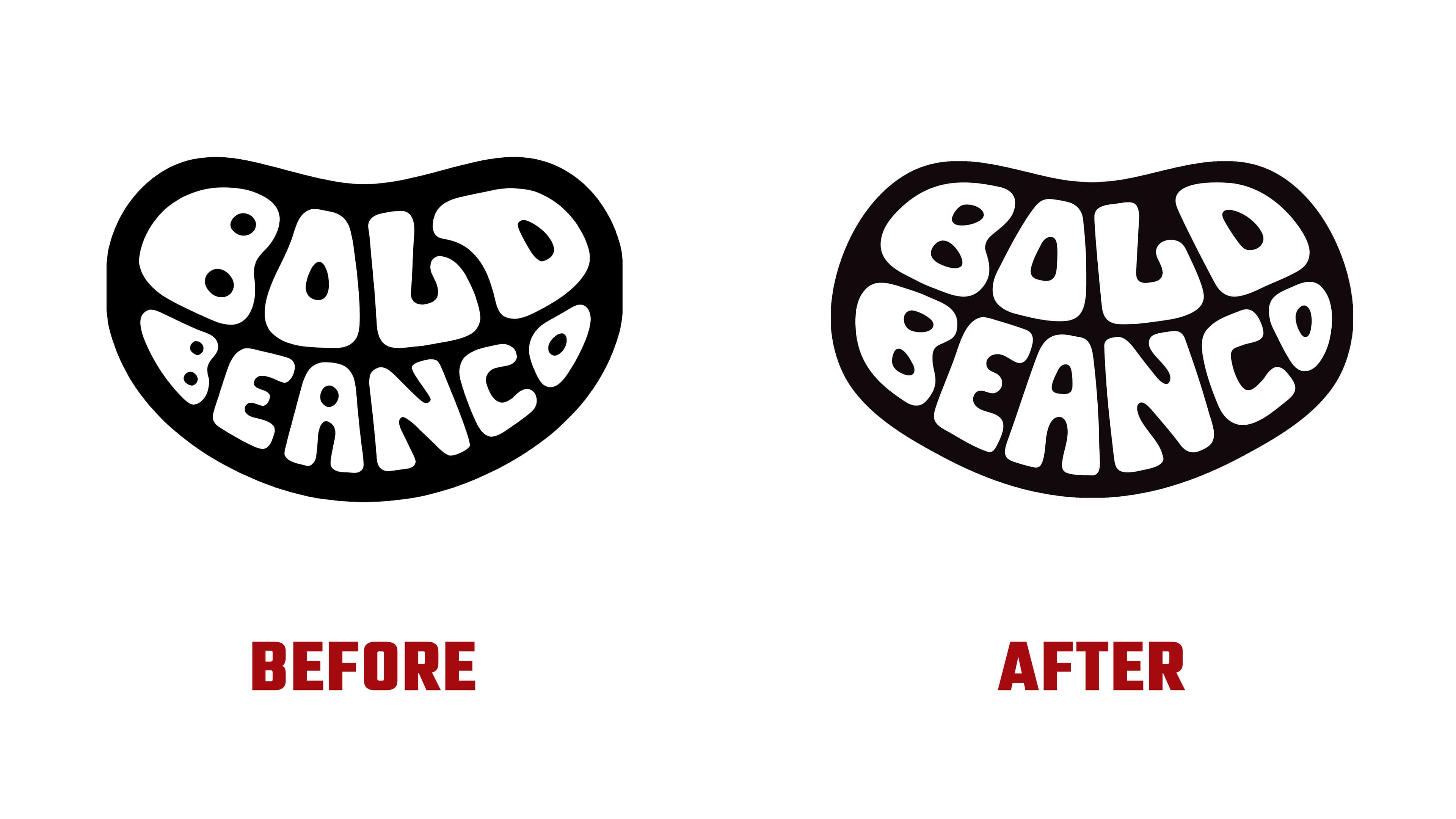
The phrase expresses the key idea of the rebranding, “Simplify to amplify.” The logo has taken on more expressive shapes, with a rich yellow becoming the main accent color, used on the lids and throughout the brand identity. The packaging is decorated with original illustrations and bean patterns that highlight the product’s character and add visual energy.
The result is a cohesive, clear style that is convenient for both shoppers and retailers. The new system easily adapts to any format, from store shelves to print materials and culinary publications.

The updated image helped Bold Bean move from a niche brand into a confident mass-market segment while retaining the sense of quality and individuality that marked the beginning of the company’s story.