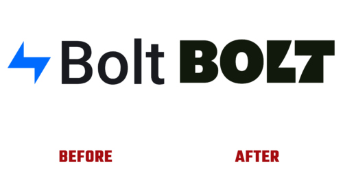
International commerce platform Bolt decided to streamline trading in 2023 and started it with a logo update. She decided to show her lightning speed to stand out from the competition and turn casual visitors into regular customers. How? Very simple.
Step One: The company commissioned a fashion redesign from Koto Studios.
Step two: immediately put the result into action by changing the old emblem to a modernized one.
Step three: attracted the attention of most users.
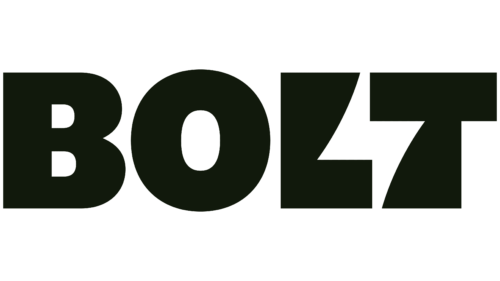
The checkout platform has changed the old wordmark and blue color scheme to an incendiary modernized version with a hidden meaning in the blink of an eye. Designers skillfully hid the concept among the letters. The online store owners liked this design because it not only brings novelty but also raises it to a high level.
There are several reasons for this.
- Specialists skillfully used the negative space by placing lightning in it – a hint of high work speed and lightning-fast ordering. It also denotes energy, charge, good spirits, and the activity of attendants.
- The developers of the Bolt emblem expanded the lines and enlarged the letters, turning them into block glyphs. With the help of massive elements, they conveyed confidence of the subject of e-commerce, its high capabilities, and reliability.
- The designers slightly curved the last two letters in the name to make a distinct lightning sign. But a slight bend did not affect the readability of the company name – it still has a clear outline and is understandable to site visitors.
- The authors of the logo also did not forget about the harmony between form and color, so they proposed a new palette – bright, catchy, and eye-catching. They painted the lettering black and the background neon yellow. As a result, the lightning in the negative space between “L” and “T” is visible.
The upgraded Bolt logo helped the site in the main thing – in confronting competitors. As the brand’s representatives emphasize, it reminds us that the store moves quickly, like lightning in the center of its sign, and instantly provides customers with an extensive selection of goods. But most importantly, the new design highlights one of Bolt’s key features – that its products can be applied flexibly in different situations.


