Indian beverage industry pioneer Parlé Agro has unveiled a new refreshing brand, Bombay 99. Launched in 2021, it has immediately taken its rightful place among the company’s iconic brands such as Frooti, Appy, Appy Fizz, and Bailey. The drink is available in three types – Indian Tonic Water, Ginger Ale and Club Soda, always available in India itself. Creating innovative brands since 1985, Parlé Agro, headquartered in Mumbai, pays special attention not only to the taste of its products but also to its unique signature design. Passion for the process of implementing original ideas when creating your brands ensures the mandatory use of innovation and ingrained designs and trends in the DNA of the business, which contributes to the most effective reflection of one’s vision of these projects. All this made it possible to turn the company into the No. 1 beverage production enterprise in the country. Launching a new product line, Bombay 99, the company turned to New York-based design studio &Walsh to create a unique corporate identity and eye-catching packaging.
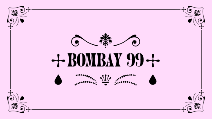
The visual implementation of the new brand was carried out with the help of non-standard curls and ornaments, the creation of which the designers were inspired by the shape of a single drop of a drink prepared by a mixer. The created logo has unique features, urging you to perceive yourself more carefully and in-depth, which allows you to see all the nuances and details laid down by the developer. However, some complexity of such a process does not beg for the efforts made during its creation. This property suggests that the visual mark does a very good job of creating a relatively exotic atmosphere that makes the brand fun, attractive, and completely different from typical tonic waters, ginger, ale, or sodas. This is because traditional methods and design principles were established several decades ago, and at the moment, they are already obsolete. The use of dynamic clipart, with some shyness, provided softness and even cartoonish fabulousness to the entire visualization.
One of the main visual elements of the identity is the flared serif typeface, which adds fun and vigor to its textured execution. It creates some bold contrasting touches, as the range names reflected with it make up the bulk of the layout’s composition. An original and especially attractive move was using point illustrations of ordinary objects, such as cocktail glasses, bottles, vases, and water taps, which is an original way of expressing the language of flourishes and lingbats.


