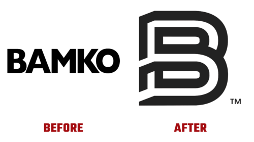
On October 19, it was revealed that the branded goods innovator is revamping its style. This was likely prompted by the decision to combine several acquired companies under the BAMKO trademark: Gifts By Design, Public Identity, Sutter’s Mill Specialties, and Tangerine Promotions. The merger took place in September, and a month later, their new – now common – logo was officially presented.
Anyone who is used to working with brands will easily do it again. Therefore, for BAMKO, changing the visual identity was not a problem but an interesting addition to the main projects. The new corporate identity reflected the company’s growth, as its annual sales have increased almost 15 times over the past decade. To commemorate the occasion, she expanded the functionality of her website and gave it an overall modernized look and feel.
Of course, the new BAMKO logo was also included. A division of the Superior Group of Companies, Inc. made its main symbol a stylized letter “B,” which looks like a labyrinth with an entrance and an exit. This emblem is made up of sinuous lines in black and white and appears three-dimensional due to their arrangement. The figure reflects the dynamics characteristic of any creative process – the transition from one form to another.
To counterbalance the active metamorphosis that occurs with the “B,” the designers made the second part of the logo simple and visually heavy. We are talking about the word mark, located just below. It only contains the name BAMKO in bold capital letters. Geometric font with equal-width strokes creates a sense of balance. At the same time, it looks strict and contrasts with the style of the free-standing “B.”


