


![]()
The Brazilian Olympic Committee (COB) has unveiled a new logo for Team Brazil. The updated design reflects a push toward modernization while honoring Brazil’s deep-rooted sports culture. The goal is to strengthen the national identity with a familiar and current look.
The new logo keeps the classic shield shape but with a few key changes that make it cleaner and more balanced. The shield now has softer, rounded edges compared to the previous, sharper version, giving it a more stable and cohesive feel. A double border around the shield adds depth and draws the eye toward the center, highlighting the core elements and giving the design a solid, unified look.
![]()
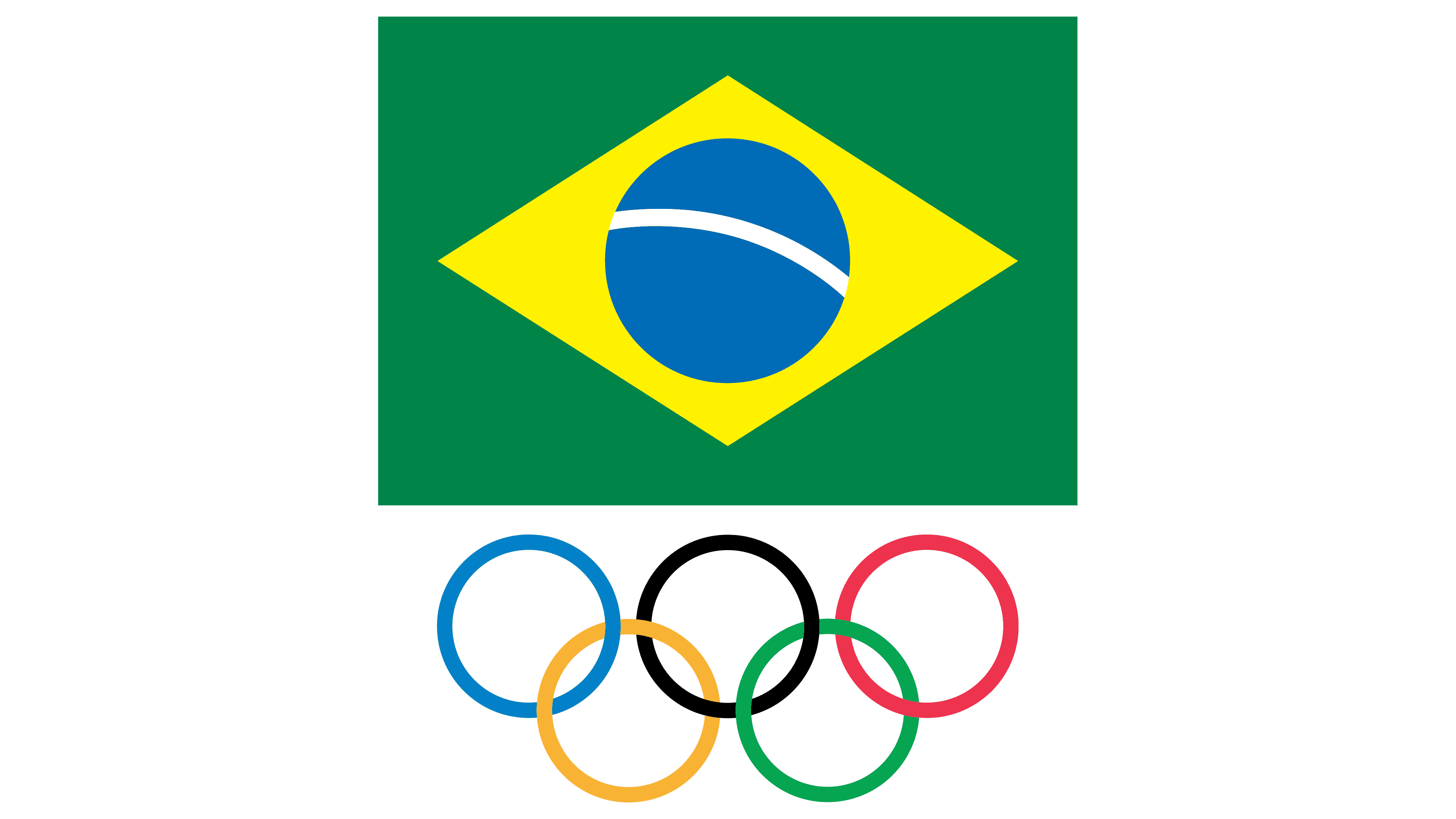
One of the biggest updates is the placement of the Olympic rings. They’ve been moved from the bottom of the shield to the top, emphasizing Brazil’s connection to the global Olympic community. The rings, displayed in their original bright colors, now hold a more prominent spot, symbolizing Brazil’s commitment to international sports. The change helps balance the layout, creating a clearer flow.
The Brazilian flag remains front and center inside the shield. The familiar blue globe with the national motto, set within a yellow diamond on a green background, has been better integrated into the overall design. Its position has been slightly adjusted to fit harmoniously with the Olympic rings above and the bold “BRASIL” lettering below, creating a smooth, natural flow that guides the viewer’s eye.
The typography hasn’t changed much, but its placement gives it a stronger presence. The clean, bold font complements the geometric lines of the shield and flag, tying everything together visually. The word “BRASIL” sits prominently in the middle, bridging the gap between the rings and the flag and reinforcing a strong national pride.
The color palette remains true to Brazil’s iconic green, yellow, blue, and white, though the shades are now brighter and more vivid. The updated colors pop more on screens and printed materials, capturing the vibrant energy often associated with Brazilian sports while remaining true to the national flag.
![]()
The refreshed logo reflects a thoughtful update—modern yet rooted in tradition. The sharper colors, balanced layout, and streamlined design bring a fresh feel to Team Brazil’s image. The new emblem will roll out across COB’s digital platforms and official materials. It will blend the country’s rich sports history with its ambitions for the future, inspiring athletes and fans alike.