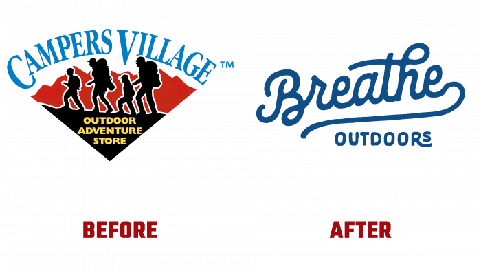
Almost 60 years ago, Campers Village, a Canadian street vendor chain, emerged. At the end of November, it was announced that the company was rebranding and will continue to delight its beloved customers.
Since 1963, Campers Village has been providing a range of products and equipment for outdoor enthusiasts who love outdoor activities. In the vicinity of Alberta, there has always been a great demand for quality service and products since this is a junction for those who perform their little personal feat, overcoming themselves and the path to the goal. And the goal of the enthusiasts is the same – to get maximum pleasure from walks, outings to nature, to recharge with energy and positive.
We set to work on a new design with renewed vigor and new breath.
The Breathe Outdoors brand is committed to helping its customers experience spiritual, physical well-being, enjoy every minute of the outdoors, unleash their potential, and find inspiration in the bosom of nature. The company’s basic idea is that no matter if a person is experienced or not, in good physical shape or not, physically strong or only mentally tough, outdoor recreation should be available to everyone. There are a lot of different events and events in the region that diversify the cultural life of the population, so the brand actively supports initiatives and takes part, cooperating with partners.
It is surprising that the logo, which was developed for the rebranding, visually very much resembles an ornate inscription, which is used for advertising summer entertainment, drinks, and paraphernalia. Light, airy font of dark blue color, italic letters, playful curls, and a small postscript “OUTDOORS” in capital letters means a combination of formalism and creativity, brightness and everyday life, heaven, and earth.
To some extent, you might think that they deliberately played on two different fonts in the design to show the contrast of the very process of “breathing” new life in conditions outside the home.
Such a font solution may seem not entirely appropriate for a retail chain, too provocative and even frivolous. But the creators wanted to emphasize an easy attitude to life, intrigue, adventure, passion for adventure, a state when a person is easy-going and ready to move mountains.
The impressions of the new logo remain positive, instilling confidence that with the products and equipment of this network, the public will have many interesting adventures and discoveries made in nature.


