The City Council has directly controlled cultural activities for children and young people in Leeds for over 20 years. This is done with the help of the Breeze company, which during all this time, is constantly improving the quality of control over organizations and events for young people and families, guaranteeing safety and special attractiveness at a high cultural level. Keeping pace with the times and to ensure constant interest from the new younger generation, Breeze announced a radical rebranding in all areas, including its portal, which was created for the convenience of informing and receiving feedback – BreezeLeeds.org.
To meet the requirements of the time, the company invited experienced specialists in image and corporate identity formation, the city design studio KISS Branding, to work on a new, more attractive visualization. The agency has done extensive work to create an effective strategy, shape the design, develop a new website, and launch a membership application. In addition, she brilliantly coped with the main task – forming a real youth brand from a well-known city organization.
The new image created a sense of simplicity of communication, completeness of the content, and satisfaction from interactions. The original solution – a youth-style floating logo, sophisticated typography, and an exquisite, attractive color palette with modern graphics and illustrations- allowed the company to create a completely new visual perception, separating it from the boring binding to the “adult problems” solved by the City Council.
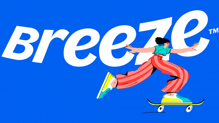
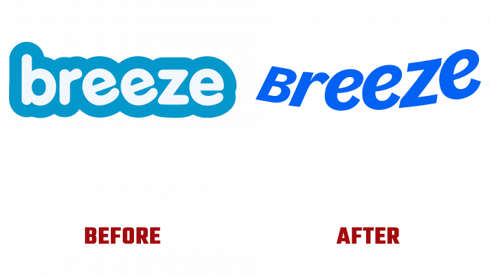
The new logo retained only the name of the company. It has taken on a whole new identity through simplified images, creative presentation of text, font, and color choices. “Blue Degree,” reminiscent of the purity and depth of a cloudless summer sky, is very impressively emphasized by a text sign “flying up” to this sky. The white-colored company name in Jacoby Italic was hand-crafted by the company’s designers. The bend from left to right, as well as the change in the size of the letters in the same direction from small to large, as if repeats the jump to the height of a skateboarder, whose image is also used in advertising modules, on posters and on the site itself.
