Unusual combinations of colors and details fully reveal the essence of the company.
ABBYY is a Russian company that has grown to a large scale and in 2021 has offices in 14 countries. Specialists are engaged in the development of software for information processing and analysis of business processes.
The team from the design agency Shuka managed to create unusual shapes. The rebranding’s main idea is transformation, which symbolizes its main feature in creating light processes. ABBYY has significantly expanded the number of services and affects many areas of the company’s work.
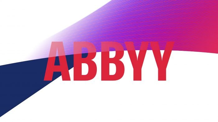
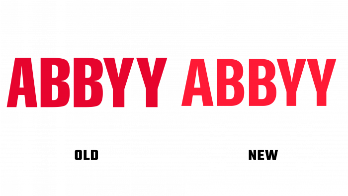
The images’ central element is a ribbon that changes direction from left to right and vice versa and is divided into sections with details and vibrant colors. The shape of the ABBYY logo remains the same, but the font and color have changed. Now the image looks modern, and the color palette has been supplemented with new juicy shades. The color palette is filled with bright red, blue, purple, turquoise colors. The words “energetic,” “modern,” “rich” can accurately describe the corporate identity of ABBYY.
Shuka created an isometric image with a variety of textures, gradients, and details. You can see how the ribbon flows from one color to another; the decor changes from dots, squares, to waves. Photos with people are also actively used. This approach helps to gain customer trust. The corporate identity was created to show that ABBYY is an innovative, energetic company that not only performs its work professionally but can also become a friend and advisor.
More than 5,000 companies use ABBYY services. The company was founded in 1989. Headquartered in Moscow, founder David Yang first chose the name “Bit Software.”
