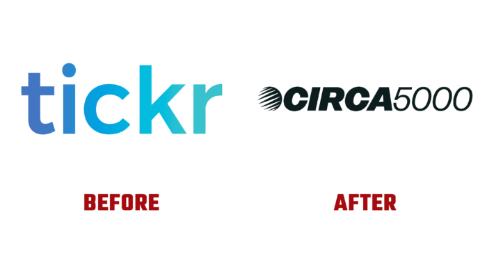
One of the modern representatives of the UK investment market operating in the virtual space is a brand founded in 2019 called Tickr. Founded by two veterans in the field, Matt Latham and Tom McGillycuddy, it held great promise for creating a vibrant and prosperous future for humanity. It was based on the understanding that every investor should be able to invest in an enterprise that has a positive impact without the risk of financial loss. Such prospects and the expansion of existing targets led the founders of the platform to revise the entire strategy of the brand. The result was a complete rebranding that covered all aspects of the identity, including the name, which led to the formation of a new CIRCA5000 application built on Tickr.
The new identity demonstrates a deep concern for the world’s future, emphasizing mandatory sustainability and absolute compliance with the highest standards – environmental and social. The visualization of the brand was built on the desire to tie its actions to the prospects of the distant future. The main message is the realization that it is already too late for ordinary business and another universal fintech. That is why CIRCA5000 becomes a reflection of the world of the distant future of our planet, in which there is everything except humanity itself. This approach explains the rethinking of the future corporation as an association of positive forces. At the same time, the provocative tone of her voice tells everyone that self-enrichment should not be carried out at the expense of using the resources necessary for the development of the planet itself.
The provocative name, which was inspired by the names of evil robots, for example, HAL9000 from A Space Odyssey or T-1000 from Terminator 2, provided visibility and vivid expression of the new brand. Using a futuristic approach, the founders send the viewer back to the year 5000, thereby emphasizing that the lack of investment in promising enterprises and the refusal to care about the planet will prevent humanity from living up to such a figure. The name, which is completely unexpected for fintech structures, suits the business and the goals it pursues especially well. As a result, the brand became so intriguing that its memorability and recognition exceeded all expectations.
The destructible globe cliché and the NASCAR-style text box, despite their visual repulsiveness, were done gracefully and professionally, effectively conveying depth and movement without the use of a visible gradient. The wordmark is presented as a variant displayed on an electronic device from the distant past. The unexpected use of italics in capital letters and numbers creates a subtle tension between the axis of the globe and the “C.” The tonal transition from bold to light emphasizes the year numbers favorably. The logo has become unexpected but surprisingly pleasant and easily perceived.


