Brompton House, the esteemed UK-based confectionery producer, has taken a significant leap into a new chapter of its brand story by unveiling a sleek, modern logo and brand identity. This major rebranding effort, masterminded by Brighton’s creative agency UnitedUs, marks a departure from Brompton House’s more traditional image, signifying a move towards a contemporary, sophisticated aesthetic.
Founded in 2004, Brompton House has steadily risen in prominence within the snack food industry, renowned for its delectable range of individually wrapped brownies, macaroons, pralines, and muffins. Despite its modest size as a family-run business with a workforce of around 50, Brompton House has left an indelible mark in the UK and internationally, exporting its products to various European countries, including France, Italy, Germany, and even as far as China.
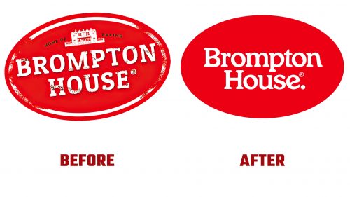
The original logo of Brompton House stood out with its unique but somewhat cluttered design. Featuring a variety of elements, including an oblique retaining shape, an intricately detailed illustration of a manor house, and a serif font with a slightly distressed effect, the logo exuded the brand’s friendly and informal personality, albeit at the expense of a sophisticated appearance.
The newly crafted Brompton House logo represents a significant transformation, epitomizing elegance and modernity. Retaining the iconic red oval and the brand name, the rebranding effort streamlines the logo by removing the manor house imagery, the tagline, the tilt, and the distressed effect. This refined design approach clearly points towards a more upscale and sophisticated brand positioning. The incorporation of a soft ’80s revival font, complete with a period at the end of the brand name, further enhances the logo’s contemporary appeal.
An essential component of Brompton House’s revamped identity is the typography. The brand employs the Henrietta typeface from Very Cool Studio for its wordmark and headlines. It infuses a contemporary flair with unique attributes such as the playful ‘muffin top’ on the lowercase “i.” This is skillfully balanced with the use of Euclid Circular A from Swiss Typefaces for body copy, ensuring a perfect blend of whimsy and seriousness.
The brand’s communication style is invigorated by the visual treatment of the headlines, which feature colored strokes, white fills, and sharp drop shadows, lending a dynamic and appealing quality reminiscent of classic design techniques.
Though the full impact of Brompton House’s rebranding on its standing in the European snack cake market is yet to be determined, the initiative by UnitedUs is a clear step towards elevating the brand’s narrative. The new Brompton House logo aligns with current design trends and aims to draw a wider audience, striking a balance between refined sophistication and friendly accessibility.
As Brompton House steps into this new era with its refreshed identity, it remains to be seen how this evolution will influence its position in the competitive snack food market.


