One of the first American craft breweries, Brooklyn Brewery, founded in 1988, follows modern trends in visualization changes. The peculiarity of the brand is that it was launched long before this method of making beer gained popularity around the world. It was founded by former AP Foreign Correspondent Steve Hindy and financier Tom Potter, based in Park Slope. A special role in the formation of the company was played by Milton Glaser, a professional designer whose fees were not available to the founders. Glaser entered into equity participation with constant control from his side over the design and identity of the company. As a result of the thoughtfulness of the strategy and the attractiveness of the external design of the brand and packaging, the company quickly expanded beyond its area. It gained immense fame, not only in the US but also in more than thirty countries worldwide. This was facilitated by the conclusion of an agreement with Carlsberg Grou on cooperation between the UK, Hong Kong, and Europe. In recent years, the brand has not only expanded in sales volumes but also created new seasonal or experimental beers, which eventually became its symbols – Bel Air Sour and Special Effects. With these changes and the increase in product development, there has been a need for greater alignment between development and brand identity. This topic was entrusted to the design studio Robot Food.
There was created as a single visual generalizing system of all different packages, options, and varieties with their pronounced individuality. The result is bold and effective interaction across all touchpoints, from can and bottle designs to boxes, beer taps, glasses, etc. The new identity made the product more mass and attractive, allowing a powerful brand to develop and achieve greater visual recognition. His original, originally handmade by Glaser himself, the letter “B” symbol has gained worldwide respect and recognition. Therefore, in memory of the great designer, the sign was unchanged in the new design.
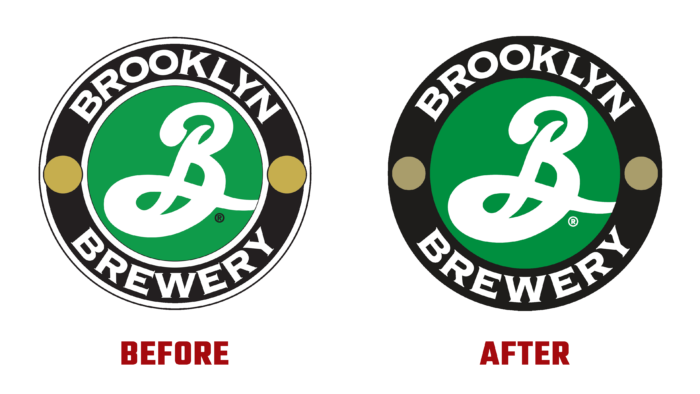
The change in the strategy touched upon areas related to an increased focus on creating unity and cohesion in the entire range of the company. His key symbol was put to the most effective use. The changes affected the font in the round logo, which has undergone very subtle changes. The gothic Copperplate typography has been redrawn to fit the circle’s outlines better. The sign has been redesigned to suit digital applications, gaining clarity, depth, and sophistication.
The overall visualization has become deeper, and the corporate color – green, has acquired brightness and saturation. The white borders that divided the composition into components were removed, not matching the new strategy.


