Brooklyn Defenders has practiced law and advocated for 25,000 Brooklyn residents for 25 years. It is a leading advocacy organization that provides legal representation at no cost to area residents.
Brooklyn residents are unable to retain attorneys and turn to Brooklyn Defenders for world-class legal representation, regardless of social status, ability, or other factors.
The Brooklyn Defenders team is a powerful force in criminal, family, immigration, and civil law and provides effective solutions to pressing issues.
As the company expanded its influence and reach, it decided to update its visual identity. Creative agents from Hyperakt were hired to acquire a new identity. They created a sophisticated visual identity that communicates the organization’s values and inspires admiration.
Focusing on the fact that, for the most part, state human rights organizations are overworked, poorly funded, and have too vague powers and obligations, it was decided to eradicate the existing stereotype. Accordingly, the appearance shows strong support, which clients are guaranteed to receive by contacting Brooklyn Defenders.
The brand should be built on trusting relationships with clients, fairness, and social equality. Therefore, the brand identity wanted to emphasize the humanity and credibility of the company.
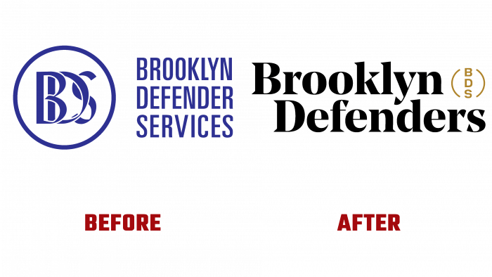
Instead of a logo consisting of a font design and a badge in the form of a blue circle with inscribed capital letters in medieval style, now the company has a black logo with a small mustard-colored inscription – the letters BDS in a round rim.
The main emphasis is on the elegant font. The name Brooklyn Defender Services, which used to be on the old logo, was transformed into a simple Brooklyn Defenders name, emphasizing the employees’ team spirit and professional ambitions. The brand speaks not only about high-quality services (they are already known outside the city) but also indicates a well-coordinated team of human rights defenders, who stand on guard and fight for the rights of their clients.
The identity has become more modern and interesting. Incongruous letters in a blue circle, encircled with a white outline, do not create an impression of a reliable company. At least, nowadays, it looks that way. Now it is much more important to avoid pretentious images and ornate fonts to show the power of the brand through minimalism and well-chosen colors.
The organic and harmonious elements of the new logo create a feeling of comfort and confidence that any client’s question may be resolved in their favor.
These are the positive evaluations that the initiators of rebranding wanted to evoke in the audience. Therefore, in the future, interest in the human rights company is expected to increase, which will make its brand more recognizable and successful in the professional arena.


