The Brotherhood Sister Sol (BroSis) – the organization of social justice for national minorities, appeared before the general public in a renewed form. Led by minority blacks and Hispanics for over 25 years, it has served as an advocate for all racial interests at Harlem (US), providing teacher education opportunities, uniting all in the fight for justice. As a non-profit organization, the brand seeks to communicate its goals and objectives to the general public. It turned to the global design agency Turner Duckworth, which collaborates with many companies and organizations in the U.S. and U.K. in branding and office design. Together with Turner Duckworth, a new visual identity was created inspired by the symbols, images, and signs of civil rights protest movements and the organization’s rich history.
The new identity has become an effective way to advance the organization’s mission of fighting inequality and promoting equal opportunities. In addition, it was required to preserve the heart and soul of the past logo, combining the best that was in it with new digital technologies and current requirements. At the same time, it was important to surround everything with a set of details that would provide a modern interpretation of the brand’s characteristics and philosophy and create a new voice. We managed to solve this problem. The changes could attract more new people, retaining all those who have seen the community as a protector and helper for many years.
Before starting the development, the agency surveyed employees, board representatives, young members, and supporters. As a result, it was possible to demonstrate through visualization as a fundamental attribute of BroSis – unconditional love drives all organization actions. 4 main symbols have been identified – Positivity, Knowledge, Community, Future. They were transformed into graphic forms that became the cornerstone of the previously untapped potential for visual identity.
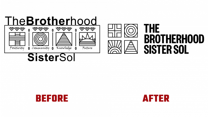
The logo’s base was retained, but the graphic design and visual construction of the signs changed. The signs were lined up in squares. Their graphics have acquired clarity and compliance with digital technologies. The signatures under each of them have been removed. To the right of the signs, the brand’s name was placed, which was placed in a “ladder” in 3 rows. A bold and well-readable font has been used to render it. Aligned on the left side, it corresponds in height to the size of the composition of characters. The main and only shade of the logo was taken to be black – austere and good-looking at any scale and against any background.


