Founded back in 1921 as the British Building Research Station – BRS, in 1972, it became the Building Research Center – BRE after a series of reorganizations and expansions. The privatization that took place in 1997 and the revision of some of the company’s activities led to changes in its identity and the reduction of the full name of Building Research Establishment Limited to an abbreviation. The company’s main task is to provide advice and expert advice in the field of building improvement for the built environment sector. It provides effective assistance to the government, business, industry in solving a wide range of tasks that consider both climate change and emerging serious economic and social problems. To reflect the current changes and meet the requirements of modernity, the company decided to rebrand, which covered all the important elements of the visual identity.
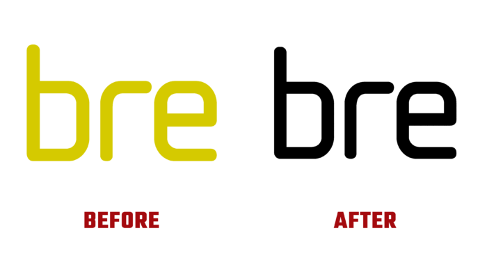
When creating a new image, it was important to comply with the main requirement – to ensure the conciseness and simplicity of visual displays. To do this, the entire brand system was simplified, which ensured simplicity and clarity of communication, maintaining visual unity in a wide range of collaborations. The logo was built based on the previously used one to maintain a connection with its history. It has been redrawn and given clarity and is in line with the requirements of modern display systems. The letters were slightly shifted to ensure their legibility at any scale and acquired the required geometric contrast. The circle in which the abbreviation is placed ensures the creation of a visually simple and easily recognizable icon. When it was created, the possibility of using the sign-in messages was taken into account to ensure the legibility of its reading. The text modules were typed using two types of font – Recife Text Light for the title and title and Neue Haas Grotesk Display Light for general text information.
To increase the attractiveness and make it easier to work with the brand’s visual elements, animation was applied to display the four business pillars of the brand – knowledge, innovation, research, and guarantees. A series of animations have been created to enhance the visual impact on users of typographic graphics and the brand’s representation in the digital environment. This effect can be updated and adapted according to the further development of the company the changes taking place in it, without making changes to the basic identity. A disciplined typographic system ensured the commonality and visual unity of all materials. The BRE team has found a unified voice at all contact points and interaction of its own identity.


