Brussels Airlines will unveil its new visual identity on November 18, which will link the brand more to its nationality. Since 2007, Benelux, the largest air carrier of the countries, has carried out the third update in its identity, making more radical changes in it than in the two previous ones. A change in our strategy, changes that took place in self-awareness and throughout the world, required us to reflect all the changes, provide clarifications and confirm our position in the transportation market with the help of new visual markers and forms. Among other things, the new corporate identity will reflect a future in which strategic investments play an important role, priorities have become clear, and the identity has become strongly pronounced national – Belgian.
The renewed brand demonstrates the company’s confidence in its future, despite the problems caused by the pandemic and the reduced quality of services and comfort for customers. But the most important thing in the process of changes in the allocation of national identity is the main emphasis. The brand logo is done by highlighting the word “Brussels,” which is executed in a black uppercase font such as Croogla 4F Light by February 4, increased several times in size compared to the other. The roundness of this typeface is matched by the smooth roundness of the airlines’ airplanes. The word Airlines is placed under the main and applied in small thin lowercase type FF Neuwelt Text Medium by FontFont, which puts it in the background.
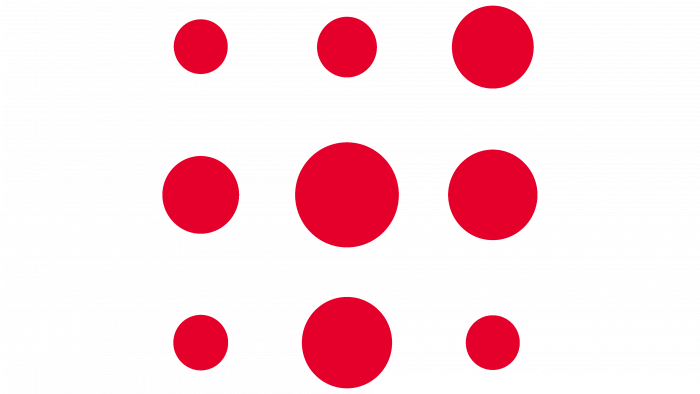
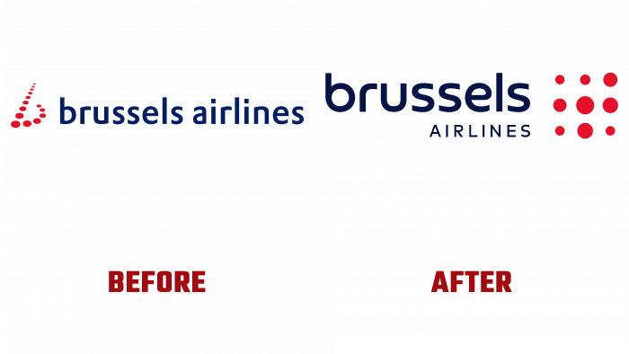
The dots that formed the stylized red “b” in previous logo versions have been retained in the new one. But they are taken out of the limits of the inscription to the right, where they formed a square of 9 red dots-circles of various diameters. In this way, a tribute was paid to the brand’s history, its rich experience in its field.
The color palette acquired clarity and shades, which made the elements of the logo composition easily and efficiently perceived when applied by typographic method on surfaces of any size and in digital space. Also, modern technologies have ensured the ease of reading the logo at any scale of its reproduction. The red color was retained as a corporate color, which acquired brightness and saturation. The compliance of the new identity with modern digital visualization technology requirements has opened up ample opportunities for further changes in the corporate identity of a well-known brand.


