


![]() BSA Logo PNG
BSA Logo PNG
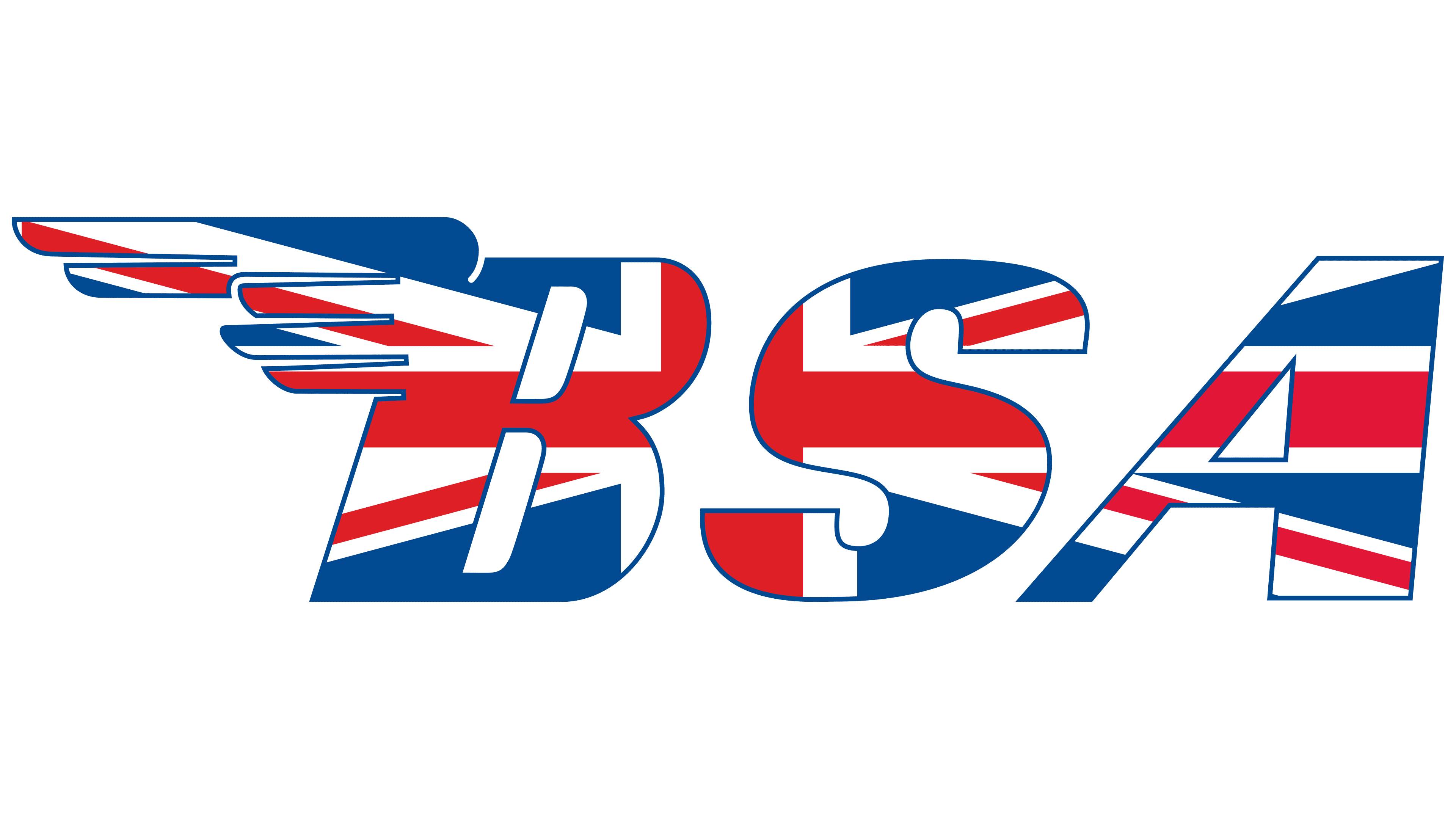
The winged BSA logo symbolized flight because the manufacturer’s motorcycles once rushed along the roads as if they had wings. Therefore, a stylish hood sign testified to the vehicle’s enormous speed and power.
BSA began during the Crimean War of 1854-1856, when Britain needed mass-produced rifles and turned to Birmingham gunmakers. In June 1861, fourteen members of the Birmingham small-arms trade formed The Birmingham Small Arms Company. The factory was built on 25 acres in Small Heath, with Armory Road laid beside it. An early Turkish order for 50,000 infantry rifles gave the company a stable start.
Arms contracts were irregular, and in 1879, the factory closed for a year without orders. In the 1880s, BSA moved into bicycles, then returned to rifles during the Lee-Metford rearmament program. A motorcycle division appeared in 1903, and the first 3.5 hp BSA motorcycle debuted at the Olympia Show in 1910. That same year, BSA bought Daimler and entered the car business.
Both world wars pushed BSA back into military production. In World War I, it made 1.5 million rifles, Lewis guns, shells, aircraft parts, and a folding bicycle. In World War II, it supplied nearly 500,000 Browning guns for Spitfire and Hurricane fighters, 1.25 million Lee-Enfield rifles, 400,000 Sten guns, and more than 125,000 M20 army motorcycles. After the war, the BSA Bantam became a major civilian model, with over 250,000 built.
In 1951, BSA took over Triumph Motorcycles and became the world’s largest motorcycle maker. Models such as the BSA Gold Star strengthened its racing image. At the same time, Raleigh bought the bicycle division in 1957, and Jaguar acquired Daimler in 1960. By 1959, Honda had passed BSA in sales, with Yamaha and Suzuki adding pressure. In 1972, BSA’s motorcycle business was folded into Norton Villiers Triumph, and BSA motorcycle production ended in 1973. Classic Legends, owned by Mahindra Group, bought the brand in 2016 and launched a new BSA motorcycle in 2021.
Meaning and History
![]()
The BSA logo has evolved alongside the vehicles produced under this brand. The Birmingham Small Arms Company Limited motorcycle division was opened in 1903 and, over the next seven years, was engaged in creating the latest bike. In 1910, work on a two-wheeled beast was finally completed. As expected, his shiny gas tank was adorned with the brand name emblem.
Over time, the BSA developed a sign with a winged letter “B”, the personification of the fact that motorcycles fly along the roads, picking up tremendous speed. It became the company’s main symbol until its closure in 1973. In the same year, the rights to the name were acquired by Manganese Bronze Holdings, and in 2016, the Indian conglomerate Mahindra Group acquired the BSA brand and continued developing motorcycles.
What is BSA?
A brand of motorcycles, bicycles, and scooters, whose production began in England in 1880, was founded by the Birmingham Small Arms Company.
1919 – 1946
![]()
The old logo features the BSA name with square dots after the “B” and “S.” This abbreviation is derived from the phrase “Birmingham Small Arms,” referring to a large industrial complex in Great Britain. All three letters were written in bold block type and painted in deep red. Thin black contours separated them from the beige oval, which was additionally surrounded by a red stripe.
1946 – 1972
![]()
The logo’s appearance can be associated with the end of the First World War, when a separate unit called BSA Cycles appeared.
The brand name is a winged abbreviation, BSA, with a clarifying caption in small print: motorcycles.
The letters BSA on the logo stood for Birmingham Small Arms. That is what the Birmingham Association of all arms manufacturers began to be called.
Therefore, adding the words cycles (bicycles) or motorcycles (motorcycles) to the abbreviation of the logo was important and mandatory. With this, customers could understand that this was not about weapons but about a division that produces vehicles.
A drop in handgun demand led to a strange shift from rifles to bicycles. The owners were looking for other ways to make money. And the abbreviation of the weapons joint-stock company’s name has remained in the motorcycle brand’s name to this day.
The wing on the letter B in the logo had a wide meaning.
- It was said that the company’s units developed high speed. In manufacturing weapons, the exact fit of all parts was crucial. The habit of filigree execution across all body elements made BSA motorcycles very high-quality, reliable, and streamlined. This allowed them to develop maximum speed. The idea of perfect execution and assembly was confirmed by the even-sized “feathers” on the logo’s wing.
- Wings also revealed the company’s complex history. It developed during a special period against the backdrop of three wars: the consequences of the Crimean War and, completely, the First and Second World Wars. They significantly slowed the brand’s development, but BSA still recovered from the difficulties. Wings of fortune helped her use difficulties to her advantage. For example, during World War I, she again returned to producing weapons, not forgetting motorcycles, which she now supplied to the front. And during the Second World War, she bought up less successful firms. A resilient spirit and the ability to rise above the situation helped the company make the right decisions, soar above adversity, and maintain production.
- Wings allowed the brand to prevail over competitors and not play by the general rules. BSA was almost the only successful company that did not promote its models through racing. She hovered in the highest circles. Thanks to the government’s release of weapons, the company’s models were constantly ordered by the police, the army, taxi companies, and repair teams, making them recognizable and popular.
All BSA letters had a slight slant to the right, which was associated with movement.
In 1973, as a result of the merger, BSA ceased to exist. The abbreviation was revived in 1994, following the formation of the BSA Regal concern. Now the trademark belongs to the Indian concern Mahindra.
Font and Colors
The logo is made in mono-color. Red is the embodiment of speed and pressure. It talks about powerful engines and the most modern, perfectly working parts. Indicates leadership in its segment. The color is also associated with weapons and blood. Lettering font: Britannic Bold.
