The BSE logo has an interesting feature: it is authentic. Its uniqueness is conveyed by a small but bright touch that catches the eye, diverting attention from the name. Although such a design is unusual for a stock exchange, it does not bring dissonance or ruin the emblem but endows it with unique individuality.
BSE: Brand overview
| Founded: | 9 July 1875 |
| Headquarters: | Mumbai, Maharashtra, India |
| Website: | bseindia.com |
Meaning and History
After officially registering the newly formed exchange, it immediately received its mark. It was necessary not only for marketing purposes to attract customers but also for personal authentication. Therefore, the logo is a concise symbol with an abbreviation of the phrase “Bombay Stock Exchange” for convenient marking in stock lists.
What is BSE?
BSE is the abbreviation for Bombay Stock Exchange, the largest stock exchange in the Asian region and the first international exchange in India. It was founded on July 9, 1875, by the trader Premchand Roychand. This is the official launch date; unofficially, it appeared much earlier when five brokers worked under the open sky, moving from place to place until they found a permanent office. In the second half of the 19th century, a group of brokers merged into a single organization. Now its head office is located in Mumbai, Maharashtra.
Before 2023
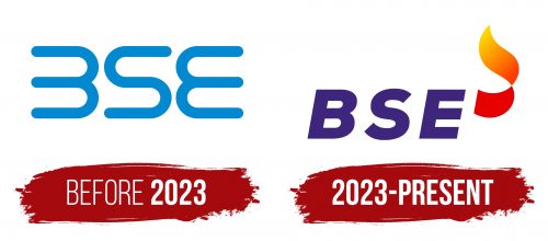
The BSE logo is text-based. It contains a single inscription – an abbreviation obtained from the full name Bombay Stock Exchange. The letters are so individual that they are barely discernible in the curved lines. This is because designers visually unified “B” and “E”: the word is difficult to read, and a stranger will not immediately understand what each glyph means. The first letter lacks the mandatory vertical stroke – only three horizontal lines are rounded on the right. And for “E,” the rounding is done from the opposite side – on the left. The only recognizable one remained “S,” which has the form of a worm, as in the NASA emblem. The upper and lower parts of all symbols are long and straight.
2023 – today
The inscription has become easy to read because the logo’s font has changed. This time, designers opted for a classic lettering style. The letters are italicized, large, bold, and wide. No serifs indicate that the company is open to anyone interested. Symbolism is also present in the winding ribbon located at the top right. According to the BSE’s administrative leadership concept, this is Diya or the flame of a torch, which BSE representatives light the way to the future for the successful development of the capital market. The flame has many gradients; hence its palette is incredibly saturated. The emblem was designed for the brand’s 149th anniversary in a new guise to meet its 150th anniversary. It symbolizes high responsibility, trust, initiative, growth, brightness, and prosperity.
Font and Colors
BSE logos have used two types of fonts: worm-like Nasalization Rg with curved tubular letters and a block typeface in a strict style, resembling Typold Black Italic by The Northern Block or Loew Heavy Italic by The Northern Block.
The corporate palette is diverse. It consists of blue (symbolizing the sky and the ocean, representing reliability, honesty, and knowledge), yellow, dark orange, and red (representing the flame lighting the way to a bright future with BSE).


