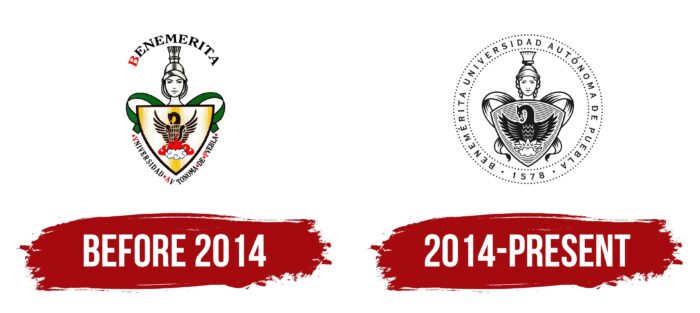
The BUAP logo is an opportunity to show your philosophical concept. The phoenix bird depicted on the shield is a symbol of eternal life, rebirth, evolution, and development. In turn, the goddess Athena represents knowledge and wisdom – something that all university students should strive for.
BUAP: Brand overview
| Founded: | 4 April 1937 |
| Headquarters: | Puebla, Puebla, Mexico |
| Website: | buap.mx |
Meaning and History
The slogan most accurately conveys the concept and goals of the university: “To think well to live better.” Thus, historically BUAP has put knowledge above all else. Not surprisingly, the emblem conveys the educational tradition inherent in Mexico. When it comes to the new era of the university, there have only been two logos. The only redesign came in 2014. Interestingly, even though the logo was more concise and minimalist, it looks extremely modern and associated with a reputable educational institution.
What is BUAP?
It is one of the most sought-after institutions in Mexico, with its main building located in Puebla. Not only Mexican students are interested in BUAP, but also international students. According to current rankings, the university is one of the 800 best globally.
before 2014
The first version of the logo was introduced almost immediately after the university was founded. Moreover, it remained relevant until 2014. The basis of the logo was an emblem with verbal inscriptions at the top and bottom. It consisted of a yellow gradient shield depicting a phoenix bird rising from the ashes. The red fire also indicates this. The use of this bird is probably directly related to the rebuilding of BUAP, a new branch in its development.
Interestingly, unlike the phoenix, the fire looks more three-dimensional and three-dimensional, while the bird is applied to the shield. At the top of the shield, there are rounded green ribbons and the image of Athena. This is a goddess from Greek mythology who symbolizes wisdom and knowledge. She is dressed in a helmet and as if holding a shield.
If we talk about the verbal inscriptions, a unified style was used for the logo, both for the name “Benemerita,” which was at the top, and for “Universidad Av Tonoma De Puebla,” which was at the bottom. The former lettering was considerably larger in size. It was based on an elegant serif typeface. Black and red were used for the letters. Dots separated the words in the lower inscription.
2014 – today
The 2014 redesign resulted in a more concise logo for the Benemérita Universidad Autónoma de Puebla. At least when viewed in the context of the color palette. The variety of colors of the original version has been replaced by the use of an exceptional blue shade, which looks modern and stylish, evoking a sense of confidence among BUAP applicants and students.
The basis of the university’s logo was an emblem placed inside a circular frame with a double outline. Interestingly, not a solid line was used for the outline, but round dots that were slightly apart from each other. Inside the frame was the verbal inscription Benemérita Universidad Autónoma de Puebla. A more modern sans serif replaced the font. The thinner lines gave the capital letters a certain elegance and confidence. The lettering was virtually unchanged but became more detailed. For example, the phoenix takes a significant place on the shield and looks more confident. The same goes for Athena; she becomes a noticeable element of the emblem; you can even see hair strands peeking out from under the helmet. The ribbons, depicted in green in the first version, are now at the top and the bottom. The shield also has horizontal lines across the entire volume.
Font and Colors
The current version of the word inscription is in classic sans serif font, made with capital letters with thin lines.
The variety of colors of the first variant of the logo, relevant before 2014, has been replaced by monotony and the use of only dark blue in the current one. However, the BUAP logo did not look worse. It has the sense of restraint and rigor inherent in the popular Mexican university.
BUAP color codes
| Black | Hex color: | #000000 |
|---|---|---|
| RGB: | 0 0 0 | |
| CMYK: | 0 0 0 100 | |
| Pantone: | PMS Process Black C |


