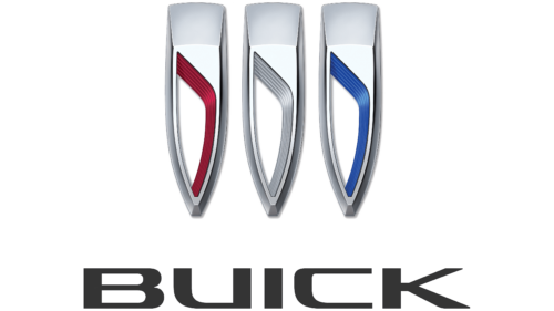
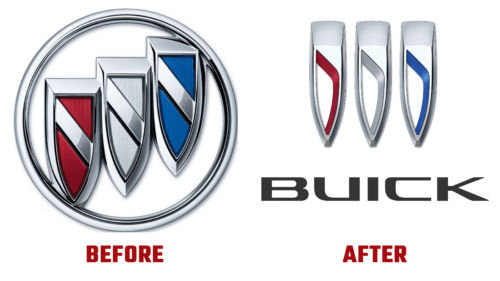
In March 2022, General Motors submitted an application for approval of a new Buick logo. And in early June, she officially introduced the logo of the subsidiary brand. In fact, this is the first significant change in its visual identity, carried out since 1990.
At the moment, it is known that three shields, elongated vertically and aligned horizontally, became the basis of the emblem. The diagonal arrangement has disappeared: the designers decided to use a flat version to bring novelty to the visual identity of the lineup. The developers also removed the round ring that united multi-level shields. Thanks to this, the icon now looks much better because there is no barrier that limited the space.
At first, the application did not mention whether the new symbolism would be in color or remain monochrome, but now it is clear: the designers combined these two characteristics. In addition, representatives of the parent company said that color is an integral feature of their mark. Therefore, the outer parts of the shields will be colorless (chrome-plated with a silvery sheen), while the inner parts will be painted, as before, in blue, red, and dark gray. The center will turn white to emphasize the visual three-dimensionality of the logo.
It is also certain that the updated badge of the subsidiary brand will grace the line of vehicles that will roll off the production line in 2023. It is assumed that it is being prepared for the Buick Electra electric car because General Motors applied for registration of this trademark at the end of last year. In any case, the tentative version of the logo echoes the 1939-1942 version.


