The Bulgari logo embodies the elegant charm of luxury and sophistication. It radiates themes of success and boundless prosperity, evoking the same impression as all of the brand’s creations. Every detail in the emblem is perfectly placed, harmoniously and subtly highlighting the brand’s uniqueness and beauty. Through the simplicity of classic colors, the designers have managed to convey the originality and high quality of the jewelry without unnecessary embellishments.
The brand’s identity successfully fuses the past and future, where tradition and modern trends intertwine to form a unique union. While blending historical significance with contemporary fashion might seem challenging, the logo and its products are living proof that it can be achieved.
The shimmering text on a solid background evokes the sparkle of precious jewels, emphasizing the elegance and refinement inherent in every piece of this luxury brand. The perfect harmony of lines and curves recalls the most iconic and successful collections that have become the brand’s hallmark. Every element in graphic design or the products carries echoes of unmatched style and sophistication.
This attention to detail has earned the brand worldwide acclaim, and today, its name is synonymous with elegance and success. With its soft glow and flawless geometry, the visual mark symbolizes timeless relevance and enduring popularity. Undoubtedly, the polish, honed over the years, will never lose its allure.
Bulgari: Brand overview
Greek jeweler Sotirios Boulgaris founded the first store Bulgari on Via Sistina in Rome in 1884, marking the beginning of the brand’s history. Boulgaris brought the rich jewelry traditions of his homeland and blended them with Italian design.
The company saw tremendous growth in the 1920s and 1930s. Sotirios’s sons, Giorgio and Constantino, joined the family business and contributed to its expansion. The brand began experimenting with new designs, combining Art Deco elements with Greek and Roman influences. Like many businesses, it faced challenges during World War II but rebounded quickly after the war, gaining more international attention, including from Hollywood stars filming in Rome.
The 1950s and 1960s were prime years, symbolizing Italian glamour. Celebrities like Sophia Loren, Audrey Hepburn, and Elizabeth Taylor were regular visitors to the Via Condotti store. During this time, the company developed its signature style, which is known for its bold use of color and unique gemstone arrangements.
The brand began expanding internationally in the 1970s, opening stores in New York, Paris, Geneva, and Monte Carlo. This decade also saw design innovation, with the introduction of its iconic watch, one of its most recognizable items.
During the 1980s, the company continued its global expansion, opening more stores worldwide and launching its first fragrance in 1992, which became a hit.
The 1990s brought major changes to the company’s structure. In 1995, the business went public on the Milan Stock Exchange, allowing for greater investment in growth and development.
In the early 2000s, expansion continued, launching an accessories line featuring handbags and scarves and the venture into luxury hospitality. The first hotel opened in Milan in 2004.
In 2011, a major shift occurred when LVMH, the French luxury group, acquired the company for 4.3 billion euros. This acquisition gave the brand more resources to grow.
After joining LVMH, the brand continued to innovate. In 2014, to mark its 130th anniversary, a new line of high-end watches and jewelry was launched. That same year, the company expanded its production capabilities with a new facility in Valenza, Italy.
In 2015, the company solidified its position in the ultra-luxury market by unveiling its first high-jewelry collection, showcasing the craftsmanship and creativity of its designers.
In 2017, a new flagship store was opened on Fifth Avenue in New York, designed to reflect the classical Roman architecture that inspires the brand. 2018, the watch offerings expanded, including creating the smallest mechanical watch ever.
In 2019, the company launched the “Mai Troppo” (“Never Too Much”) campaign, emphasizing its bold and colorful style. That same year, a new high-end jewelry collection was released, inspired by ancient Rome.
Despite global challenges, the company continued its expansion in 2020 and 2021, enhancing its online presence through digital marketing and e-commerce.
By 2022, the company had firmly established itself as a top luxury brand. It expanded its hotel network while growing its core jewelry, watches, accessories, and fragrances businesses.
As of early 2023, the company remains a symbol of Italian elegance, attracting clients worldwide with its innovative designs and craftsmanship. The brand began as a small jewelry shop in Rome and has grown into a global name over its nearly 140-year history. By blending its rich heritage with modern design, the company has maintained its status as a leader in the luxury market despite changes in ownership and global challenges. The company continues to represent style and innovation in luxury goods.
Meaning and History
What is Bulgari?
This Italian luxury company, known for its exquisite jewelry, watches, and accessories, was founded in Rome. The brand draws inspiration from Greek and Roman art, reflected in its luxurious and vibrant designs. The company stands out with bold jewelry, using precious cabochon-cut stones that give their pieces volume and expressiveness. The brand’s designs are recognizable for their sensual style, large-scale pieces, and harmonious modern and classic motifs blend. In addition to jewelry, the brand offers high-quality leather goods and perfumes and manages a collection of luxury hotels that reflect their unique aesthetic.
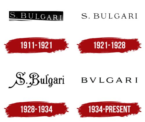
1911 – 1921
Minimalism is evident in the brand identity of this period, where every detail works to reveal the brand’s full potential. With a subtle romantic touch, the emblem elegantly conveys the brand’s essence, as if declaring that the world is full of beauty and that this brand creates the most exquisite and luxurious items. This feeling can be encapsulated in a slogan easily associated with the logo, where light letters gracefully stand out against a dark background, creating an effect of sophistication and uniqueness.
This design is dominated by classic motifs, primarily in the color palette. The shades harmonize beautifully, creating a soft yet memorable contrast. The brand name, neatly written on a black line, appears as something more than just text. It’s like a “golden key” that unlocks the company’s philosophy, rooted in refined beauty, brilliance, and luxury. These products appeal to those who truly appreciate art and aesthetics.
In the Bulgari emblem, the capital letter of the founder’s name stands out uniquely—separated from the surname by a distinctive triangular mark. This triangle, though drawn with sharp, straight lines, evokes the image of a dot, creating a sense of completeness and harmony. It’s not just a simple geometric figure; it carries depth and symbolism, adding a touch of mysticism and mystery to the logo.
This simple yet expressive addition highlights the uniqueness of Bulgari’s products, infusing each item with a sense of mystery and atmosphere. This element, like a key to a secret, invites one to look closer at the details, unveiling new layers of the brand’s aesthetics. The triangle becomes the bridge between past and future, reflecting the brand’s philosophy, where elegance, luxury, and mystery go hand in hand, creating an unmistakable aura that cannot be overlooked.
1921 – 1928
The identity underwent an update in 1921 amidst the brand’s rapid growth and expansion of its collections. The logo adopted a minimalist look while maintaining a high level of information. The brand was already well recognized in the market, so the update’s goal was not to add new elements but to refine those previously used.
On a clean white background, the letters are elegantly and precisely aligned. The brand name appears refined and harmonious. Special attention is drawn to the letter “S,” which, while not oversized, fits seamlessly into the overall concept, creating a sense of unity in the text element. Another intriguing detail is the dot, which is not in the usual round shape but in the form of a diamond, evoking associations with the sparkle of stars or gemstones. The font exudes elegance—it’s not too bold but features sharp serifs, emphasizing a classical aesthetic and a sense of completeness.
This update helped highlight the brand’s key traits: sophistication, luxury, and a pursuit of perfection, turning the logo into a significant part of the company’s visual identity.
1928 – 1934
In this period’s identity, an artistic style dominates, giving the logo a distinct uniqueness. The brand name is closely tied to fairytale-like motifs, evident in the elegant swirls, patterns, and beautiful serifs that highlight the brand’s originality. One of the most memorable elements is the dot placed after the expressive and superscript letter “S.” This symbol divides the text into logical parts and draws attention to the company’s individuality, adding a signature style and expressiveness.
The letter “S” holds special significance, as it is associated with the founder’s name—Sotirios. The second word in the logo, “Bulgari,” is crafted in a true Italian style, reflecting the spirit and elegance of this luxury brand. However, it is worth noting that the founder was originally from a small Greek village, and his surname was pronounced as “Bulgaris.” Despite this, the visual mark has successfully conveyed the brand’s Italian heritage and its connection to its roots, transforming the identity into a symbol of luxury and craftsmanship associated with masterpieces that captivate the hearts of connoisseurs worldwide.
Each element of the visual mark seamlessly combines history and modernity, creating a unique image of the brand that represents success and the rich cultural tradition behind each of its creations.
1934 – today
The Bulgari brand changed the spelling of its name to Bvlgari in honor of its Roman heritage. The use of the letter “V” instead of “U” is a stylistic choice based on the Latin alphabet, where “V” and “U” are the same letter. This reference to classical Roman culture reflects that the brand’s founder, Sotirios Bulgari, was born in Greece but opened his first store in Rome in 1884. This approach emphasizes the brand’s connection to ancient history and Italian heritage, giving the logo a unique elegance and helping distinguish it internationally. As a result, the company’s visual identity evolved accordingly.
The Bvlgari logo reflects the brand’s history, origins, and market status. The modern version impresses with its simplicity and elegance. The letters stand out against a light background, crafted with special attention to detail. It conveys a sense of authority and unwavering reliability, subtly hinting at each product’s unparalleled quality and aesthetic beauty. Every letter is meticulously drawn as if each detail is a work of art created by a skilled artisan.
This simple yet elegant emblem is designed in a classic style, referencing the company’s Roman roots. “V” instead of the typical “U” is a direct nod to the Latin alphabet and ancient Roman heritage. This sets the brand apart from others and serves as a reminder that it is not just a jewelry house but a cultural phenomenon with a centuries-old legacy.
The black font on a white background underscores the brand’s purity, luxury, and prestige. The minimalist color scheme adds refinement and seriousness to the logo. Black symbolizes permanence and quality that can always be relied upon, while the white background represents lightness and elegance.
The font is strict, with sharp lines and delicate serifs, reflecting the brand’s attention to detail, the quality of its products, and the timeless value of classic design. These letters resemble engravings on ancient coins or columns, again nodding to Roman origins.
When the company began operations in the late 19th century, inspiration from the Roman style helped it win over customers. The logo’s symbols recall the grandeur of the ancient world, highlighting the timeless relevance of style and the brand’s focus on enduring values.
The Bvlgari emblem blends tradition and modern technology, cultural heritage, and innovation, creating a unique sense of luxury and the highest quality.


