


![]()
A new pastry shop, Butter Baby, has opened in Jakarta. Its story began in an unusual way, with the fall of a cosmic visitor. The main character of the brand, a dessert master from the planet Butterlandia, landed in the Blok M district and, after meeting the local “troublemakers,” decided to stay and share his sweets. He arrived in search of salvation for his home world but found inspiration on Earth in warm butter, smiles, and good spirits.
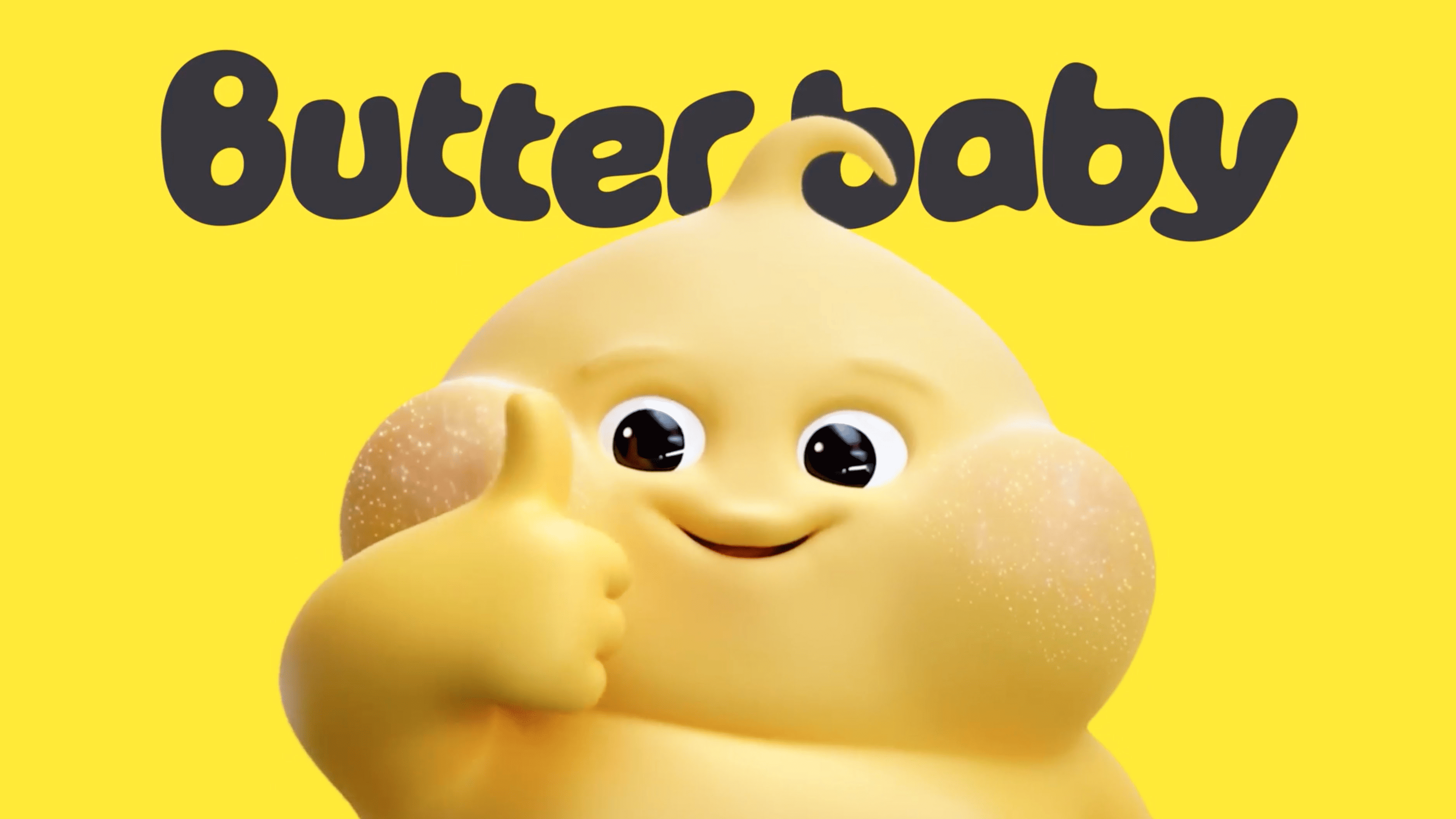
The brand was created by the studio Universal Favourite, which turned this story into an entire universe. Instead of a standard identity, the designers developed a mythology, a unique language, and a gallery of characters, including the cheerful and resourceful Butter Baby with pink cheeks. He became the pastry shop’s mascot.
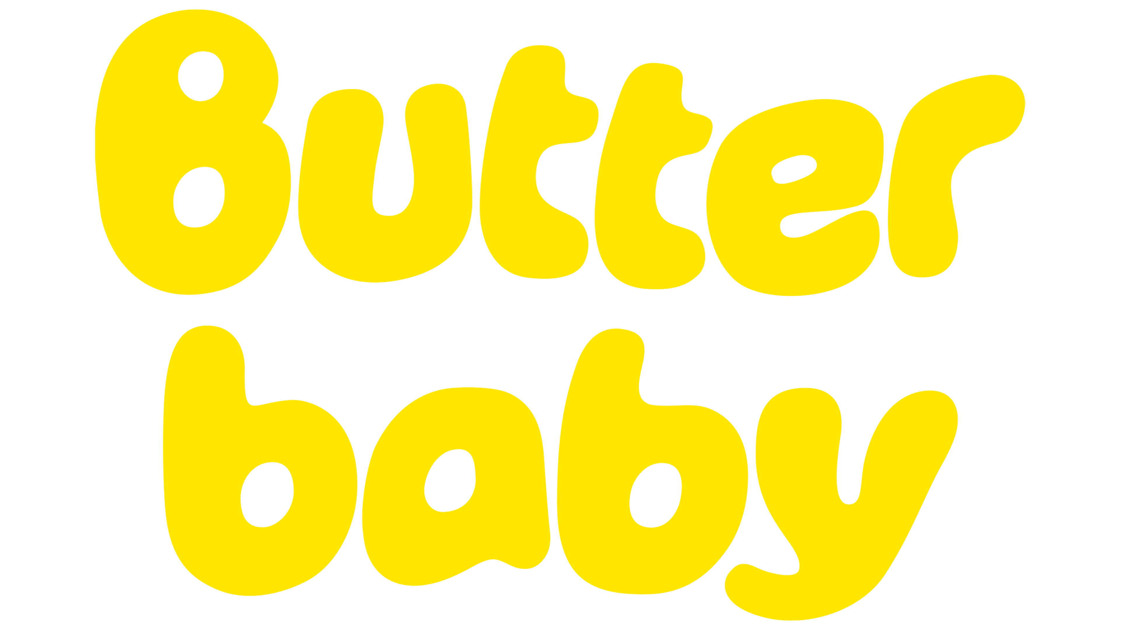
The visual style of Butter Baby resembles the opening of an old sci-fi cartoon: naive, funny, and slightly crazy. The logo looks as if it were drawn by a child’s hand: the letters flow like drops of butter, and the first “B” seems to melt. In its clumsiness, it is charming and conveys the brand’s atmosphere, warm, playful, and slightly surreal.
The main typeface, Ozik, is soft and flexible, reflecting Butter Baby’s character. The secondary typeface, Sohne, is more restrained and is used for informational texts, helping create visual balance.
The color system is built around a bright yellow shade associated with butter and energy. It is complemented by deep blue, cosmic gray, and a milky tone, while silver foil recalls the hero’s origin and adds shine.
Copywriter Daniel St. Vincent created the brand’s language and light humor in the texts. He invented the distinctive speech of Butterlandia’s inhabitants, filled with jokes, fantastic details, and a friendly tone. Each text turns into a new story, creating the image of a small galaxy flavored with butter and imagination.
Today, Butter Baby is not just a pastry shop but a brand with its own world, characters, and language, where fantasy and sweetness coexist.