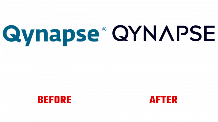
French medical technology company – Qynapse, founded in 2015, unveiled its new logo and developed a new website. As a software developer for neuroimaging central nervous system abnormalities and other cloud-based platform solutions, the company uses artificial intelligence technology. Its developments aim to improve the efficiency of predicting the course of diseases in the central nervous system. This is especially true for diseases such as dementia and multiple sclerosis, Parkinson’s disease, or certain types of stroke.
The program allows you to quickly, accurately, and objectively analyze images of the brain using patented algorithms. They provide the ability to process more than 200 indicators. During the development process, the company envisioned its future, in which it will ensure the use of artificial intelligence as an important and necessary element for conducting clinical trials. To popularize and visually convey the features of its activities, the company decided to radically change its identity, which will meet the current strategy and modern trends in brand development. The new corporate identity is the best reflection of the essence of the company’s activities, its desire to apply the latest modern technologies that are revolutionary. With its help, it became possible to demonstrate serving a more accurate and effective future in diagnostics and treatment of complex diseases associated with abnormalities in brain function.
The new image demonstrates the unshakable peace of mind achieved through new developments and actions that effectively underscore the underlying motivation. By successfully combining imaging with various biomarkers and new treatments, it is possible to provide a visual impression of the potential for Qynapse’s innovative solutions to influence test results positively. This makes it possible to make the most effective decisions in treating abnormalities in the central nervous system. Representing the company’s name, executed in Acherus Grotesque Semibold by Horizon Type, the logo provided the required perception of the essence and spirit of the company. The emblem successfully reveals the inner meaning and focus of the company’s tasks, which is especially important for healthcare providers, payers, pharmacists, and patients.


