The Cadbury logo is directly linked to the main ingredient in most of its company confections. Of course, it is a brown color reminiscent of chocolate. The inscription looks like a cream applied as a decoration on a cake. This impression is created by connected handwritten letters between which there is no gap.
Cadbury: Brand overview
Cadbury is a British chocolate company. The brand was founded in 1824. To date, the rights to the trademark belong to Mondelez. The range of products will delight chocolate lovers. The company was named after its founder, John Cadbury.
In 1824, John Cadbury opened a small store in Birmingham, England, selling cocoa and drinking chocolate, luxury items at the time. He began making his chocolate in 1831, setting the stage for Cadbury’s future. His son George later joined the business, expanding it further.
A major innovation occurred in 1866 with the introduction of Cocoa Essence, the UK’s first unsweetened cocoa powder, thanks to a new method that improved chocolate’s purity and taste. In 1879, motivated by their Quaker beliefs, the Cadbury brothers moved to a bigger factory in Bournville. They built a model village for their workers, offering good living conditions – a rare practice.
1905 marked the launch of Dairy Milk, the world’s first mass-produced milk chocolate bar, notable for its high milk content. This became a key product for Cadbury.
Over the 20th century, Cadbury grew by introducing new products like Bournville dark chocolate, Cadbury Creme Eggs, and Roses chocolates and expanding internationally.
In 1969, Cadbury merged with Schweppes, diversifying its product range. This partnership split in 2008, allowing Cadbury to focus solely on chocolates and confections.
2010 was another pivotal year when Cadbury was acquired by Kraft Foods (now Mondelez International). Despite concerns over its “Americanization,” Cadbury has continued to thrive, focusing on innovation, sustainability, and its flagship products.
Today, Cadbury is a global brand operating in over 50 countries and remains a staple of British culture and a symbol of chocolate’s joy.
Meaning and History
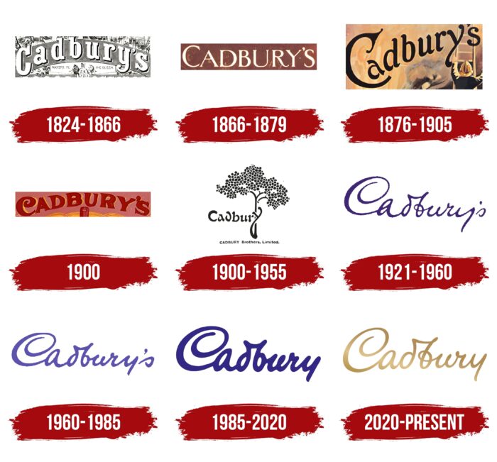
The company’s logo has changed nine times since its inception. The first variation of the modern logo appeared in 1921, and since then, it has only been slightly updated and supplemented. Interestingly, in 1824, John Cadbury was engaged in selling tea and coffee, but later, it was customary to focus on tea. As a result, the brand ranks second globally in terms of sales.
What is Cadbury?
Cadbury is a well-known candy company from the UK that is famous for a wide range of chocolates like the popular dairy milk. It’s one of the top chocolate makers in the world. The company is recognized for its purple packaging and clever ads. Cadbury has been around for almost 200 years, providing quality chocolate to people everywhere.
1824 – 1866
The original logo was introduced the same year the company was founded. It was a wordmark with the brand’s name, made in bold type with rounded corners of the letters and pronounced serifs. Each character had a unique writing style. For example, you can look at the curls of the letters “y,” “r,” and a slightly modernized “a.” At the same time, the verbal inscription was not overloaded with unnecessary details and looked quite fresh, given the realities of 1824.
1866 – 1879
The first significant redesign of the logo took place in 1866. It depicts only a verbal inscription in thin white letters. At the same time, the complex details and interesting spellings of the letters that took place in the original variation of the logo were removed. An interesting feature is that the width is different; sometimes, it is noticeable at a glance. The verbal inscription received a brown background so that customers could associate the logo with chocolate.
1876 – 1905
An interesting version of the logo was introduced in 1876. The wording was now in black italic type. At the same time, all the letters are not on a straight horizontal line but seem to rise. The curves and strokes in the letters are Separately noteworthy, which makes them more refined.
1900
In 1900, a logo was launched that lasted less than a year. It was decided to use the arched style for the logo. Red letters on a pink background looked quite impressive and attractive to users. Moreover, all characters were now capitalized and also had bold lines. The readability of the title was at a high level.
1900 – 1955
Perhaps the first major redesign of the logo took place in 1905. Interestingly, the company owner at that stage of its development, William Cadbury, invited a well-known artist to work on a new version of the logo. It was Georges Auriol. This man was not only a modernist but also a type designer.
A cocoa tree was drawn to evoke associations with chocolate in a potential buyer. In this case, the last letter in the name, “y,” was the bottom of the tree.
The wording was done in a unique and interesting font, even though the exact brand name was hard to read the first time correctly. Interestingly, the company most actively used this logo from 1911 – to 1939 and subsequently returned to it after the end of the Second World War.
1921 – 1960
Interestingly, another one was used along with the previous version of the logo. And it was not even quite a logo but rather the signature of William Cadbury. At the same time, it began to be actively used only in 1952. Because the logo was made in the signature format, the verbal inscription’s readability was low. Although it looked spectacular, it was blue lettering, which seemed out of place for many new buyers.
1960 – 1985
At this stage, two separate company logos were introduced. One contained an additional letter, “s,” and the second was presented without it. Overall, the main focus of this redesign was to update the wordmark to make it more readable. The letters began to have a different shape; extra curls were removed. Based on the owner’s signature, it was as close as possible to the previous version.
1985 – 2020
The problem with the readability of the logo was completely solved only in 1985. Interestingly, in addition to working on the font, various color palette options were also considered, including yellow and purple. As a result, it was decided to use a purple hue.
2020 – today
At this stage, the logo’s color palette was decided to change, even though the font style of “Cadbury” remained identical to the previous version. The yellow color gradient created a golden look, making the image more modern and attractive.
Font and Colors
The first versions of the Cadbury logo were presented in the 19th century and had a modern font that is irrelevant today. Subsequently, the logo was changed. The owner’s signature, drawn by hand, became the key element. Even though the company name is hard to read, the image looks fresh and modern.
The font most similar to the one in the Cadbury logo is likely Bickley Script Std, although most of its outlines have been altered.
It used a different color palette at the company’s development stages. However, if we discuss the latest logo variations, purple and yellow are the key colors. Bright colors evoke users’ positive emotions and interest in the brand’s products.
FAQ
How does Cadbury work?
Cadbury is a global confectionery leader known for its chocolate, gum, and candy. The company prioritizes high-quality ingredients, especially cocoa, and is dedicated to ethical sourcing through its Cocoa Life program. This program supports cocoa farmers and promotes sustainable farming.
Cadbury’s production process mixes these ingredients following specific recipes to make products like the famous Dairy Milk chocolate. They ensure quality through rigorous taste, texture, and overall quality checks.
Cadbury uses traditional and digital marketing to reach consumers worldwide. Its approach focuses on the joy of sharing and enjoying chocolate, helping Cadbury stay a favorite in the confectionery world through ethical sourcing, careful production, and effective marketing.
What makes Cadbury different?
Cadbury Chocolate is unique because its recipe mixes milk and cocoa for a creamy texture and rich flavor. This blend makes Cadbury a favorite among chocolate lovers. The company’s focus on quality and careful choice of ingredients enhances its chocolate’s flavor. Cadbury’s long history and tradition in chocolate and its ongoing innovation in flavors and products add to its appeal. Together, these elements make Cadbury stand out and be loved globally.
Why is Cadbury so famous?
Cadbury is famous for several reasons. Its chocolate is known for being rich and smooth, a quality it has maintained since it started in the early 1800s. Cadbury has always aimed to make high-quality chocolate, earning a strong reputation. This long-standing tradition shows Cadbury’s dedication to quality and chocolate-making expertise.
Cadbury’s marketing has also contributed to its popularity. The company has used memorable ads, catchy slogans, and engaging commercials to connect with people of all ages and build a globally recognized brand.
Innovation is another key to Cadbury’s success. The company has always introduced new products, flavors, and types of chocolate to keep up with consumers’ changing tastes. This focus on innovation, while still maintaining high quality, has made Cadbury a favorite chocolate brand for many generations.
In short, Cadbury’s great taste, commitment to quality, strong marketing, and innovation have made it a lasting and beloved brand in the chocolate world.
What is the Cadbury brand name?
Cadbury, once known as Cadbury’s and Cadbury Schweppes, is a top British confectionery company now owned by Mondelez International, which has been part of Kraft Foods since 2010. Known globally for its long history of making chocolate, Cadbury offers a variety of sweets, chocolates, and other treats. Over the years, Cadbury has changed its name and ownership but has kept its reputation for high-quality and innovative products in the candy industry.
What does the logo symbolize the Cadbury Logo?
With William Cadbury’s signature, the Cadbury logo symbolizes much more than the company’s name. It represents the lasting legacy of the Cadbury family from one generation to the next. This signature promises the high quality, unique recipes, and exceptional taste Cadbury has offered since it started. It shows the company’s dedication to excellence, blending its rich history with ongoing innovation and quality. This commitment has been a key part of Cadbury’s identity.
What does the Cadbury logo represent?
The Cadbury logo features William Cadbury’s signature, reflecting the brand’s rich history and genuine quality. This signature’s flowing, slightly tilted script highlights the personal effort and care Cadbury puts into its products. Lowercase letters, except for the capitalized ‘C,’ make the logo unique and stylish. The golden color of the logo adds a sense of luxury and helps it catch the eye. Together, these elements show Cadbury’s dedication to excellence and commitment to making high-quality chocolates.
Why does Cadbury have a purple logo?
Cadbury’s purple logo and packaging, introduced in 1914, were chosen as a tribute to the Queen of Great Britain, making the Pantone 2865c shade a crucial part of its identity. In 1921, Cadbury started using this specific purple for its logo, a choice that lasted until 2020. This color represents more than just the brand’s look; it’s a nod to Cadbury’s royal connections and distinguishes it from competitors. A century later, Cadbury secured the official rights to this purple, cementing it as an essential element of their brand and symbolizing quality and luxury to customers worldwide.
What is the message of Cadbury?
Cadbury’s message is all about high-quality products and genuine care, as shown by the personal signature on each chocolate bar. This personal touch implies that every Cadbury chocolate is made with meticulous attention to detail. The brand’s use of purple pays tribute to Queen Victoria, symbolizing royal generosity and luxury. It aims to make each product a treat and a kind gesture of indulgence.
In 2018, Cadbury shifted its slogan to ‘Kuch Accha Ho Jaaye, Kuch Meetha Ho Jaaye’ (Let’s make something good happen, let’s have something sweet) from the previous’ Kuch Meetha Ho Jaaye’ (Let’s have something sweet), putting a stronger emphasis on sharing and spreading joy. This move highlights Cadbury’s focus on creating moments of happiness and connection by sharing chocolate. Cadbury is a brand that values and promotes positive and heartfelt connections, showing that it’s about more than just chocolate; it’s about bringing people together.
What does the Cadbury logo mean?
The Cadbury logo features William Cadbury’s signature, symbolizing the brand’s rich history and commitment to quality. This signature represents the legacy of the Cadbury family, starting with founder John Cadbury in 1824 and their ongoing dedication to the highest standards in chocolate making. It suggests that every Cadbury chocolate bar is backed by a personal promise from the company to offer only the best. This blend of tradition and quality assurance makes the logo more than just a design; it guarantees excellence and is a reminder of Cadbury’s long-standing reputation.
Why did Cadbury change its logo?
Cadbury changed its logo twice to honor its founders and their legacy. In 1921, to show gratitude to the founding family, the logo added a personal signature with an ‘s’ at the end, marked by an apostrophe, highlighting the family’s joint efforts. Then, in 1985, the logo changed again to pay tribute directly to John Cadbury, the founder. This time, they removed the ‘s’ to simplify it to ‘Cadbury.’ These changes were made to respect the brand’s heritage and the vision of its founders, showing Cadbury’s enduring appreciation for its origins and the people who started it all.
