The popular planning platform has developed a new design with the Pentagram team.
Calendly is a convenient cloud-based scheduling platform that lets you schedule appointments and sync them with other available apps like iCal or Google Calendar. The company is headquartered in Atlanta, Georgia. Calendly is considered a unicorn company with its recent investment of $ 350 million. The brand is now valued at $ 3 billion, with Calendly helping to organize over 100 million meetings annually for 9 million organizations and individuals.
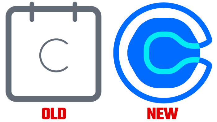
According to company representatives, the visual identity is no longer at the level of the company. Calendly has long outgrown the level of a simple calendar logo with the letter “C” inside in shades of gray. With a new visual identity, the brand wants to demonstrate how some of the processes are simplified with an app.
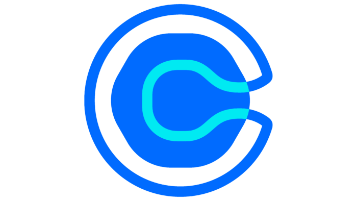
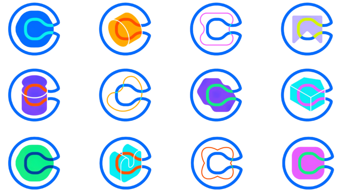
The rebranding of Calendly includes creating a new logo, typography, and visual systems for use in online and offline platforms. The company logo is represented by the letter “C,” inside which an interesting figure is placed. The icon is fluid and often animated, and the main feature is that it does not repeat itself twice. Such symbolism conveys the idea that our every day is unique and does not repeat itself. Pentagram also changed the font for the company name. The lettering has become bold, the space between the letters has decreased, and the letter “C” is written with a capital letter. Designers have abandoned the old shades of gray and added a rich blue – an association with reliability.
Calendly introduced a set of shapes and patterns used in the logo. Additionally, the designers showed an extensive color palette for the corporate identity. It consists mainly of bright and rich colors – just what you need for a perfect start to the day. On the one hand, with the help of such a design, the creators wanted to demonstrate the creative possibilities of each person and convey the idea that together we can create incredible things. On the other hand, combinations of shapes and patterns confuse users a little and add complexity to deciphering a design idea. This concept does not quite fit with the brand’s main idea – to make the everyday routine easier.


