 Call Her Daddy Logo PNG
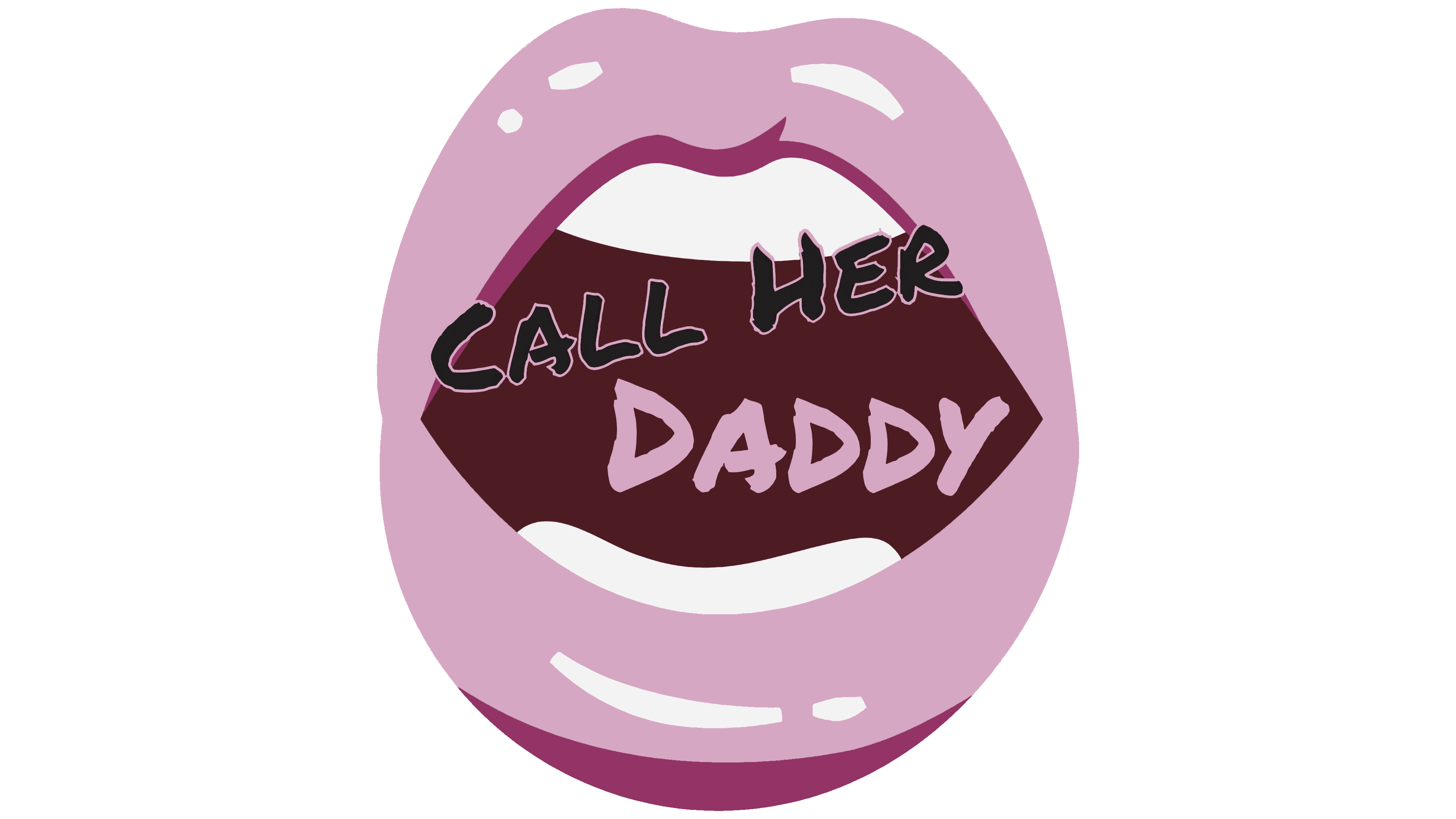
The Call Her Daddy logo extravagantly hints at the podcast’s theme and what it represents. Soft letters, smooth lines, and pink-colored everything exude sensuality. However, the emblem also has a businesslike touch, as the channel covers many other topics, including cultural life and relationship psychology.
Call Her Daddy began in New York in 2018, when roommates Alex Cooper and Sofia Franklyn started recording frank conversations about sex, relationships, and life as young women in the city. The first episode, “Sext Me So I Know It’s Real,” was released on October 3, 2018. The title came from a joke between the hosts when “Call Him Daddy” became “Call Her Daddy.”
The show grew from 12,000 downloads to 2 million in two months, attracting Barstool Sports founder Dave Portnoy. In 2018, Barstool signed Cooper and Franklyn to a three-year deal with a $75,000 base salary, bonuses, and company ownership of the podcast’s intellectual property. In spring 2020, negotiations over pay and rights led to a public split after the episode “Kesha… The End.”
Portnoy offered the hosts a new one-year arrangement with future rights to the brand, but Franklyn rejected it and left. Cooper stayed and continued the show alone from May 2020. Miley Cyrus appeared as a temporary guest in August, while Franklyn launched her own podcast, Sofia with an F.
After 2020, Call Her Daddy shifted toward celebrity interviews. In June 2021, Cooper signed a three-year, $60 million Spotify deal, then launched The Unwell Network in September 2023 with creators including Alix Earle and Madeline Argy. In August 2024, she signed a $125 million SiriusXM deal, expanding the podcast’s distribution. Guests later included Kamala Harris in October 2024 and Michelle Obama in January 2026, while the show competed with Sofia with an F and Anything Goes with Emma Chamberlain.
Meaning and History
The podcast was founded by two college friends: Alexandra Cooper and her roommate, Sofia Franklyn. Despite facing many obstacles, including financial ones, the resource remained active and retained its theme. It even expanded its scope, becoming a fascinating “series” with rich content. The program’s name came naturally and is based on the questions discussed within its framework. It became the key element of the text logo.
But one graphic detail in the emblem is now recognized as its core element. It is the symbolic kiss, the letter “O,” made with lipstick on the lips. It resembles a distinctive, bright, and extravagant imprint. Such a logo instantly sets the mood and creates a relaxed atmosphere for candid conversations.
What is Call Her Daddy?
Call Her Daddy is a podcast and modern online resource you can stream or download to your device for on-the-go listening. It covers relationship topics, sex, funny stories, and life advice. Sofia Franklyn and Alexandra Cooper launched the program in 2018.
2018 – today
Although the Call Her Daddy emblem is text-based, it still carries drawn elements.
- First, the neon-pink kiss. It represents the single letter “O” located in the bottom row. Its unusual shape makes the sign distinctive and a highlight.
- Second, the word “Daddy” is executed in lipstick. Broad strokes clearly convey the upper part, which usually protrudes above the lipstick tube. The glyphs are uneven, with jagged ends.
- Third, the word “podcast” looks as if it were written with a mascara brush. The thread-like strokes suggest bristle marks. The letters are asymmetrical and messy but stylish.
- Fourth, the phrase “Call Her” appears to be applied with eyeliner (pencil). The letters’ boldness creates this impression, as if the pencil were wax.
The logo elements are arranged in two rows, separated by a slanted line created with a thin lip tint. The top line also tilts leftward, while the bottom one is strictly horizontal.
Font and Colors
All inscriptions are made using a custom-designed font. Moreover, they have no relation to typography, as they are drawn elements. Each part has its own typeface: bubbly, handwritten, bold. The only thing that unites them is the uppercase. All glyphs are capital and blocky.
The logo’s color palette is provocative but moderately restrained. The main color is black, well complemented by neon pink. Together, they balance each other and work in harmony with the contrast principle. The background can be any color scheme, depending on where the emblem is placed.