The Polish brand Ed Red is an innovative traditional Polish cuisine that fits in a can.
In 2014, the restaurant business was exploded by a new culinary star – a seasoned gourmet passion in a metal tin can freshly be made by a chef from the restaurant. The innovation of the Ed Red company was in a special recipe that allows you to preserve the beneficial substances and flavor characteristics of dishes that usually take a very long time to cook. In this case, the dishes have the opportunity to be stored on the shelves for another 24 months. It is sustainable, practical, and tasty.
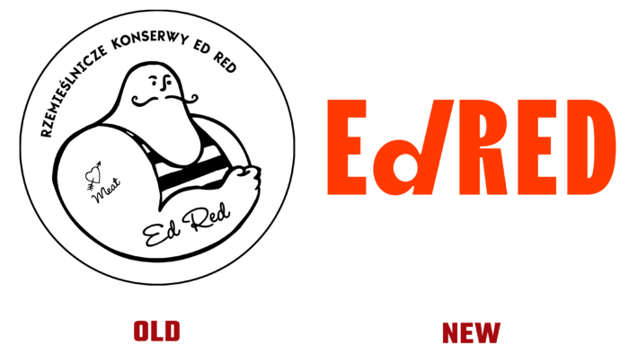
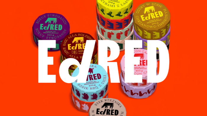
The renewal of the logo was a reflection of the perception of the new time by the creators of the brand. Edgar Beck’s Polish agency helped reinterpret the brand’s philosophy and recreate a creative image using just a font and a bright orange-red color.
Up to this point, the logo did not match what the company represents. A strong man with a long mustache, outlined in a thin black line, looks more like a sailor in a vest than a restaurant food lover. We must pay tribute; the creators of the old logo emphasized their attitude to food – there were inscriptions that this is canned food from Ed Red, which contains 100% natural ingredients. The tattoo on the shoulder of the Ed Red character read “meat,” and the name of the character itself flaunted on the forearm. But the name was in no way played with either color or association with food.
A different matter with the new logo: the letters are sharp, the small slanted d, in contrast to the capitalized others, as if depicts a part of the opening key (opener) for canned food. The Traulha font, developed by Bureau Brut, gives dynamism and aesthetics to the company’s new image. An unusual approach to the selection of letters and a hint of objectivity in the logo. This is a worthy replacement for the old, which gives no reason to doubt the modernity and compliance with the brand’s mission.


