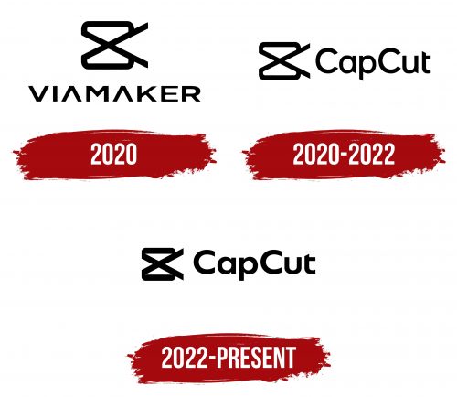
The CapCut logo resembles intertwined video tape ribbons over which the author works. The emblem promises orderliness and harmony in the final clip thanks to the convenient editing tools.
CapCut: Brand overview
Developed by the technology giant Bytedance, the same company behind the viral sensation TikTok, CapCut entered the digital scene in April 2020. It was introduced as a video editing application tailored for those with little to no editing experience, marking a departure from the complex interfaces of traditional video editing tools.
CapCut quickly set itself apart with its intuitive design, offering features like automatic effects, a variety of emojis, and straightforward cutting and merging of video clips. This approachability made it an instant hit among content creators, particularly those focused on producing material for platforms like TikTok and Instagram, where engaging, polished content is key.
By the dawn of 2023, the app’s popularity had skyrocketed, boasting a staggering user base of over 200 million monthly active participants. Its rise was propelled by the global surge in short-form video content, with CapCut’s simple yet powerful editing capabilities making it a go-to choice for users aiming to create viral content.
By March 2023, CapCut achieved a milestone by outpacing TikTok in the number of first-time downloads, cementing its status as the preferred video editing app for a new generation of digital creators. Its success is attributed to its user-friendly interface and its alignment with the fast-paced, trend-driven world of social media entertainment.
In just three years, CapCut has transformed from a newcomer to a leading player in video editing applications, significantly influencing how content is created and consumed across the globe.
Meaning and History
The decision to create a convenient and completely free video editor was not accidental, as the program is an additional service for users of the main platform, TikTok. With it, creators of short videos can quickly shoot, edit, and post materials. The emblem for the program appeared together with the application. The visual symbol proved to be very successful and remains constant despite two rebrandings.
What is CapCut?
A simple and convenient free video editor for phones. It was developed by the Chinese company Bytedance, which owns TikTok. It allows you to shoot, trim, and edit videos, add subtitles and music, and apply filters and stickers.
2020
Initially, the service was called Viamaker. The name indicated the auxiliary role of the program. The absence of crossbars in the letter A hinted at unfinished work, a draft. It emphasized reception and simplicity. Shoot, process, and post a story quickly through one program.
Stylish scissors were placed on the logo. The choice of the item is related to the theme of creativity. Working in the editor is a real artistic process. Conceive a plot, shoot a video, edit, and add stickers and filters. Processing turns an ordinary clip into an author’s masterpiece.
The editor is most often used for removing unnecessary moments. Therefore, scissors are the leading tool of the program.
The crossing of the rings resembled:
- Videotape rings.
- An inverted camera.
- Hourglass.
Each element is related to the theme of the video and adds multifacetedness to the understanding of the logo.
2020 – 2022
The name of the program was quickly changed to a more abrupt and shorter one. The inscription was placed after the image of the scissors. The compound name of two words with three letters each is like a sample of a finished edited video after trimming.
The new name also speaks of perfection—the final touches. The program offers a variety of attractive templates. Videos, after processing, turn out to be brief but meaningful.
2022 – today
In 2022, the logo was slightly adjusted, making the letters lower but bolder. Now, the emblem is more legible and takes up less space on the screen.
Font and Colors
The logo’s black color resonates with the film’s dark color. It speaks of working with a draft using special tools. The font of the name is unique due to the shortened crossbar of the t. The resilient inscription with smooth curves emphasizes the simplicity of working in the program.


