


![]() Capital One Logo PNG
Capital One Logo PNG
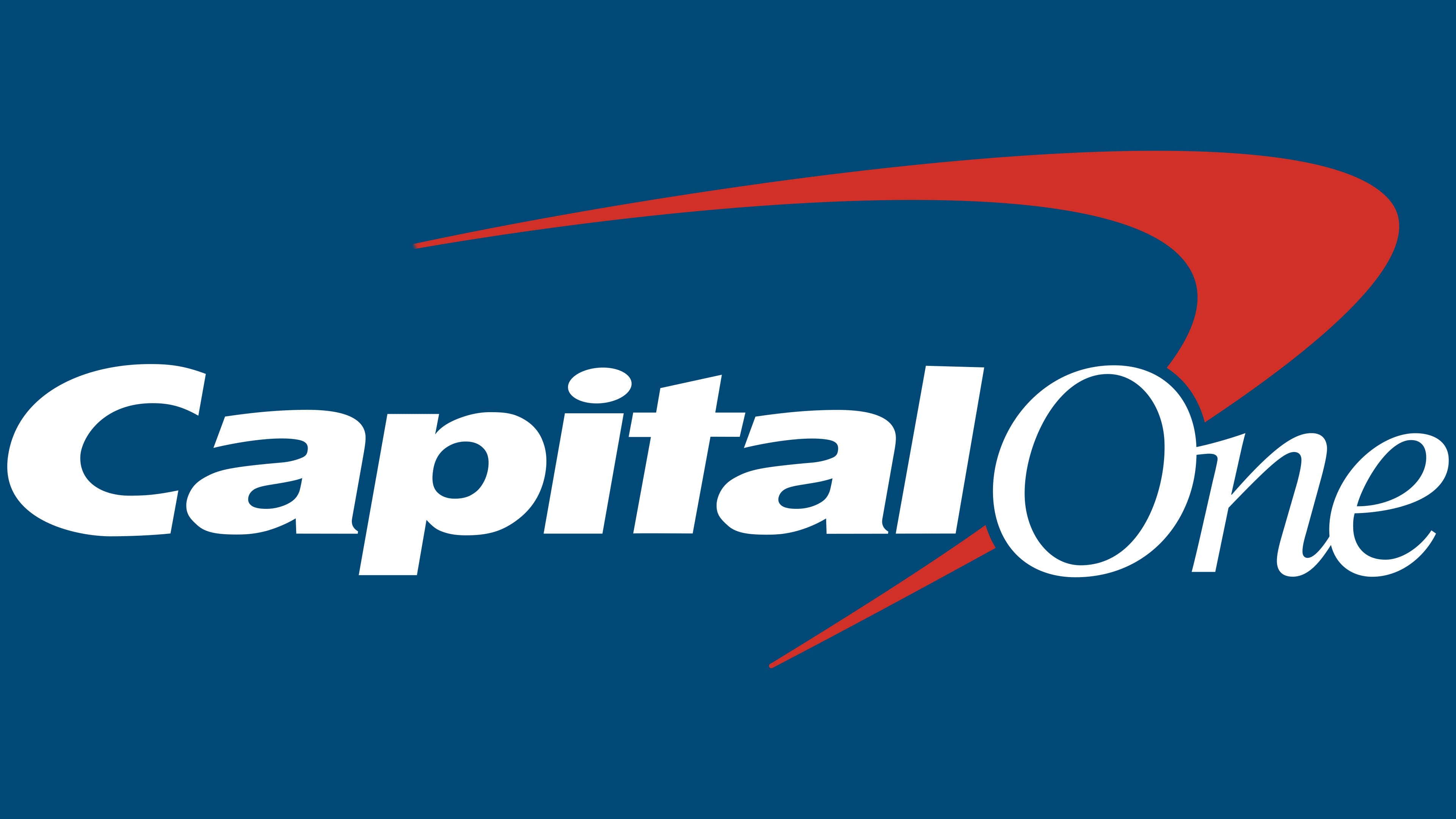
The Capital One logo combines the pursuit of a dream with a practical business approach. The organization will help each client increase capital to realize plans and desires. The emblem exemplifies customer focus and care for everyone.
Capital One grew out of an idea Richard Fairbank and Nigel Morris developed in the mid-1980s while working at Strategic Planning Associates in Washington. They noticed that U.S. credit card issuers gave very different customers the same rates, limits, and terms. They proposed using consumer data to price cards based on real credit risk. More than 20 major banks rejected the idea. Signet Bank in Richmond, Virginia, finally agreed, but only if Fairbank and Morris joined the company.
In 1988, they built a credit card division inside Signet, using mass mailings, A/B testing, and risk models based on customer data. In 1991, the team launched a large mail campaign offering lower rates to customers who moved balances from other banks. The balance-transfer model later became the industry standard. On July 21, 1994, Signet announced the spin-off of the card business, first called OakStone Financial. After the October 1994 IPO, it became Capital One, with shares priced at $16.
The spin-off was completed in February 1995. Fairbank became CEO, while Morris served as chief operating officer. Capital One expanded quickly in U.S. credit cards, entered Britain in 1997, and moved into auto lending in 1998 by buying Summit Acceptance Corp. By the late 1990s, it had become a major card issuer, competing with Citibank and Chase, especially in nonstandard and subprime lending.
After the 2008-2009 crisis, Capital One tightened credit standards and pushed deeper into banking. It had already bought Hibernia National Bank in 2005 and North Fork Bank in 2006. In 2012, Capital One acquired ING Direct USA for $9 billion and later renamed it Capital One 360.
Meaning and History
![]()
The bank changed its logo twice, but these updates were minor. He added a checkmark above the title the first time, and removed the gradient the second time. The designers have kept the original identity, so the company does not lose recognition.
What is Capital One?
It is a short name for Capital One Financial Corporation, an American holding company that is one of the 100 largest banks in the United States. It has commercial and consumer banking divisions as well as credit card services. The company entered the financial market in 1994. Its network of branches covers the United States, the United Kingdom, and Canada.
1994 – 2008
![]()
The old logo featured the blue-and-gray lettering “Capital One.” There was no space between the two words; different colors and fonts were used to distinguish them. As for their location, the blue “Capital” was just above the gray “One.”
2008 – 2016
![]()
In 2008, the finance group took a radical step in identity: it made the second word blue and added a rounded checkmark to the logo, to the left of the letter “O.” The new element was a red-and-white gradient in the middle. In the Brand New ranking, this logo was listed as one of the least successful in 2008.
2016 – today
![]()
Despite the criticism, the bank did not change anything. He removed the white gradient, making the checkmark completely red, and kept everything else.
Font and Colors
Rumor is that Capital One is designing a little-known Credit One Bank with a bad reputation. Their logos are very similar: both feature an inscription with a checkmark above the word “One” and point to the left. Only Credit One Bank adopted the logo in 2006, while Capital One presented its version a little later, in 2008. This played into an unpopular competitor’s hands: they began to confuse him with a leading American lender due to a successful coincidence.
The financial institution’s name is written in two fonts. For “Capital,” the Frutiger Black Italic sans serif is modified. The second part of the lettering is in the traditional Minion Italic typeface, which Robert Slimbach was inspired by Renaissance typography. The letters in both words slope slightly to the right.
The emblem features the bank’s official colors: red (#a12830) and blue House Style (#003a6f). They complement each other and the white background.
FAQ
What is the Capital One slogan?
Capital One’s slogan, “What’s in your wallet?” is widely recognized. This highlights the importance of having the right credit card or banking services.
This slogan, first used in the early 2000s, appears in many marketing campaigns. It highlights the benefits of credit cards and other financial products. This phrase encourages people to consider the value of a card by emphasizing rewards, security, and customer service. The slogan is used in commercials and advertisements, reinforcing the brand’s role in the financial services industry.
What is Capital One’s trade name?
The Fortune 500 company is a major supplier of MasterCard and Visa credit cards through its subsidiaries. The brand is known for its wide range of financial services and products.
The company trades on the New York Stock Exchange under the “COF.” It is a member of the S&P 500 index, indicating its significant presence in the financial industry. This inclusion demonstrates the brand’s stability and market importance.
What does the Capital One logo mean?
The logo features a bright red swoosh behind the lettering, pointing upward. This swoosh shows movement and confidence, and the upward direction suggests progress. The color red symbolizes energy, passion, and reliability.
This design reflects the brand’s commitment to being dynamic and trustworthy. The logo conveys the company’s commitment to providing reliable financial solutions to its customers.
What is Capital One’s symbol?
The symbol is an arc-shaped checkmark, similar to a flying boomerang. This red checkmark is located behind the blue brand name inscription. The design attracts attention and is easy to remember.
The shape of a boomerang can convey various meanings. It can convey reliability, like a checkmark, suggesting customers can trust the brand to deliver dependable service. The shape indicates the company’s dynamic nature, showing movement and progress.
The bright red element stands out. The bold color and unique shape make the logo noticeable, helping to attract new customers and maintain a strong presence in the financial market. The red and blue colors in the logo create a strong contrast. Red symbolizes energy, passion, and reliability, while blue symbolizes trust, stability, and professionalism.
What font is the Capital One logo?
The logo uses two different fonts, making it unique. For the word “Capital,” the designers chose a modified Frutiger Black Italic with bold, slanted letters. This gives the logo a strong and dynamic appearance.
The second half of the name, “One,” uses Minion Italic. This font combines all characters to create a smooth, elegant look. Robert Slimbach of Adobe, Inc. developed Minion Italic. Combining these two fonts gives the brand a distinctive and professional look.