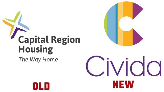
The organization builds a brand around a new name, backed by a brightly designed logo.
The history of the non-profit organization began in 1970, and over the more than 50 years of its existence, the company has gone through many different changes. Civida helps people get housing in and around Edmonton. The company’s goal is to provide safe and affordable housing for families.
The new identity has emerged under the influence of change. Civida does not focus only on the metropolitan area, which makes the previous name irrelevant. The company logo is made in bright and contrasting colors. The image’s shape is the letter “C,” divided into several colored sectors from green, purple, shades of blue, and yellow. The color palette is represented by the corporate shades that were used in the previous logo.
The name Civida consists of two words of Latin and Spanish origin. The first part comes from the Latin word “Civitas,” meaning “community.” The second part refers to the Spanish vocabulary and displays the word “Vida” – “life.” The right combination of roots demonstrates the company’s goals. Additionally, Civida introduced the slogan “Life Starts With A Home.”
Part of the rebranding was creating a website and the development of social networks with a renewed visual identity. The rebranding does not mean that the organization changes its purpose or mission, Civida officials said. The focus remains on providing the best safe housing for clients.
CEO Greg Dewling said that Civida’s employees had worked hard to create a visual identity, and he is very proud of them. The leader added that now is the right time to make a statement and show a desire to move forward.


