


Animalistic motifs in automobile brand logos are a kind of classic. Therefore, they are often used and help convey the meanings the company sets out. In the past, logos were perceived simply as part of a company’s recognizable visual image. Today, it is a powerful means of communication with the client and an important element of reputation management.
The image of a griffin in a logo can be explained for several reasons:
- First, in the historical and cultural context, each animal is associated with a certain character and “set of meanings.” The lion, as the king of beasts, signals the company’s readiness to defend its market leadership position. The eagle is associated with flight, which resonates with those who love quality cars. If we turn to mythology, the griffin is a mythical creature with the head of an eagle and the body of a lion. When the image of the griffin is used in a corporate style, it is meant to emphasize strength and high status, as the eagle is called the king of birds and the lion the king of beasts.
- Secondly, most animals, in people’s minds, are associated with speed, agility, endurance, fearlessness, and survival. Such symbolism is quite appropriate for an automobile brand because a good car should also be enduring and maneuverable.
Let’s consider popular automobile brands that used the image of a griffin in their logos.
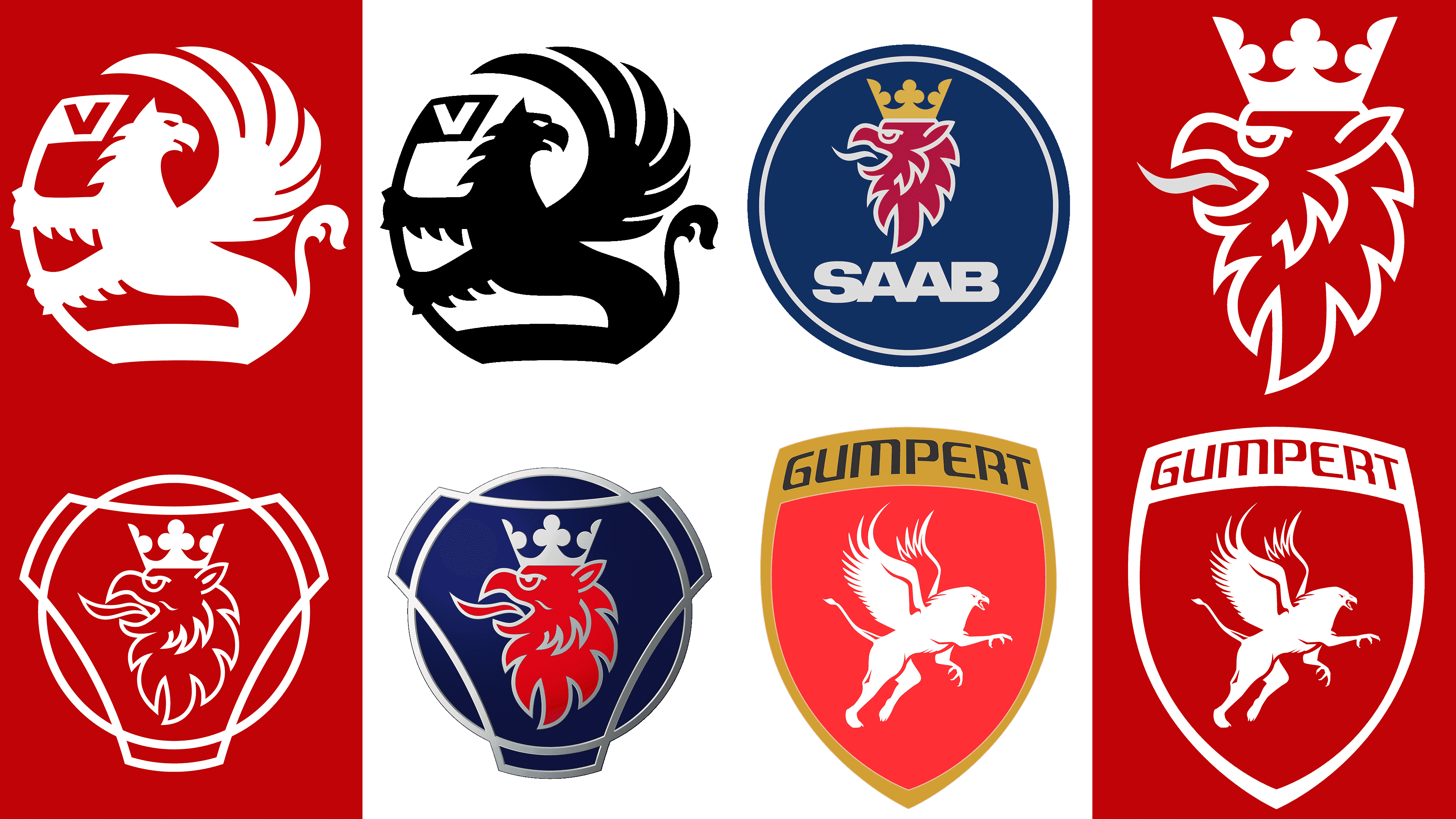
Vauxhall
![]()
This British company, headquartered in Bedfordshire, was founded by Alexander Wilson in 1857. The company specializes in the production of passenger cars and small commercial vehicles. However, there was a period in the company’s history when it also produced buses and trucks.
For more than two decades, the company held the position of the UK’s second-largest car manufacturer.
The brand’s logo has changed over time. For example, when the next version of the logo redesign appeared in 2008, the company’s managing director, Bill Parfit, said that the new logo conveyed respect for more than 100 years of the brand’s history and carried a renewed philosophy.
The brand’s circular emblem features a griffin. It is based on the coat of arms of Faulk de Brault. In the XVIII century, this soldier-mercenary, for outstanding services to the monarch, received the estate of Luton. The house the soldier built became known as Vauxhall. Borrowing the plot of this emblem, Vauxhall sought to emphasize its connection to the surrounding area.
Inside the circular emblem, we see a griffin holding a flag bearing the company name in capital letters. It looks powerful and confident.
Saab
![]()
This Swedish company, headquartered in Trollhättan, was founded in 1937. Unfortunately, the company ceased to exist in 2012. During its active period, the company produced famous cars characterized by high quality, reliability, and endurance. And the Saab emblem itself became one of the most recognizable in the world of cars. The emblem is taken from Count von Schein’s official coat of arms.
The round blue emblem shows a red griffin with white outlines. His image is arranged in profile. On the head of the griffin is a crown. Returning to the symbolism of this animal, as mentioned above, the crown confers regal status and reflects the company’s great ambitions. A golden hue was chosen for the crown. The combination of blue, red, white, and gold colors in the emblem looks very elegant and creates the right contrast. The company’s emblem turned out to be stylish, original, and recognizable.
Scania
![]()
The company was founded in 1891 and still exists today. Its main specialization is the production of trucks and buses. The company also produces engines for general industrial and marine applications. The logo features the same griffin as in the previous case, which is not surprising, as both companies represent the Swedish automotive industry.
The only difference between the two logos is some nuances in outlines. In general, their concept is identical. Its author is Carl Fredrik Reiterswerd. This is a famous Swedish painter and sculptor.
Gumpert
![]()
The history of this car brand began relatively recently, in 2004. Its founder is Roland Gumpert, a former Audi director. The headquarters of the German company is located in Altenburg. The brand is known for its high-speed Apollo cars and has broken several records, which no other car in this segment has achieved so far.
Considering the characteristics of such cars, it is quite understandable why the powerful symbolism of the mythical griffin was reflected in the brand’s emblem. Today, the company is working to expand exports, and its cars are sold in Europe, the United States, and the Middle East.
The griffin on the emblem seems to be repulsed and preparing to either take off or scatter. This competitiveness is understandable given Apollo’s record-breaking cars. At the same time, it may suggest that the car is ready to meet its owner’s demands and not let him down on the road.
ISO
![]()
The company, founded by Renzo Rivolta, existed from 1953 to 1974. It specializes in producing cars and motorcycles. The Isetta is a legendary car that made the brand particularly successful and recognizable in its time. But despite the ups and downs, the company could not remain in the market for long.
The golden griffin is depicted on the logos of that time. Today, it looks unconventional and vintage. In general, the logo looks like a coat of arms. This suggests that the company’s management probably wanted to develop it on a large scale. Unfortunately, this did not happen, and the company failed to become a carrier of advanced technologies and traditions relevant today. Nevertheless, it left a bright mark in its field. And a no less interesting logo.