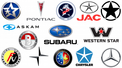
Stars have long attracted the attention and imagination of man. When viewed in the night sky, they represent distant wonders, alluring and mesmerizing. No wonder these glittering celestial bodies are often seen in the world of branding, especially in the automotive sector.
Car logos adorned with stars are certainly common. But why this particular shape? What makes the star so appealing to automotive brands? To understand this, it is necessary to delve into the multifaceted symbolism associated with this celestial figure.
Stars, in their vastness and radiance, carry many meanings. For some automakers, a star can be a symbol of the vast expanse of the universe and its infinite possibilities. A star can mean a relentless pursuit of perfection, akin to striving into the vast, unexplored cosmos. For others, the star may be an emblem of unrivaled quality, brilliance, and excellence, reminding of its radiant glow in the night sky. This cosmic emblem indicates power, ambition, and the drive to discover uncharted territories.
Automotive brands that incorporate stars into their logos are guided by these deeply rooted perceptions. Whether it is an indication of a desire to push boundaries, a testament to unrivaled quality, or a symbol of ambitious endeavors, the star plays a key role.
One can find many brands that have utilized the star in their emblems in both modern times and bygone eras. These brands have perfectly realized the powerful symbolic significance of the star for their uniqueness, which has increased their recognition and appeal in the market.
TOP Car Emblems with Stars
Stars, as emblematic symbols, universally convey positive sentiments. Glowing and enchanting stars have long been associated with perfection, aspiration, and brilliance. It is this universal positive association that makes them an attractive choice for branding, especially in the automotive industry. It gives companies an iconography that is less likely to be interpreted in an unfavorable way.
Stars are integrated into a myriad of company logos. The interpretation and representation of this celestial body depend on regional cultures and brand ideology. In some cases, it may be the classic five-pointed star, while in others, it may be more abstract or stylized variants. The variants can be as varied as the cultures and histories they represent.
In a number of logos, the star image can be either pronounced or subtle. In some logos, the star has a pronounced shape that immediately attracts attention, while in others, it is more subdued, allowing for different interpretations.
Whether the star is the main theme of the brand or a more subtle element, its presence, regardless of the complexity of the design, underscores the brand’s desire to be associated with the universally recognized qualities of excellence, leadership, and ambition that stars represent.
Mercedes Benz
The iconic Mercedes Benz emblem, characterized by the motif of three stars, is a distinctive symbol in luxury automobiles. The brand, which was born in 1926, has been the epitome of luxury and grandeur in the automotive field ever since.
The three-pointed star is often associated with the versatility of the brand’s innovative engines; according to the idea of Gottlieb Daimler, their application covered three main areas: the sky, roads, and waters, represented respectively by aviation, automobiles, and marine vessels.
The history of the creation of the emblem shows the merger of two different symbols. Initially, the star was surrounded by a laurel wreath, which evolved into the more modern and streamlined circle as we see it today. However, combining the wreath and the three-pointed star into a single emblem symbolized not only an aesthetic evolution but also marked a turning point in the development of the brand.
Interpretations of the Mercedes Benz logo are numerous, but for all their diversity, the brand’s point of view remains unchanged. In official communications and advertising materials, the central motif consisting of triadic dots is still revered as a “star.”
Jeep
Many car enthusiasts and history buffs have noticed a distinct star-shaped emblem on Jeep vehicles. Jeep, known as a manufacturer of rugged and durable SUVs, introduced the Jeep star emblem during the turbulent time of World War II.
In the period leading up to the war, the United States played an important role in the global automobile industry. Numerous automobiles were shipped overseas from the shores of the country. Upon completion of the manufacturing process, these vehicles were stamped with a distinctive star in the form of the Jeep logo, as well as a unique identification number symbolizing their origin.
Visible on Jeep tactical vehicles, the five-pointed star served a dual purpose. It was not only a design element but also played a critical role in distinguishing American vehicles from those of opposing sides. This star symbol was common not only to the Jeep but also to other American “tactical” vehicles. The size of the star was often very large, making it more prominent and eye-catching than conventional automobile emblems.
Nowadays, seeing this iconic emblem on a Jeep vehicle has become a rarity. The emblem, usually a five-pointed star encased in a circle, is a nostalgic reminder of Jeep’s pivotal role and significant contributions to a defining period of world history.
Subaru
Subaru, one of the most famous brands in the automobile industry, is unmistakably associated with its emblem that features stars. This famous Japanese automobile brand has carved a niche for itself through the predominant use of boxy engines in cars with displacement of more than 1500cc.
In 1972, the company marked a turning point by introducing all-wheel drive, which set new standards and by 1996 had become commonplace in compact and midsize cars. If you trace Subaru’s history back to 1953, you can see its journey to becoming the 21st largest automaker on the world stage. Subaru’s diverse lineup of vehicles adapts to changing needs and caters to a wide range of preferences in today’s automotive market.
The constellation of stars adorning the Subaru logo is not just a design choice but a meaningful representation. These stars are more than just decorative elements arranged in a blue oval with chrome trim. Since “Subaru” is the Japanese term for the constellation of Taurus, including the six four-pointed stars, there is a cultural and celestial connection. The more pronounced star to the left of the emblem stands for the parent company, Fuji Heavy Industries. Conversely, the grouping of the remaining five stars symbolizes the brand’s various subsidiaries.
Pontiac
Pontiac has become one of the most famous automobile manufacturers in the United States. Produced under the auspices of General Motors, Pontiac has historically been the choice of those seeking Oakland’s premium class of automobiles, bridging the gap between luxury and functionality.
Although it has been several years since the last Pontiac vehicle rolled off the assembly line (production ceased in 2010), the legacy of this iconic brand remains unchanged. The Pontiac name is protected as a trademark of General Motors, a testament to its lasting impact on the automotive industry.
The Pontiac logo provides a glimpse into its rich history. Early versions featured the profile of a Native American on a circular background, signifying the brand’s origins and the indigenous heritage it symbolizes. Over the decades, the emblem has undergone many transformations, each reflecting changing design trends and market preferences.
The Pontiac emblem epitomizes sophistication and dynamism. Dominated by an arrowhead design in bright shades of silver and red, the emblem is accented by a central four-pointed star. While this symbol may not be as common on the roads today, it holds a special place in the pantheon of automotive logos, especially those adorned with stars.
Polestar
The evolution of the automobile industry has led to the emergence of many global players, one of which is Swedish automaker Polestar. Founded in 1996, the brand was conceived by Polestar Racing, an important ally of Volvo Cars. By 2015, Volvo realized the company’s potential and absorbed Polestar, bringing it under its umbrella. Polestar now holds a prominent place among the elite brands that make up the Geely conglomerate of automakers.
Polestar’s reputation is primarily due to its skill in creating electric cars. At the same time, the company does not limit itself to creating stand-alone vehicles but offers equipment modifications and engine improvements for existing Volvo models. This diversity emphasizes the company’s commitment to progressive automotive solutions.
The centerpiece of the company’s corporate identity is the emblematic Polestar logo. A visual interpretation of the brand name, the logo is a combination of two arrows converging to form a four-pointed celestial emblem. This choice of design has caused different perceptions among car enthusiasts. Some imagine it in the form of two boomerangs; others believe that it is a star. The similarities between the Polestar emblem and the Citroen emblem can be traced back to the constantly evolving nature of automotive design and its nuances.
Chrysler
The Chrysler “Pentastar” logo has become an integral symbol that reflects the automaker’s identity and history. Introduced during the transformative era of the 1960s, the design resonated with Chrysler’s mission and has become synonymous with the brand’s commitment to excellence.
With a history dating back to 1925, Chrysler has always shown a desire for cutting-edge design and pioneering innovation. The five-pointed emblem design had a deeper symbolism. Enthusiasts and experts speculated that each “Pentastar” dot could stand for the major brands that make up Chrysler. These include Dodge, Plymouth, Chrysler’s flagship brand, Airtemp, and the luxury Imperial.
However, choosing this iconic design was not an easy choice. In search of the perfect logo, Chrysler considered over seven hundred design proposals. Like all organizations that prioritize evolution and modernity, Chrysler felt the winds of change. With the paradigm shift in design, the automaker needed to abandon the cherished Pentastar. This decision didn’t mean abandoning the historical past but rather aiming to align with a more modern design philosophy. The new emblem was to be a harmonious blend of Chrysler’s glorious history and its vision for the future.
JAC
Founded in 1964, JAC, or “Jianghuai Automobile Co.” has firmly established itself as a titan in the Chinese automotive sector. Over the decades, its presence has expanded significantly, and JAC Motors now holds the prestigious title of the leading commercial vehicle manufacturer in China. The brand’s reputation is so high that it has extended its influence to global markets: its products are sold in more than 100 countries.
JAC Motors operates under the auspices of the Chinese state. The company, not inclined to “dovishness,” boasts a diverse range of cars offered. The JAC catalog is designed for the widest audience: from compact city cars, ideal for urban travel, to heavy commercial trucks, designed to perform complex industrial tasks. At the beginning of the 21st century, JAC introduced a model that attracted a lot of attention – the Refine. This model resonated with many and quickly gained popularity in the domestic market, strengthening the brand’s credibility.
Branding plays a vital role in shaping a company’s image, and the JAC logo is no exception. In the old days, the emblem had a characteristic five-pointed star, reminiscent of the design of the Chrysler emblem. Painted in a bright red color identical to the shade of the JAC font, this star was encased in elegant oval borders. However, as brands evolve, so do their symbols. JAC decided to revise its brand identity by removing the iconic star. Despite these changes, the star still remains in the minds of many as a testament to the brand’s storied past.
Venucia
Venucia emerged in 2010 as a separate brand under the Dongfeng Nissan Passenger Vehicle umbrella. This venture was a strategic move by Dongfeng Nissan to meet the growing automotive needs of the Chinese market. By 2020, the brand had become so important that it became an autonomous enterprise focused solely on vehicle production.
This autonomy proved to be short-lived. In December 2020, Dongfeng unexpectedly announced its intention to reintegrate Venucia into the overall Dongfeng Nissan brand structure. This decision emphasizes the complex and dynamic nature of corporate strategies in the automotive sector.
The genesis of Venucia was based on a strategic approach. The main objective was to introduce vehicles to the Chinese market that embodied Nissan’s design ethics and development understanding. The subsequent announcement in 2011 of the first vehicle bearing the Venucia nameplate, the D50 sedan, marked the brand’s official entry into the market.
The Venucia emblem, which is a compelling trio of five-pointed stars of varying sizes, is not just a design choice. The five points of the star have an allegorical meaning, echoing the brand’s five founding principles. Venucia has woven its philosophy and ambition into its brand image despite its relatively short period of independent operation.
Western Star
With a rich history since its founding in 1967, Western Star, as its name suggests, uses a star as the centerpiece of its logo. This brand operates under the vast umbrella of the Daimler conglomerate, marking its presence primarily in American markets.
Daimler, a well-known name in the North American automotive sector, has Western Star as one of its major truck manufacturing subsidiaries. But the history of Western Star’s ownership is one of transition. Its journey began with the founding of the White Motor Company. Over time, the brand underwent changes in its manufacturing strategy. One such significant change was the relocation of the manufacturing base to Utah. This move played a crucial role when White Truck’s assets were acquired by Volvo and Western Star was left out of the deal.
Subsequent ownership changes led to Western Star being acquired first by Nova Corporation and then by Bow Valley Resources. At the turn of the millennium, in 2000, came a decisive moment for the brand: Western Star became part of the Daimler lineup.
The Western Star emblem is very distinctive. It shows the brand name in bold sans-serif uppercase font, above which stands the imposing letter “W.” This letter serves as a background for the brand’s signature element – a bright red star edged with a silver outline. The choice of colors and design elements, especially the five-pointed star, is symbolic.
The Western Star logo is more than just a branding element; it reflects history and a desire for excellence in the automotive industry.
Englon
Geely, the Chinese automobile giant, made a strategic acquisition of Englon, the company that once replaced the Shanghai Maple brand. By acquiring the company, Geely intended to capitalize on Englon’s potential to create cars characterized by elegance and magnificence reminiscent of classic British cars.
In 2014, following Geely’s acquisition of the London Taxi Company, the Englon emblem was transformed into the face of this iconic cab service. This integration emphasized the brand’s growing influence and hinted at its wider aspirations in the global automotive sphere.
Englon unveiled several noteworthy vehicles, such as the Englon SC3, SC6, and SX7. Each of them signaled the brand’s commitment to design and performance. The Englon logo was particularly eye-catching. It is based on a breathtaking image divided into two parts: one side depicts a golden silhouette of a woman on a crimson background. At the same time, the other side features a scattering of sparkling stars on a dark blue background.
The emblem was framed by an exquisite silver and black border, contrasting with the bright inner image. The brand name “Englon,” executed in an elegant golden font reminiscent of handwritten calligraphy, was also proudly placed along the outer rim. All of these elements combine to create a logo that reflects Englon’s desire to combine old-world charm with modern aesthetics.
Berkeley
Originally from the UK, the Berkeley car brand had a short life of only four years before going bankrupt in 1960. Despite its short existence, the brand left a significant mark on the automotive industry. Known for its fuel-efficient microcars, Berkeley showed its engineering ingenuity in the motorcycle-based engines that powered these compact cars. These sporty mini cars hold a special place in the hearts of collectors as artifacts of automotive innovation from a bygone era.
The genesis of Berkeley’s automotive journey can be traced back to a strategic partnership. Lawrence Bond, a visionary designer with a penchant for compact cars, teamed up with Coachworks, which was headed by Charles Panter. This collaboration bore fruit when the Berkeley debut car was unveiled.
The Berkeley emblem is characterized by distinct design elements. The centerpiece of the emblem is a pronounced capital letter “B” in crisp white. This letter is artistically placed on a bifurcated circle, which harmoniously combines red and gray shades. Complementing the overall aesthetic of the emblem is the elegant inscription “Berkeley,” framed by five carefully crafted black five-pointed stars. These stars encompass the inner circle of the emblem, lending sophistication to the design.
Facel Vega
The history of the Facel Vega brand began in 1939 when it announced itself as a French manufacturer known primarily for its mastery of stamped steel parts for automobiles. Its emergence was timely, as it coincided with the urgent need for advanced mechanical solutions during the turbulent years of World War II. In the same year, Bronzavia, a well-known subcontractor of military operations in France, created a subsidiary, Facel.
In 1945, marking a new chapter in its history, Facel merged with Metallon. Together, they embarked on the ambitious path of producing exclusive bodies for short-production vehicles. This venture was not limited to a single brand. Instead, they created bodies for brands such as Simca, Panhard, Ford of France, and Delahaye. Facel hand-built some 2,900 cars, each one a mark of the brand’s commitment to precision and perfection.
The Facel Vega logo featured six symmetrical five-pointed black stars neatly arranged inside a complex gray border. The outer border also featured the brand identifier, “Facel Vega Paris.” The core of the logo is a bold circle divided into contrasting segments of black and yellow colors. In the center of the circle are the initials “F” and “V” – a brief but succinct designation of the Facel Vega name, emphasizing the elegance of the brand and its proud French heritage.
Askam
Askam’s history is intertwined with the legacy of prominent global automakers, reflecting its importance in the commercial vehicle segment from 1964 to 2015. Functioning under Çiftçiler Holdings, Askam was not just a manufacturer but a brand synonymous with reliability and versatility in commercial vehicles and trucks.
Its beginnings were marked by its cooperation with Chrysler, one of the leaders in the automotive industry. Chrysler’s majority stake of 60% in Askam laid the foundation for the company’s development. In the early stages of its existence, Askam was called “Chrysler Sanayi” and bore the Chrysler imprint not only in the name but also in design and functionality. One of the distinctive design features that this collaboration incorporated was the front cab, a signature Chrysler creation. This design, albeit with various modifications, became a constant visual element of Askam vehicles until the brand was discontinued.
Askam’s story took a turn when Chrysler sold its shares, transferring ownership to local shareholders. Askam’s emblem is a visual statement of its heritage and ethics. A four-pointed star in blue dominates and the logo is complemented by twin curved lines that form an elliptical silhouette. Often associated with reliability and confidence, the blue color reflects the brand’s commitment to consistent quality and performance.
The brand name “ASKAM,” typed in predominantly capital letters, emphasizes the brand identity. The bold sans-serif font emphasizes that the brand guarantees sustainability, stability, and unmatched durability in the commercial vehicle sector.
Durant Motors
Durant Motors, founded in 1921 by former General Motors CEO William Durant, sought to cover a broad spectrum of the automotive market. Positioned as a rival to leaders such as Chevrolet and Buick, Durant Motors produced a range of vehicles, including the Flint, Star, and Durant brands.
Subtle strategist Billy Durant expanded the company’s product line by acquiring Locomobile, a luxury car manufacturer. The Star Four automobile holds a special place among the many cars produced by Durant Motors. This model, which was produced from 1922 to 1928, is a symbol of Durant’s aspirations for leadership in the automotive industry, which is confirmed by the company’s emblem.
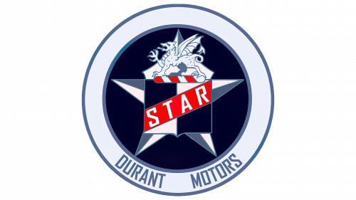
The emblem of Durant Motors was a harmonious combination of classic and bold elements. The central element of the emblem was a star, made in a calm light blue color and enclosed in a contrasting circle of deeper blue color. This central motif is framed around the perimeter by a lighter blue circle, creating a striking visual contrast. The branding was complemented by the brand name “Star,” highlighted in a bright red color, and the lettering “Durant Motors” was elegantly placed, keeping the emblem balanced. An exotic touch was added to the emblem with a dragon intertwining modernity with mythology. This emblem, rich in symbolism and aesthetics, was a testament to Durant Motors’ commitment to excellence in the competitive automotive market.
Car Emblems with Stars
Car emblems are more than just symbols; they convey history, values, and aspirations. Among them, star emblems have a special place in the automotive industry. Their ubiquitous presence on cars of various brands testifies to their universal appeal and significance.
The question may arise: why exactly is the star so often found in car logos? The answer lies in the inherent qualities of stars. They are often seen as symbols of aspiration, quality, and a guiding beacon. This makes stars a fitting symbol for automotive brands, alluding to navigation, ambition, and the pursuit of excellence.
Every brand has a star emblem, not only as a design element but also as an embodiment of the spirit and mission of the brand. Whether it’s a promise of unrivaled quality, groundbreaking innovation, or a desire to shine in their segments, these emblems resonate deeply with audiences.
The fascination with star motifs is not limited to the automotive sector. The star has found its way into technology, fashion, and the beauty industry. Her adaptability and the universal feelings she evokes make her popular with many global enterprises. They see it as an ideal of reaching new heights, innovation, and breakthroughs and a guiding star in their field.
