


With many automobile manufacturers spread across the globe, it is not uncommon to see car emblems adorned with wings. Such symbols often embody notions of freedom, speed, and dynamism. Some of these images are overt, while others include nuances associated with birds.
For an emblem to resonate effectively across industries, it must convey its message quickly and succinctly. To reduce potential ambiguity, firms often use visuals and motifs familiar to their target groups. In the automotive world, symbols such as the star motif, animal-inspired logos, and bird-inspired designs are common.
We will focus on some prominent wing-inspired car emblems in the automotive sector. Each of these illustrations distinctly uses the concept of wings.
Winged car emblems hold a significant place in the automotive sector, and their popularity stems from their many connotations. When observing these symbols, bird-like features such as wings and feathers often come to the forefront, reflecting the essence that car manufacturers seek to convey in their branding.
The inclusion of wings in a car emblem often symbolizes swiftness and precision. It brings to mind birds known for their speed and graceful aerial maneuvering.
Wings symbolize the incomparable freedom and autonomy of driving on the open road. This feeling reflects the freedom and excitement that many motorists associate with driving.
Chrysler
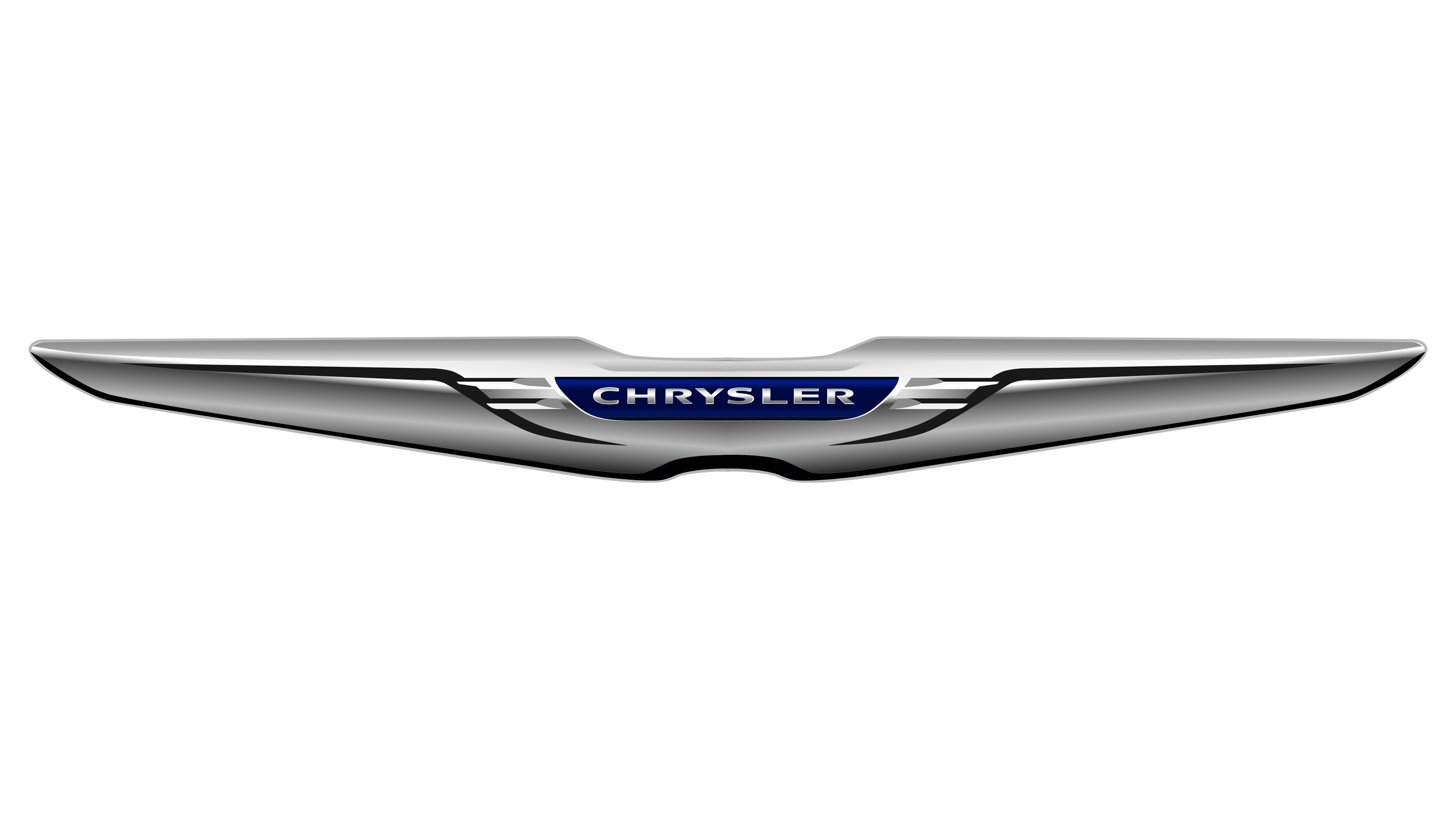
Chrysler stands out in the automotive industry for its distinctive emblem, with wings subtly woven into the design. While some may argue that the wings on the Chrysler emblem are less pronounced than those on other brands’ emblems, their presence cannot be denied. Positioned prominently, two elongated silver wings extend on either side of a central blue badge that proudly bears the Chrysler name.
The minimalist design of the wings, devoid of intricate details, gives the emblem a modern, streamlined look. From afar, the wings can even be mistaken for the car’s front bumper, emphasizing the brand’s automotive essence.
Mazda
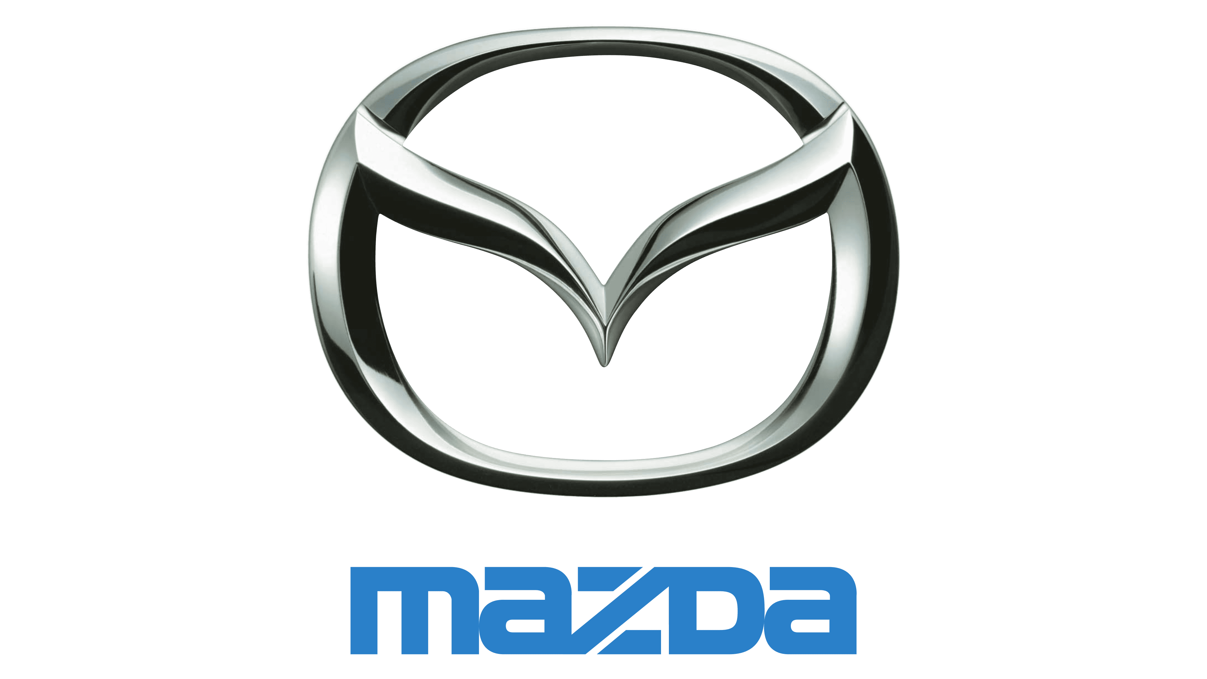
The famous Japanese automobile manufacturer, Mazda, has created an emblem that subtly conveys the essence of flight. The central element of the emblem is a V-shape enclosed in an oval, resembling the wings of a soaring bird. This image symbolizes freedom and ambition, attributes deeply rooted in the company’s ethos, and demonstrates Mazda’s commitment to innovation and forward motion.
The integration of the bird’s wings with the oval creates an interesting visual play. It subtly hints at the letter “M,” further cementing the brand’s identity in the emblem. This intricate design speaks to Mazda’s attention to detail and the brand’s ability to intertwine symbolism with aesthetics.
Bentley

Hailing from the heart of the UK, Bentley is the epitome of automotive excellence, renowned for its unrivaled quality and meticulous craftsmanship. Bentley’s emblematic winged logo is both a testament to the brand’s heritage and an embodiment of its lofty ambitions. The Bentley name is embedded in the fine feather detailing of the wings, reaffirming the brand’s significance and heritage.
At the heart of this design is a specially designed ‘B,’ seamlessly integrated between the wings. Over the years, this emblem has become synonymous with luxury, making Bentley cars easily recognizable and revered around the world.
Aston Martin

Originating in the UK in 1913, Aston Martin has established itself as a recognized luxury sports car brand. In 1927, the brand introduced its iconic emblem: two captivating wings framing the company name. Over the decades, this emblem has undergone various transformations. Despite all the changes, the wing motif has remained, cementing itself as an enduring symbol of Aston Martin’s heritage and commitment to excellence in automotive design.
Mini

Since its introduction in 1967, Mini has established itself as an outstanding automotive brand. Its journey in the automotive industry took a significant turn in 2000 when BMW acquired the brand, further strengthening its global reach and reputation.
The Mini emblem may seem like a simple amalgamation of a center circle with surrounding lines. But if you delve deeper into its design, you’ll discover the brand’s ingenious intent. According to the creators, these are not just lines but stylized wings that gracefully surround the central motif. These wings, painted in a shimmering silver hue, are not just decorative. They symbolize impetuosity and autonomy, two qualities inherent in Mini cars.
The emblem, executed with the utmost care, reflects Mini’s core values and design philosophy. The choice of silver for the wings adds elegance and symbolizes the brand’s modernity and dynamism.
SsangYong

SsangYong is one of the leading figures in the South Korean automotive industry. Its creation resulted from the merger of two companies, which, over time, combined their strengths and expertise. SsangYong’s diverse lineup, from tanks and buses to trucks and SUVs, showcases its versatility and technical prowess in producing a wide range of specialty vehicles.
The SsangYong emblem holds a prominent place in Korea. At a glance, the emblem’s design may resemble a wreath, and its curved wings embody a minimalist aesthetic. This balance between tradition and modern design makes the emblem recognizable and timeless. The emblem on the streets and highways is a constant reminder of SsangYong’s enduring heritage and its significant role in shaping the automotive industry in Korea and beyond.
Genesis

Originally from South Korea, Genesis has firmly established itself in the global automotive market as a luxury car manufacturer. Recognized for its commitment to precision, innovation, and luxury, this brand is part of the Hyundai Motor Group, a renowned automotive brand. The introduction of Genesis in 2015 marked Hyundai’s strategic move into the luxury car segment, setting it apart from the parent company’s core lineup.
The Genesis Sports emblem features wide wings that extend outward to symbolize the brand’s commitment to excellence, freedom, and progress. In the center, between these wings, the brand’s name confidently asserts its identity. The emblem is reminiscent of the Chrysler logo, reflecting the widespread use of this design to convey luxury, elegance, and expansiveness in the automotive industry.
UAZ
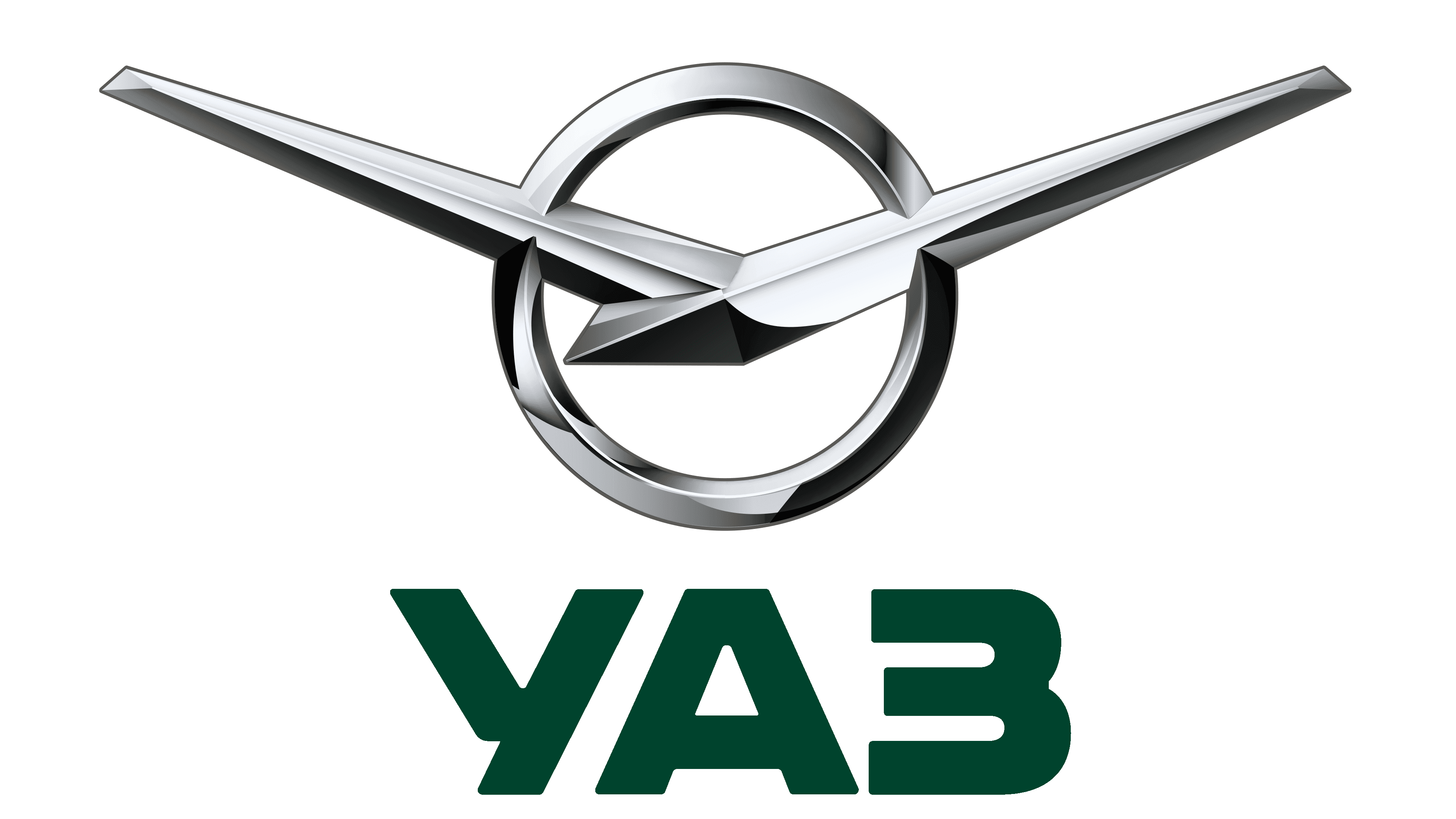
Hailing from Russia, UAZ is not the first name that comes to mind when considering automobile emblems adorned with fenders. Nevertheless, its historical contribution to automobile production is quite significant. Known primarily as a manufacturer of reliable military vehicles, UAZ works in various areas of automotive engineering, including aircraft and conventional cars.
The UAZ emblem is markedly different from the archetypal winged logos that many people associate with automobile brands. Avoiding traditional bird imagery, the UAZ emblem leans toward avant-garde design, evoking the silhouette of an airplane. This design choice emphasizes the brand’s entry into aviation and reflects its forward-thinking approach and commitment to modernity.
Vauxhall

The Vauxhall emblem, imbued with symbolism, is an elaborate griffin holding a flag with a pronounced ‘V.’ At first glance, the griffin’s wing gracefully soars upwards from the right side of the circular frame, subtly complementing the overall design.
Characterized by modern and polished lines, Vauxhall’s design seamlessly blends tradition and modernity. This skillful combination of elements keeps the brand memorable and helps it stand out in the vast automotive market. The emblem as a whole speaks to Vauxhall’s commitment to quality, innovation, and design excellence.
Lagonda
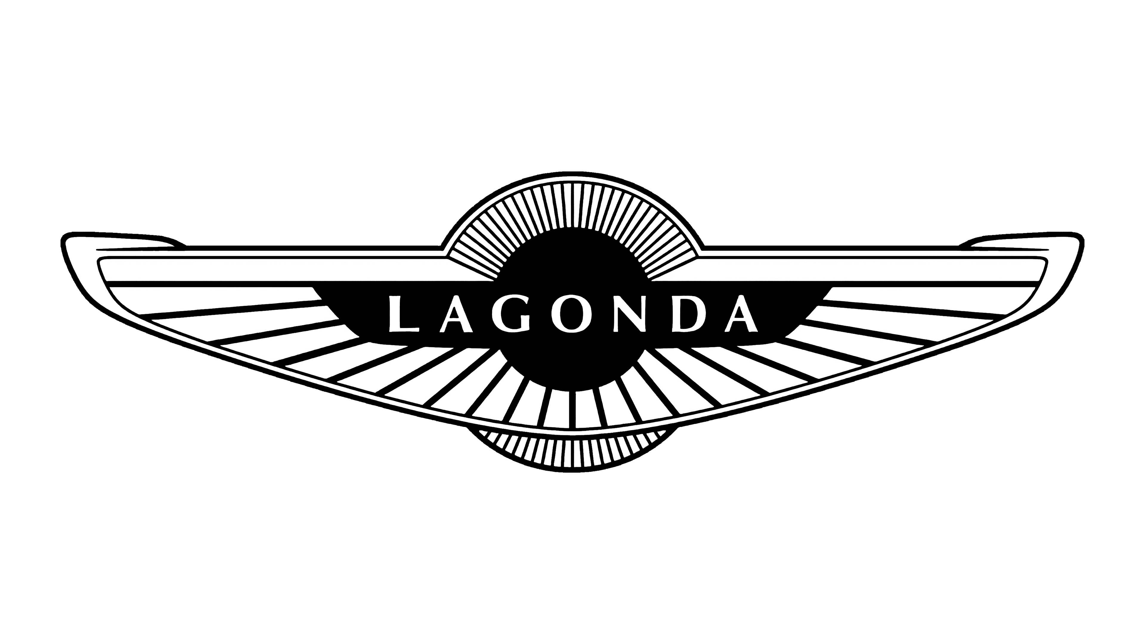
Hailing from England’s historic sites, Lagonda has established itself as a pioneer in the luxury car industry. Its historical background and heritage made it a game-changer when Aston Martin, another automotive industry stronghold, acquired it in 1947.
The emblem is dominated by widely spaced wings that create a sense of freedom, movement, and progress. Carefully designed wings serve as a backdrop for the brand’s pronounced name, ensuring immediate recognition. The emblem is reminiscent of the Aston Martin logo, likely indicating their intertwined history and shared ethos.
Hispano-Suiza
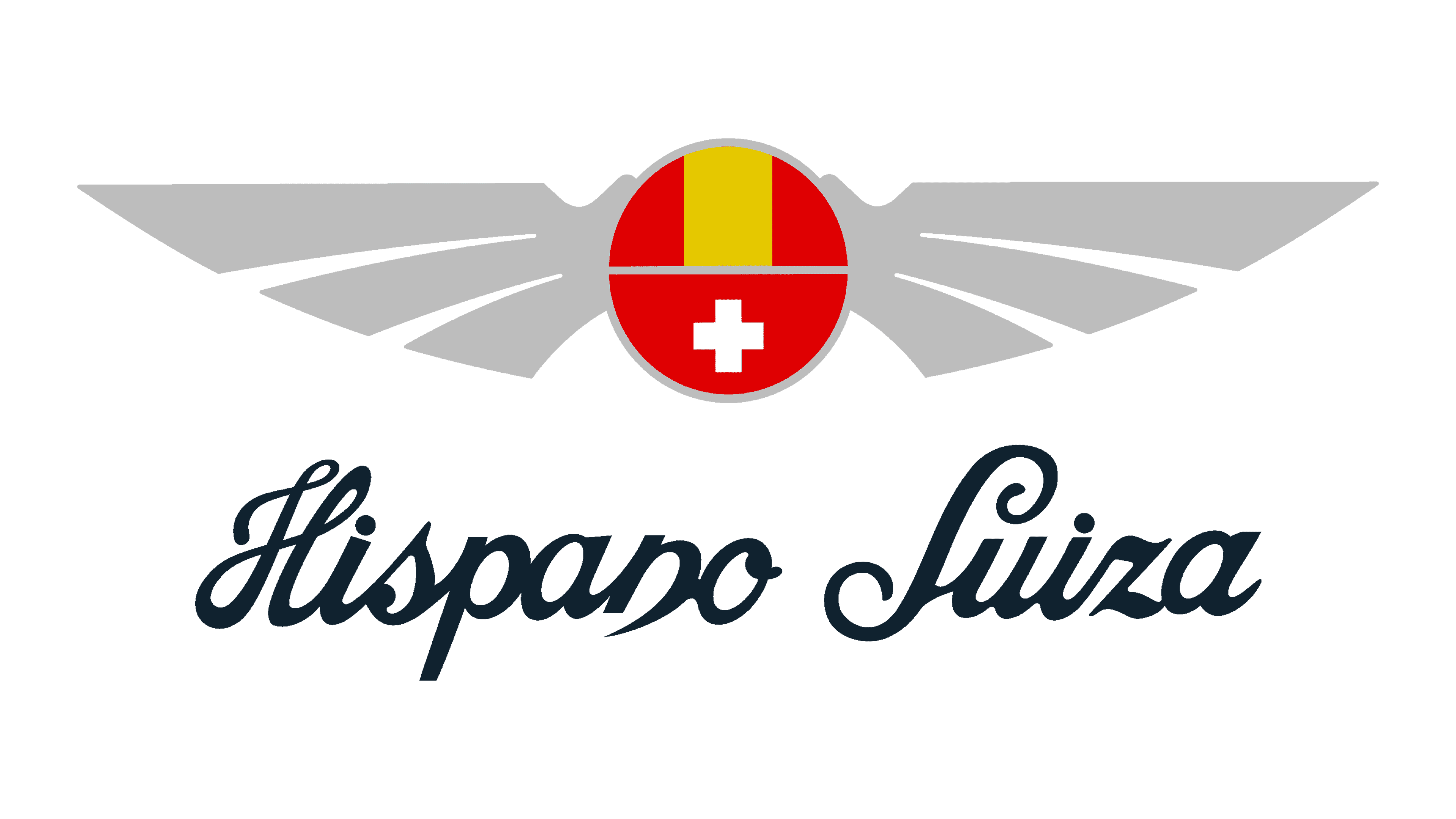
Founded in 1904, the company combines Spanish and Swiss automotive craftsmanship. This fusion is evident in a company that has stood the test of time and now operates under the auspices of Safran and the Peralada Group.
The Hispano-Suiza emblem epitomizes elegance and modern design. It features a circular heart with intertwined images of the Swiss and Spanish flags. This intertwining symbolizes the harmonious combination of Swiss precision and Spanish flair. Adjoining the center circle on either side are wings, each decorated with three different feathers. These wings evoke a sense of freedom and movement, symbolizing the brand’s involvement in the aviation industry.
Jensen Motors
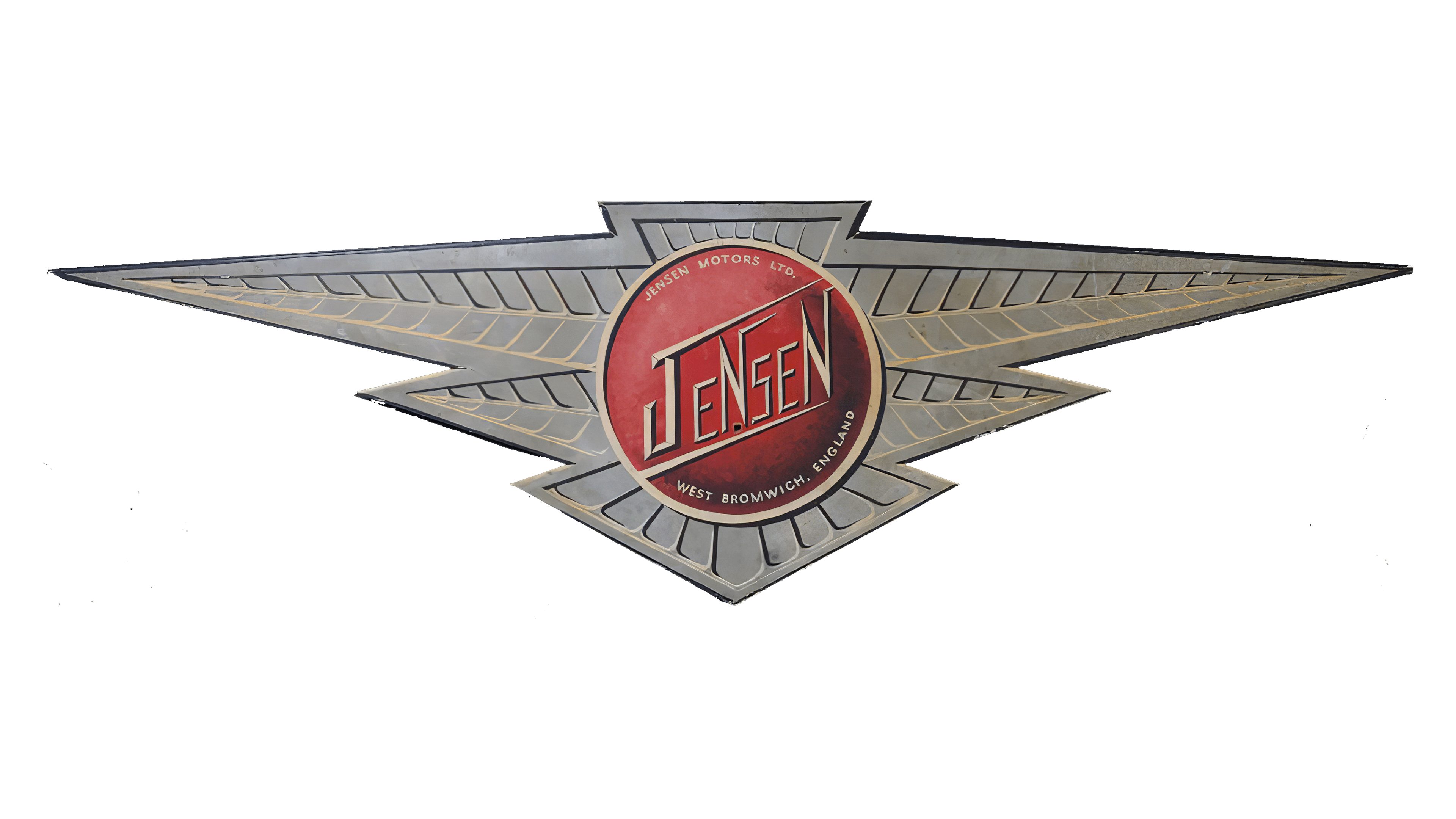
Emerging from Britain’s rich automotive history, Jensen Motors Limited has made its mark in the industry. Over nearly a century from its founding to its official closure in 2011, the brand left a significant mark on the sports and commercial vehicle sectors. Their expertise was not limited to manufacturing; they were also adept at creating specialized bodies. This skill enabled the company to work with global automotive giants such as Ford and Chrysler, thereby strengthening Jensen’s position in the industry.
The Jensen Motors logo was striking and embodied the brand’s essence. Dominated by sprawling wings, the logo design was far from traditional. The sharp, angular wings echoed the brand’s philosophy of soaring above the competition and breaking boundaries. The wings symbolize freedom, speed, and the brand’s commitment to always aiming for the sky in innovation and quality. The choice of such a bold logo for Jensen Motors truly reflected its ambitious endeavors in the automotive world.
FAW

FAW, often referred to as First Automobile Works, holds an important place among Chinese automobile giants. As one of the “Big Four” Chinese automakers, it is a testament to the industry’s automotive prowess and growth.
FAW’s manufacturing versatility is evident in its diverse range of automobiles. It not only meets personal transportation needs with passenger cars but also plays a key role in public transportation by producing passenger buses. The brand is also trusted in the logistics and transportation sector, as it manufactures light, medium, and heavy-duty trucks. Each vehicle category, serving different purposes, emphasizes the brand’s commitment to quality and innovation.
Haima
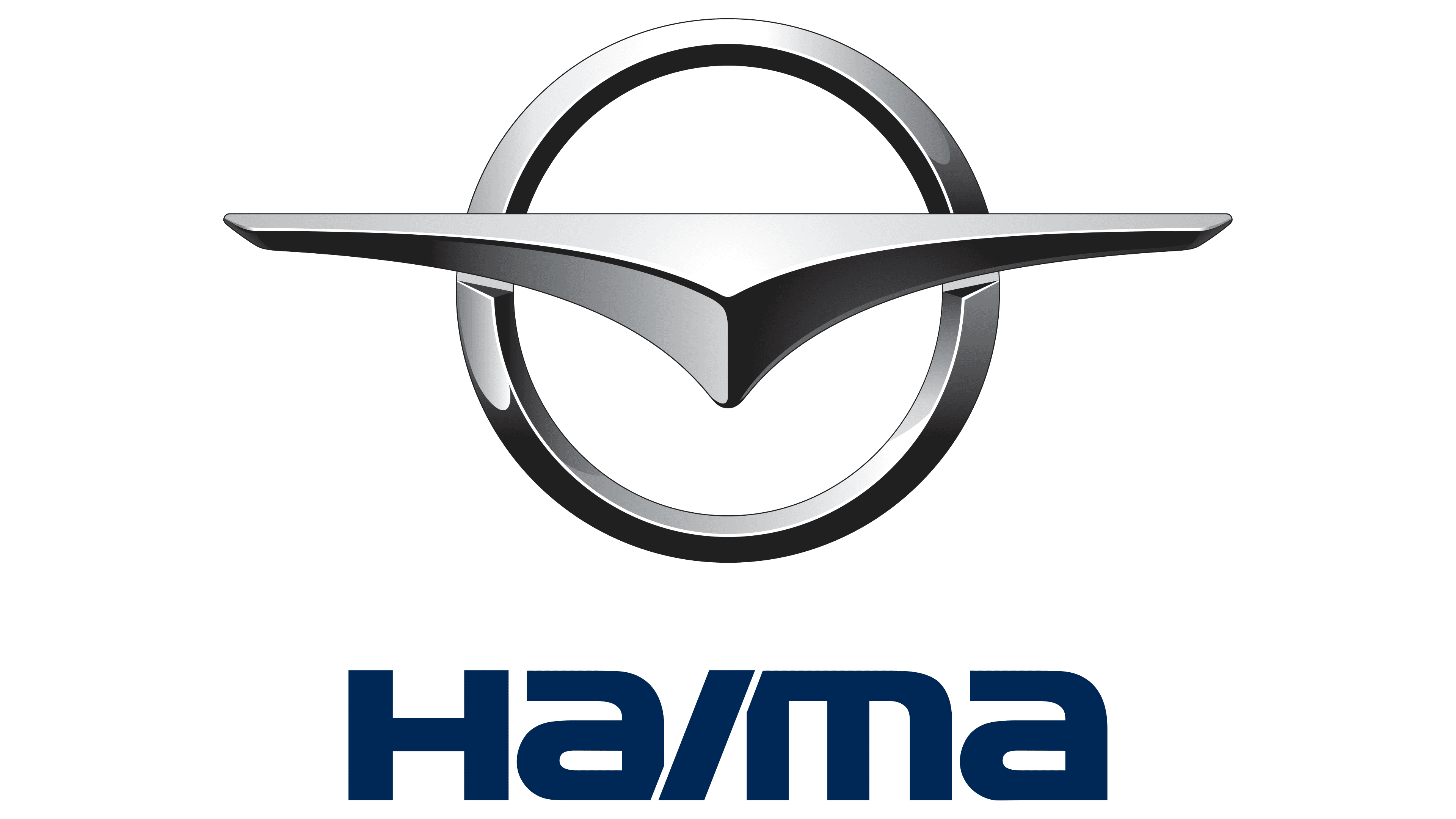
Founded in 1992, Haima has firmly established itself in the automotive industry, particularly in the corporate sector. Its emblem, which seamlessly blends simplicity and modernity, is a streamlined wing shape that gracefully transitions into a gleaming silver circle.
The company’s design approach, as reflected in its emblem, is to produce vehicles that are timeless, reliable, and refined. Haima’s choice of a winged emblem can symbolize flight, progress, and freedom.
Wuling

Founded in 2007, Wuling has carved out a niche for itself in the electric vehicle industry by entering the vast Chinese automotive market. The brand’s emblem, featuring a mesmerizing array of red diamonds, seamlessly combines innovation and traditional aesthetics.
The emblem’s design is an original combination of two elements: the abstract image of a flying bird and the clear silhouette of the letter “W.” This dual symbolism references the brand’s name and also emphasizes its commitment to eco-friendly mobility solutions. The use of red, a color deeply rooted in Chinese culture and symbolizing good luck and joy, further emphasizes the brand’s origins and aspirations.
The Wuling emblem continues its journey in the automotive sector, serving as a testament to the company’s innovative spirit in combining modern electric-vehicle technology with tradition and heritage.
London EV Company
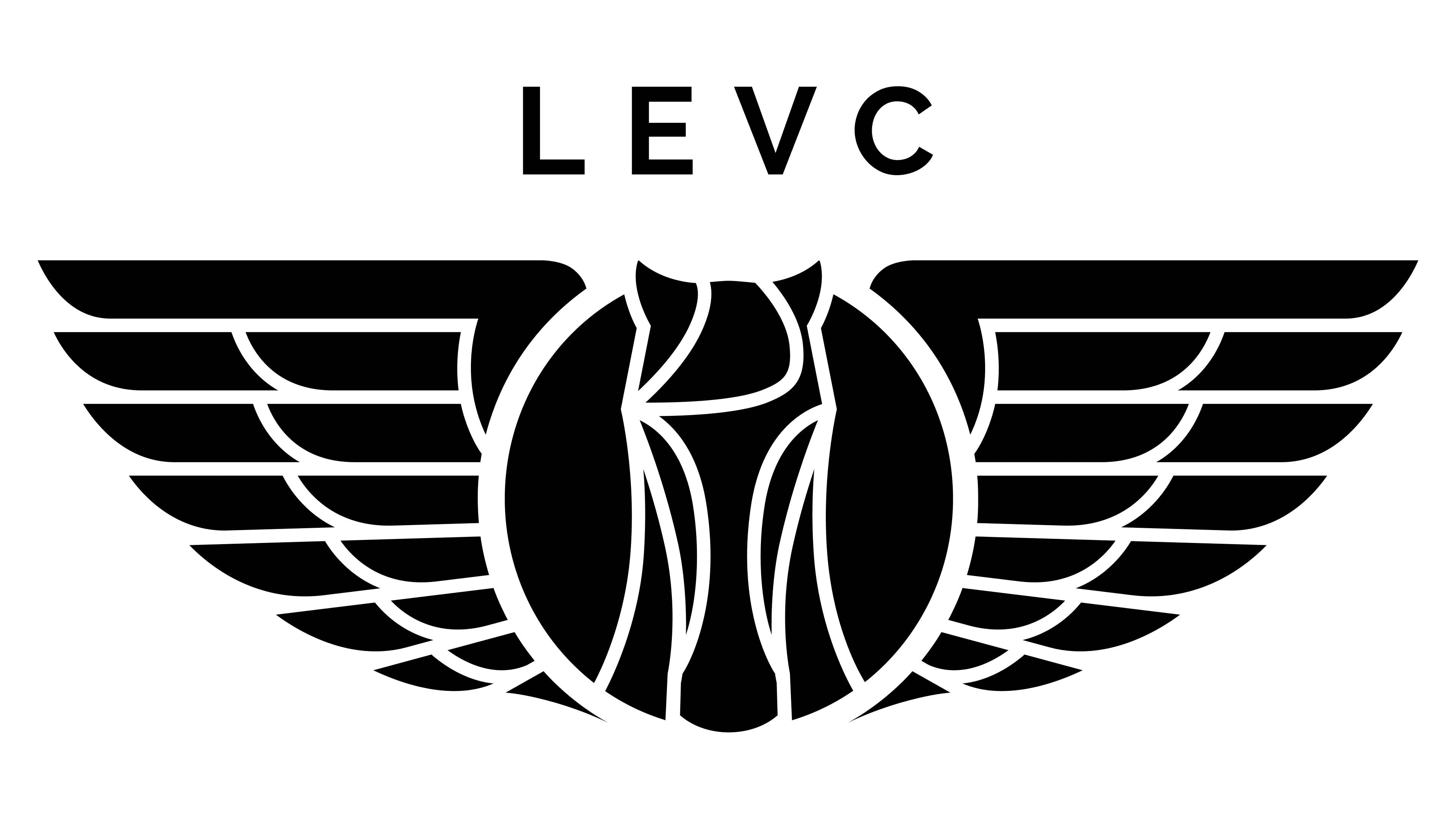
Founded in the heart of the UK, London EV Company (LEVC) has firmly established itself in the automotive engineering arena. Under the umbrella of the renowned Chinese automotive giant Geely, LEVC combines British craftsmanship with global technology to position itself well in global competition.
The LEVC emblem exemplifies design sophistication. The circular motif encompasses the elaborate head of a horse, a universal symbol of strength and grace. The image of the horse is associated with strength, agility, and forward motion, which aligns perfectly with LEVC’s core values and the cars it builds.
Framing this central motif is a set of stunning black wings. These wings elevate the emblem, creating a sense of movement, freedom, and evolution. The choice of black for the wings adds depth and sophistication, enhancing the emblem’s luxurious, timeless appeal. All these elements combine seamlessly in an emblem that is not only attractive but also reflects the essence of LEVC, a harmonious blend of tradition and innovation.
Morgan
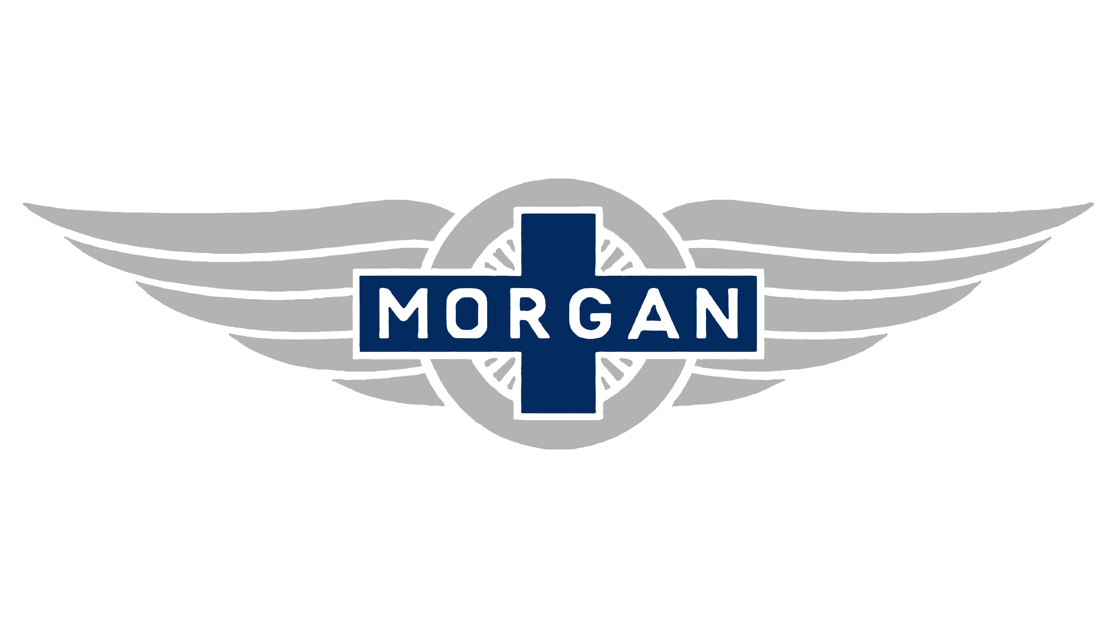
Brands such as Morgan contribute to Britain’s affection for winged-car emblems. This family business, which traces its roots back to Henry Morgan, is a testament to Britain’s automotive heritage.
Its masterfully designed emblem is central to the Morgan brand identity. Within its confines is a circular motif bearing the proud name “Morgan,” strategically shaped as a cross. The wide wings encompassing the center circle are eye-catching. The wings are shiny silver, neither too flashy nor too simplistic. Their design combines grace and dynamism, reflecting the brand’s commitment to elegance and perfection. The silver hue adds visual appeal to the emblem and symbolizes the brand’s impeccable reputation in the automotive industry.
Donkervoort
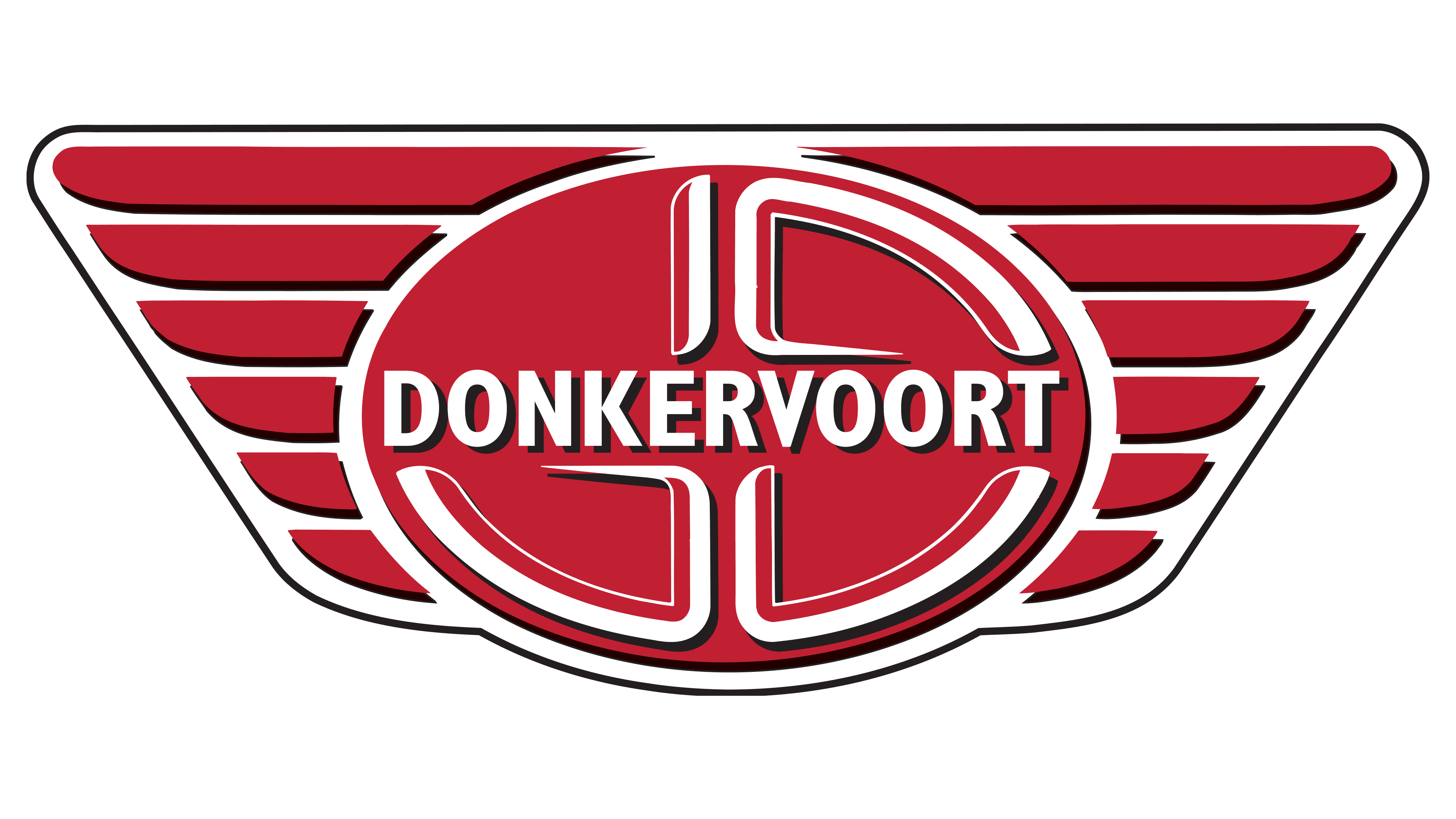
In 1978, a unique car company emerged in the Netherlands, specializing in hand-built, ultra-lightweight sports cars. The desire for precision and detail was not only evident in the cars but also in the Donkervoort emblem. The emblem, designed in a minimalist style, represents wings that embody the spirit of freedom, speed, and elegance.
When looking at this design, one can draw parallels with the wings used by the famous Chrysler brand. Whether intentional or accidental, this similarity is in keeping with the industry’s long tradition of wings symbolizing speed, agility, and the desire to reach greater heights. Such symbolism indicates the manufacturer’s desire to push the boundaries of automotive design and performance.
ISO Rivolta
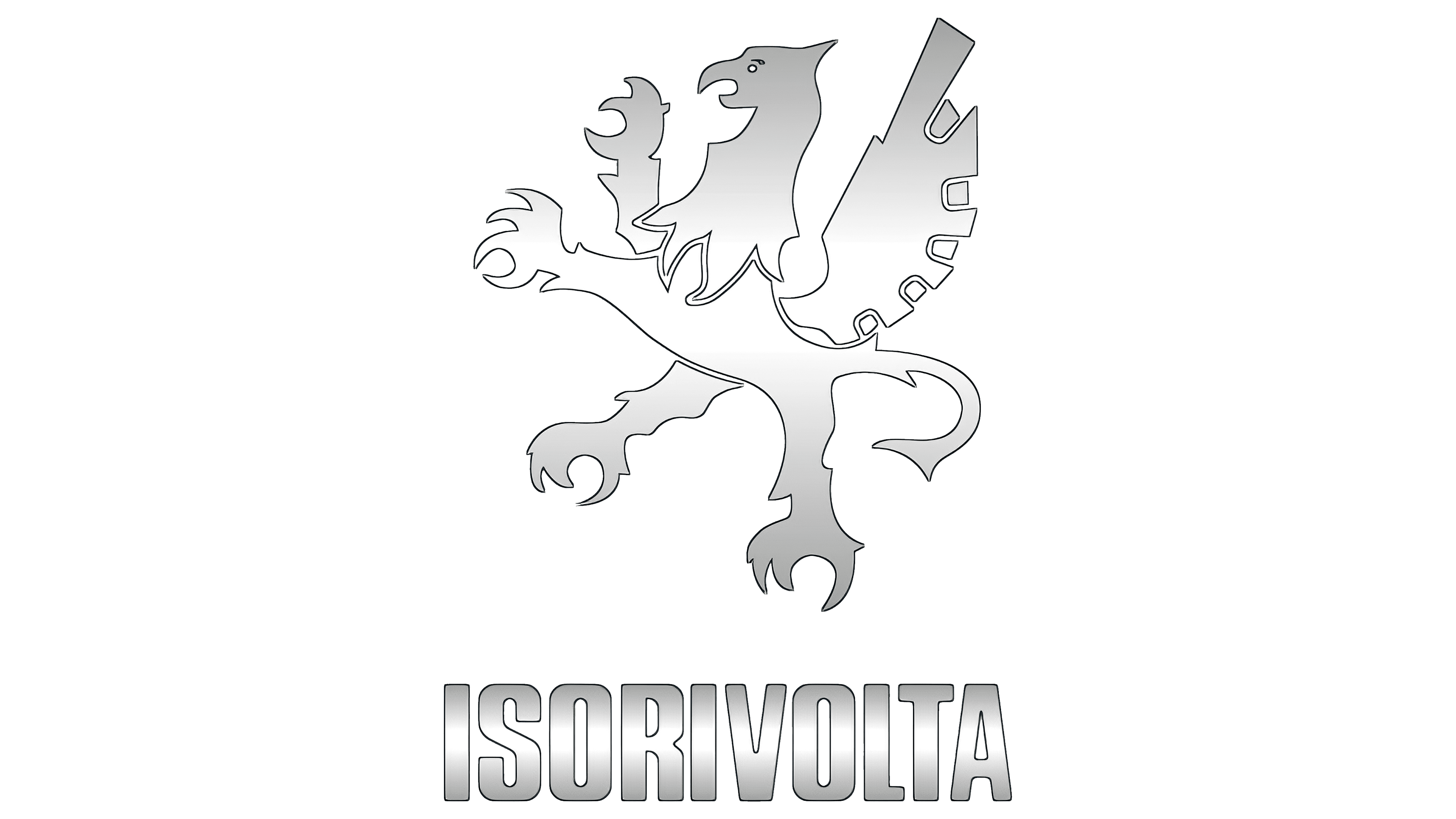
Hailing from Italy, a country synonymous with design and talent, ISO Rivolta made its mark in the automotive and motorcycle industry between 1953 and 1978. Despite the company’s modest tenure in the market, its impact on design and craftsmanship was palpable. ISO Rivolta’s offerings were characterized not only by mechanical excellence but also by an attractive visual appearance.
Central to the corporate identity was an emblem that elegantly reflected the company’s Italian heritage and ethics. The emblem featured the brand’s name, reflecting its commitment to quality and authenticity. Accompanying the name was the tricolor of the Italian flag, a proud reference to the company’s roots and its commitment to Italian standards of excellence.
The most eye-catching element of the emblem was the image of a golden griffin, a mythical creature renowned for its strength and majesty. With its wings spread wide, the griffin symbolized both strength and grace, characteristics that ISO Rivolta sought to embody in its cars. The Griffin, with its wings spread, seemed ready to soar, just as the brand’s ambition is to reach unrivaled heights in vehicle design and functionality.
Bizzarrini

Founded by Giotto Bizzarrini, an engineer who previously worked with famous brands such as Ferrari and Alfa Romeo, Bizzarrini began in the 1960s as an Italian manufacturer of automobile parts. It gained attention for its elaborate and technologically advanced sports cars. Although the company’s journey in the automobile industry was short-lived, ending in 1969, its legacy endures, especially among vintage car enthusiasts and collectors.
The Bizzarrini company badge is a testament to its vibrant identity in the automotive world. The company’s name was emblazoned on a rich red background, a color often associated with passion and speed in the automotive industry. The central element of the design was a bird image. This bird motif can be interpreted as a symbol of freedom, agility, and soaring ambition, echoing the car’s concept.
Duesenberg
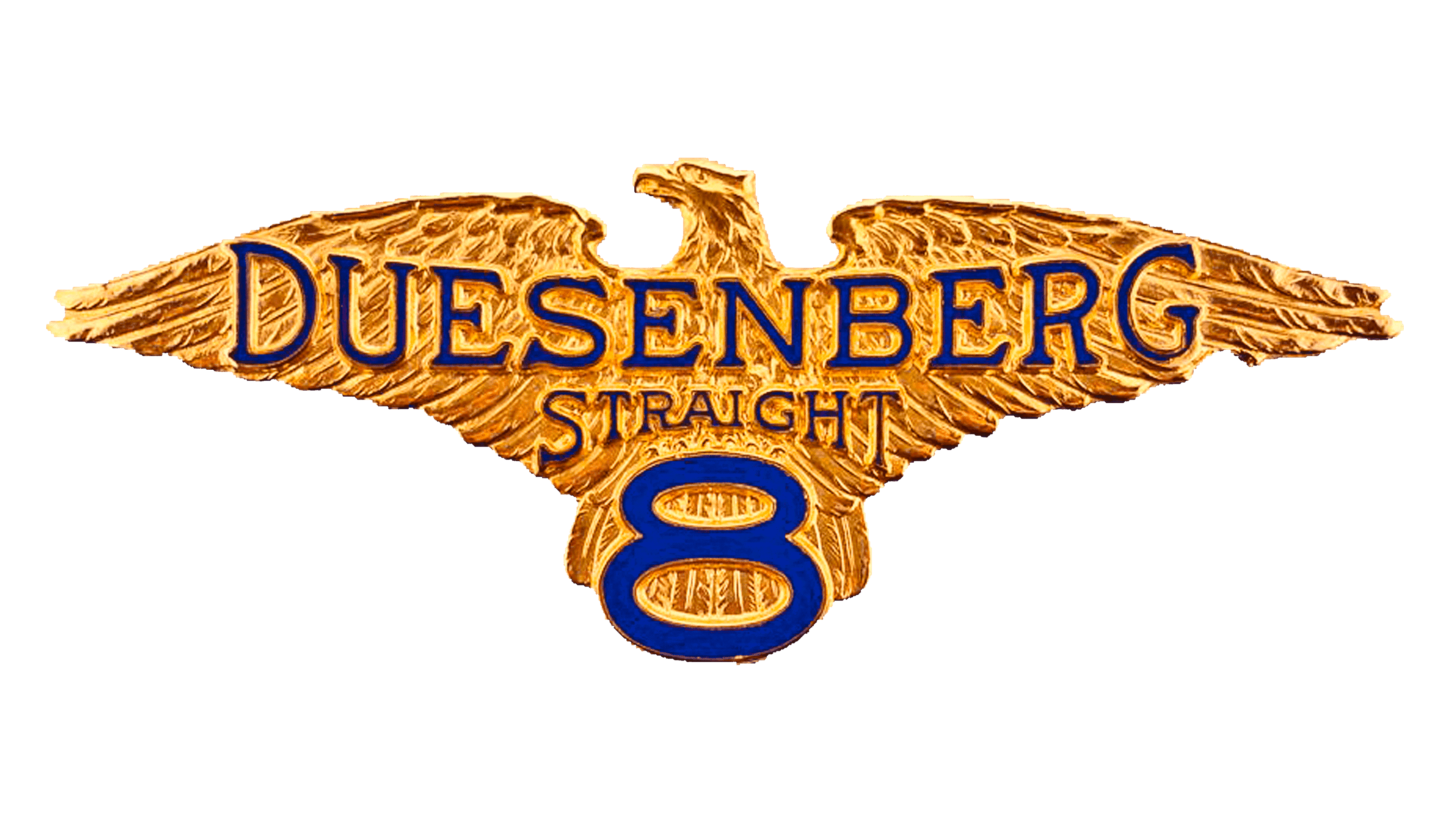
The Duesenberg brand, introduced in the United States in 1913, became a benchmark in the automotive industry. Although it had ceased operations by 1937, the brand’s legacy cannot be denied. Even today, car enthusiasts can come across some of these iconic cars in collections.
The Duesenberg company’s emblem is a testament to its grandeur and luxury. The emblem is dominated by a golden eagle, symbolizing strength, freedom, and perfection. The wings of this majestic bird gracefully embrace the brand name “Duesenberg,” illustrating protection and support. What draws attention, however, is the number “8” discreetly placed at the base of the eagle’s tail. This may hint at the eight-cylinder engine, one of the features that perhaps distinguished the brand in its day.
Packard

Packard, founded in Detroit, Michigan, is known in automotive history as a manufacturer of premium luxury cars. This American brand, born in the bustling industrial era of the late 19th century, produced its first cars in 1899. As the decades passed, the company carved a niche by producing cars that enthusiasts and regular buyers coveted. In 1956, Packard closed its doors, marking the end of its distinguished journey in the automobile industry.
An important aspect of Packard’s identity was its emblem, which is evocative and regal in its presentation. The dominant emblem is a gracefully seated swan with majestically outstretched wings. The choice of the motif was not accidental: the swan, often associated with grace and luxury, perfectly reflects the brand’s essence.
Below the swan is an intricate crest that forms the base. Rich in detail and elegance, this crest serves as a visual element and reaffirms Packard’s commitment to craftsmanship and attention to detail. The combination of swan and crest embodied the brand’s ethos: luxury, elegance, and timeless design.
Invicta
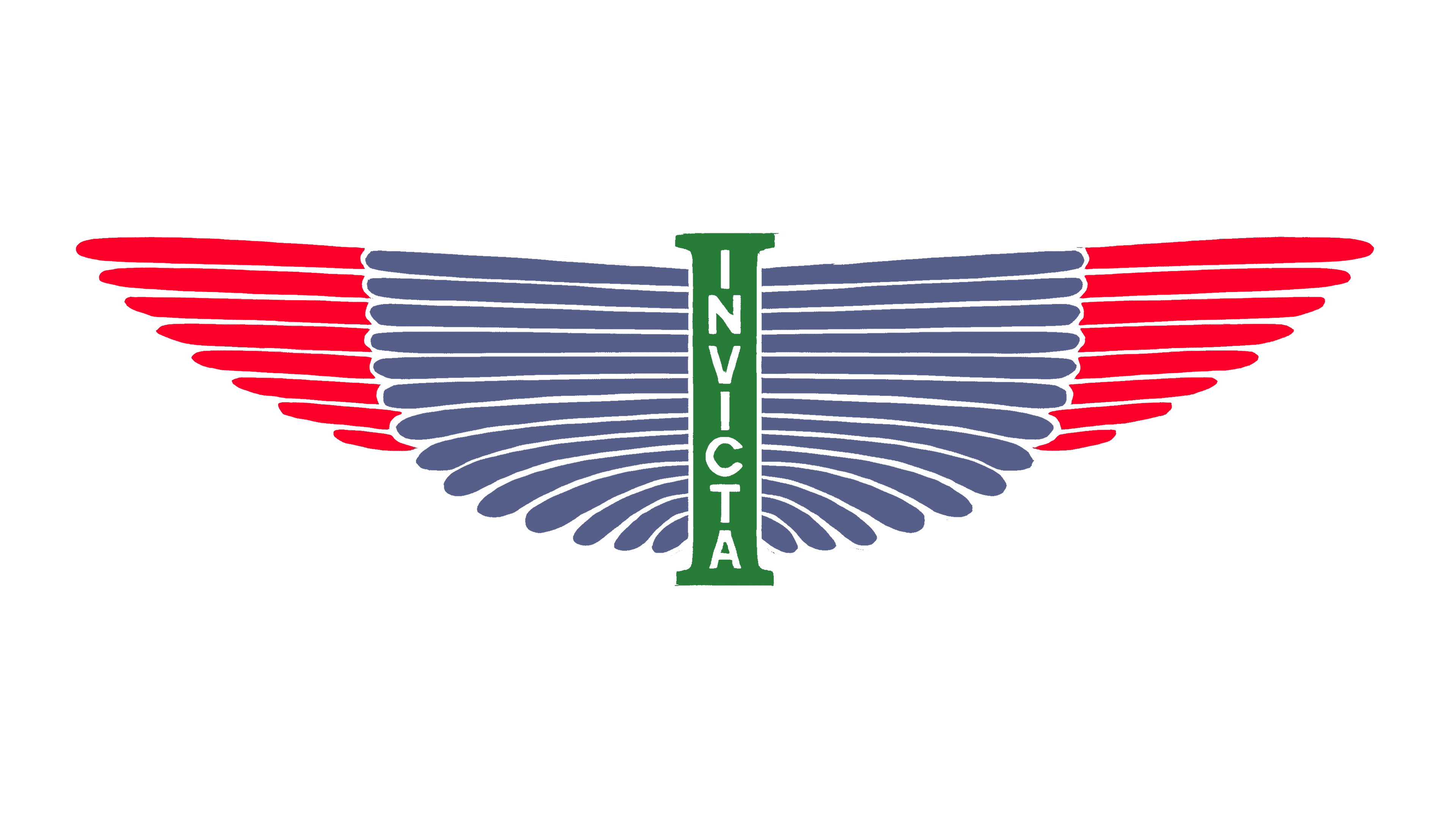
Invicta, founded in the English county of Surrey, is a testament to British automotive excellence. Throughout its history, the brand has produced numerous cars, each with distinctive characteristics that have made them favorites among car enthusiasts and collectors. Invicta’s heritage is rooted in its cars and the emblem that adorns its creations.
The emblem, which is an integral part of the brand’s corporate identity, is an elaborate work of art. In the center of the emblem is a prominent letter “I,” which is not only the brand’s initial but also the name “Invicta.” Intricate wings frame this central motif, each feather precisely drawn. These wings symbolize freedom and speed, embodying the brand’s ethos of being above the rest in design and innovation.
Venturi
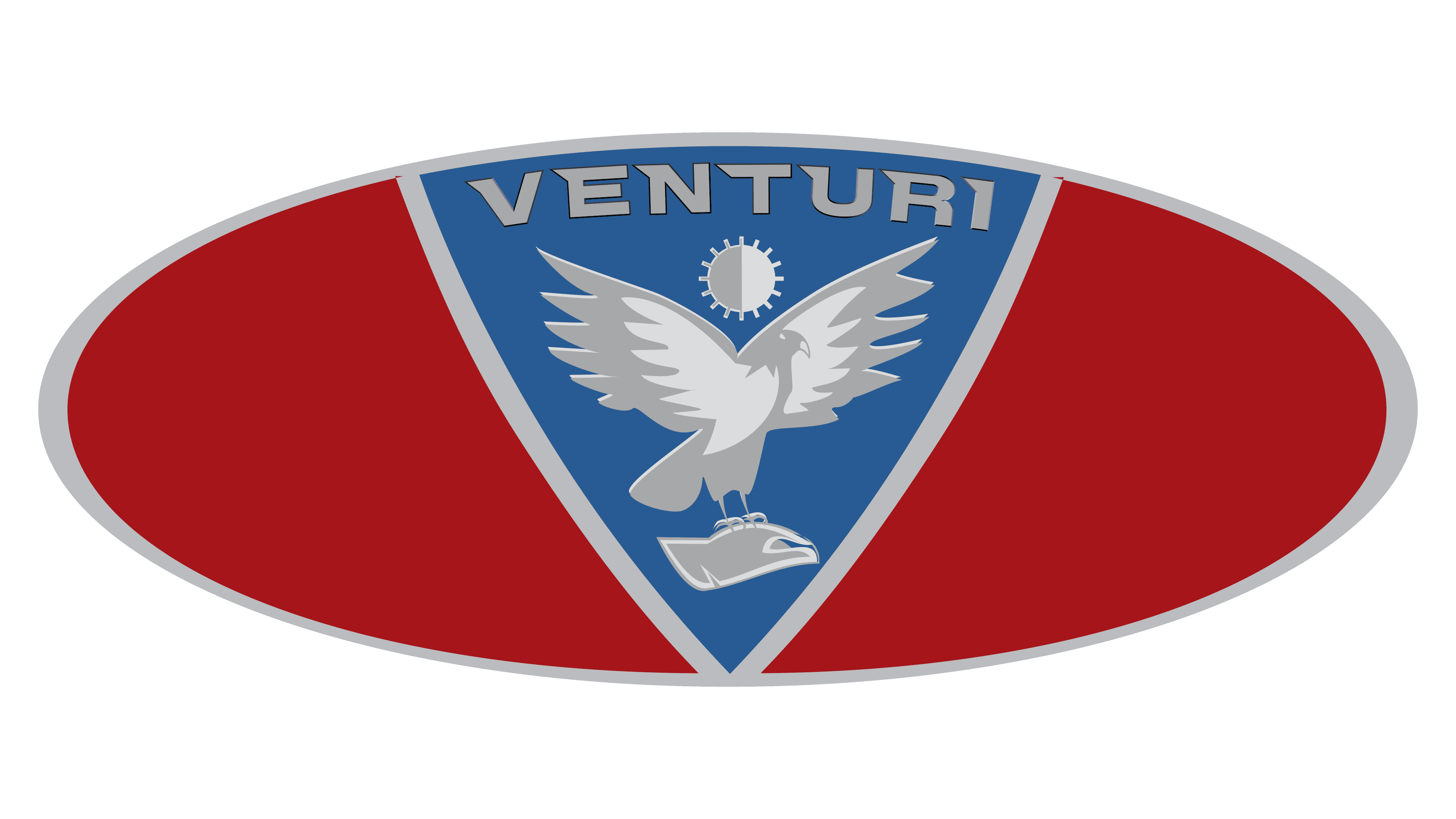
Originating in the luxurious principality of Monaco and established in 1984, the Venturi brand is a testament to the craftsmanship of luxury automobiles. This luxury is reflected in its emblem, intricately designed to embody the brand’s essence. At the center of the emblem is a bird-like figure resembling an eagle with majestically spread wings. This majestic bird is set against a triangular motif, enclosed within a rich red oval, further emphasizing its grandeur.
Over the years, the Venturi emblem has become a beacon for those who appreciate the automotive world’s combination of performance, luxury, and exquisite design. This meticulously crafted emblem serves as a brand identifier and a symbol of the brand’s enduring heritage in luxury automobiles.
Rezvani
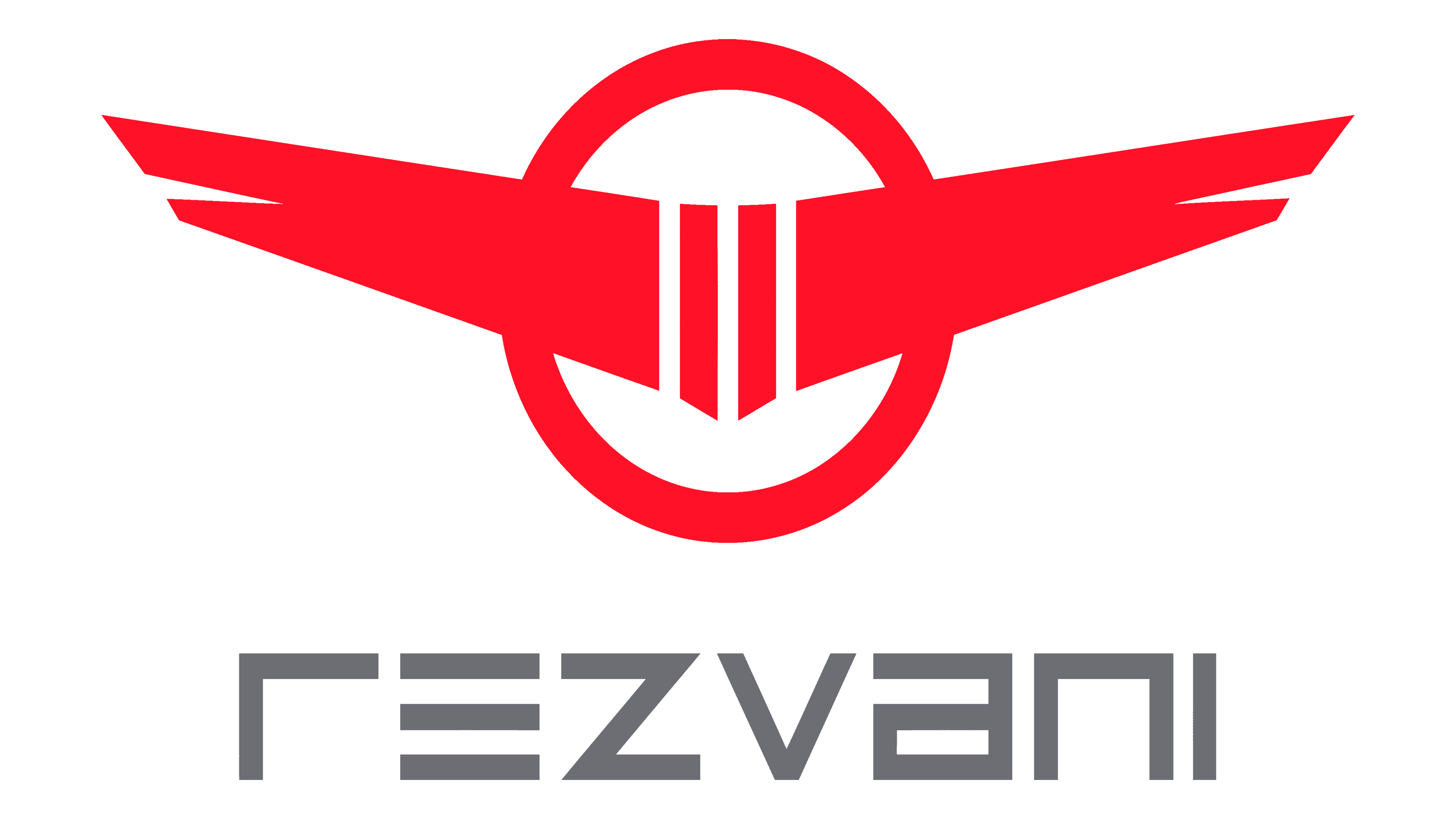
Rezvani entered the automotive market in 2013, standing out even among long-established automotive brands. With roots tracing back to Ferris Rezvani, an experienced designer who previously worked with automotive giants such as Ferrari and Aston Martin, the brand combines an innovative spirit with a rich heritage.
The Rezvani emblem deserves special attention. The emblem features wings strikingly reminiscent of an airplane’s. The wings, inspired by aviation, speak of speed, precision, state-of-the-art technology, and a philosophy of moving forward.
Although relatively young in the automotive industry, Rezvani has already made it clear that it wants to set the benchmark for design and performance.
Laraki

Based in Morocco, Laraki Automobiles is a testament to automotive excellence, particularly in high-performance sports cars and concept design. Founded in 1999 by Mohammed Laraki, this company sought to establish itself in the luxury automobile market. Under his leadership, Laraki Automobiles continues its journey, reaching new milestones and setting new benchmarks every year.
At the heart of the emblem is a bright silver wing that conveys speed, elegance, and aspiration. This unusual wing, with its elegant design, embodies the brand’s ethos of striving for the highest, pushing boundaries, and soaring in the automotive industry.
The wing in the logo embodies Laraki’s vision for the future of automotive design, epitomizing grace and power. As Laraki Automobiles has evolved over the years into a creator of masterpieces on wheels, this iconic wing has become synonymous with the brand, symbolizing unparalleled performance and impeccable design.
Arash

Based in England, the Arash Motor Company produces high-end super and hypercars. It has introduced only four models since its inception. Two of them continue to come out of the production facilities. Another model was expected to launch in 2021. Given the company’s commitment to exclusivity, encountering an Arash car on the road is rare. Previously, the company’s emblems featured a flying bird, perhaps symbolizing dominance and speed.
Gumpert

The Gumpert company, known for its rich German automotive heritage, has carved out a niche in the world of sports cars. Among its outstanding creations is the Gumpert Apollo, a testament to the brand’s commitment to performance and innovation. The company was founded in 2004. Credit goes to Ronald Gumpert, whose pedigree in the automotive world is evidenced by his previous role as director at Audi Sport.
While the cars attracted attention on roads and race tracks, the brand’s style also became prominent. The logos associated with Gumpert and transferred to “Apollo Automobil” were not mere conventions but complex designs that reflected the brand’s ethos. One of the most striking symbols in the corporate identity is the griffin, a mythological creature that embodies strength, speed, and freedom through its wings.
Arrinera

Originally from Poland, Arrinera Automotive, founded in 2008, is recognized for its emblem featuring graceful wings, which distinguishes it from many other winged automotive logos. Over the years, Arrinera has undergone various logo redesigns. What has remained constant, however, is the theme of a modern take on the timeless wing image. Each iteration offers a fresh look while staying true to the brand’s original essence.
Panther

The British auto industry has its share of intriguing signature styles, and the Panther brand is no exception. While the brand’s name immediately evokes a feline predator, its emblem points in an unexpected direction. The centerpiece of the emblem is a motif that resembles the grille of a vintage car.
This central motif is flanked by sprawling wings that add dynamism and zest to the entire design. These wide, finely detailed wings convey freedom, speed, and agility. Under the grille, between the fenders, is a prominent banner. It proudly displays the brand name “Panther,” further emphasizing the company’s individuality and serving as the logo’s focal point.
The choice of elements in the Panther logo is a great example of how a brand can combine seemingly disparate images to create an identity that stands out, resonates with its target audience, and emphasizes its values and heritage.
Qvale

There are many brands in the automotive world, each with its unique heritage, and the Italian company Qvale is a chapter in that vast narrative. Founded by the visionary Bruce Qvale, this relatively short-lived company brought a touch of Italian craftsmanship to the automotive world.
The Qvale emblem blended tradition and modernity. The choice of the dragon as a symbol, often associated with power, strength, and mysticism, was easily combined with a modern touch: three linear stripes resembling wings.
Despite its brief stay in the automotive industry, Qvale managed to make a name for itself. The cars produced under this brand were not just vehicles but expressions of art, engineering, and passion. Their rarity and the craftsmanship with which they were created have led many car connoisseurs to consider them valuable pieces worthy of any collector’s garage.
Hillman
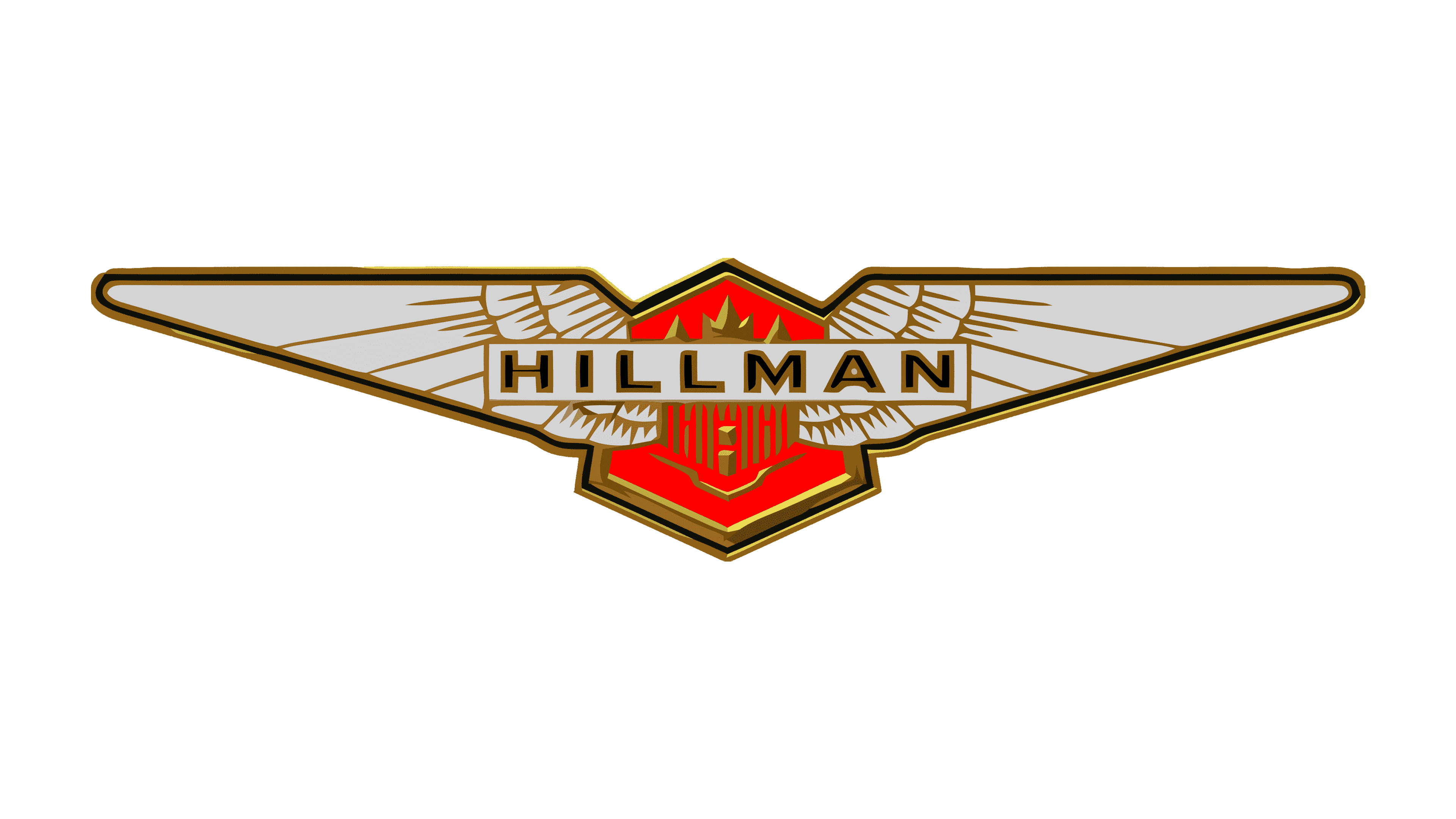
Originating in the UK in the early 20th century, Hillman became a beacon of automotive innovation during an era of rapid development. Established in 1907 and lasting until 1931, the company flourished under the leadership of William Hillman and Louis Coatalen, two visionary founders who were instrumental in shaping the brand’s identity and reputation.
The brand’s emblem is undoubtedly mesmerizing, drawing parallels with the symbolism of many modern luxury car brands. A pair of snow-white wings symbolizes the freedom, elegance, and innovative spirit that embodied the Hillman cars. In the center of the wings is a banner bearing the brand name “Hillman,” emphasizing its importance in the automotive industry.
Although the brand’s activity spanned only a limited period, its emblematic winged symbol remains a constant reminder of the time when British automobile design and craftsmanship reached new heights.
Simca

The French car company Simca showcased an emblem that evokes nostalgia. The emblem design, featuring a swallow, is complemented by a vibrant color palette that reflects the era’s creative energy.
Founded in 1934, Simca carved out a niche in the automotive industry, leaving a legacy that lasted several decades until its eventual closure in 1970. Although the company is no longer in business, its brand and cars have not faded into oblivion. To this day, selected enthusiasts and collectors cherish Simca cars as valuable assets. The appeal of the brand and the fondness with which it is remembered.
Changan

Founded more than a century and a half ago, Changan is one of China’s most famous automakers. As a state-owned enterprise, it has made a significant contribution to the country’s automotive industry by producing a variety of vehicles, including vans, cars, and light trucks.
At first glance, the emblem has a simplistic V-shaped pattern. However, a closer look reveals that the emblem is a pair of wings. In a competitive global automotive market, such symbols and their meanings can serve as powerful reminders of a brand’s ethics, history, and distinct vision. With over 159 years of experience, Changan’s choice of the winged emblem perfectly complements its long-standing reputation and ambition in the industry.
Russo-Balt

Originally from Russia, Russo-Balt is one of the pioneers in the production of cars and airplanes in the country. Its emblem draws inspiration from the heraldic symbols of the Russian Empire, depicting a double-headed eagle with intricately shaped wings.
Although such intricate patterns may seem out of place in today’s streamlined, minimalist branding, for Russo-Balt, this emblem is a testament to its rich history and heritage. The detailed image evokes a bygone era and underscores the company’s commitment to preserving traditions. By using such a rich symbol in its branding, Russo-Balt conveys that it attaches great importance to its lineage and the historical significance of its activities.
Isdera

Isdera entered the automotive market in 1982, in the heart of Germany, focusing on building high-performance sports cars. While the design of the brand’s cars caught the eye on the streets, its emblem did as well.
The emblem, designed in soothing soft blue hues, radiates both calmness and dynamism. On this calm background is the image of a blackbird, reminiscent of a falcon with its pose and majesty. The choice of the image was not just aesthetic. The falcon, known for its speed and precision, symbolizes the qualities Isdera sought to instill in its vehicle line.
The choice of a vertically oriented badge is unique, making it stand out and memorable to those who catch a glimpse. The Isdera emblem, like its fleet of cars, reflects the brand’s commitment to aesthetics combined with performance.
Bandini Automobili

Founded in 1946 in Italy, Bandini Automobili was a tribute to its visionary founder, Ilario Bandini. For nearly half a century, until 1992, the brand was synonymous with luxury sports cars, reflecting post-war affluence and craftsmanship.
The Bandini emblem was a mélange of symbolic elements. The bright colors of the Italian flag demonstrate national pride and origin. The presence of a rooster-like bird gives the logo an intriguing edge. The inclusion of the bird in the logo is interpreted as an indication of agility, alertness, and dynamism, qualities often associated with powerful sports cars.
Stutz
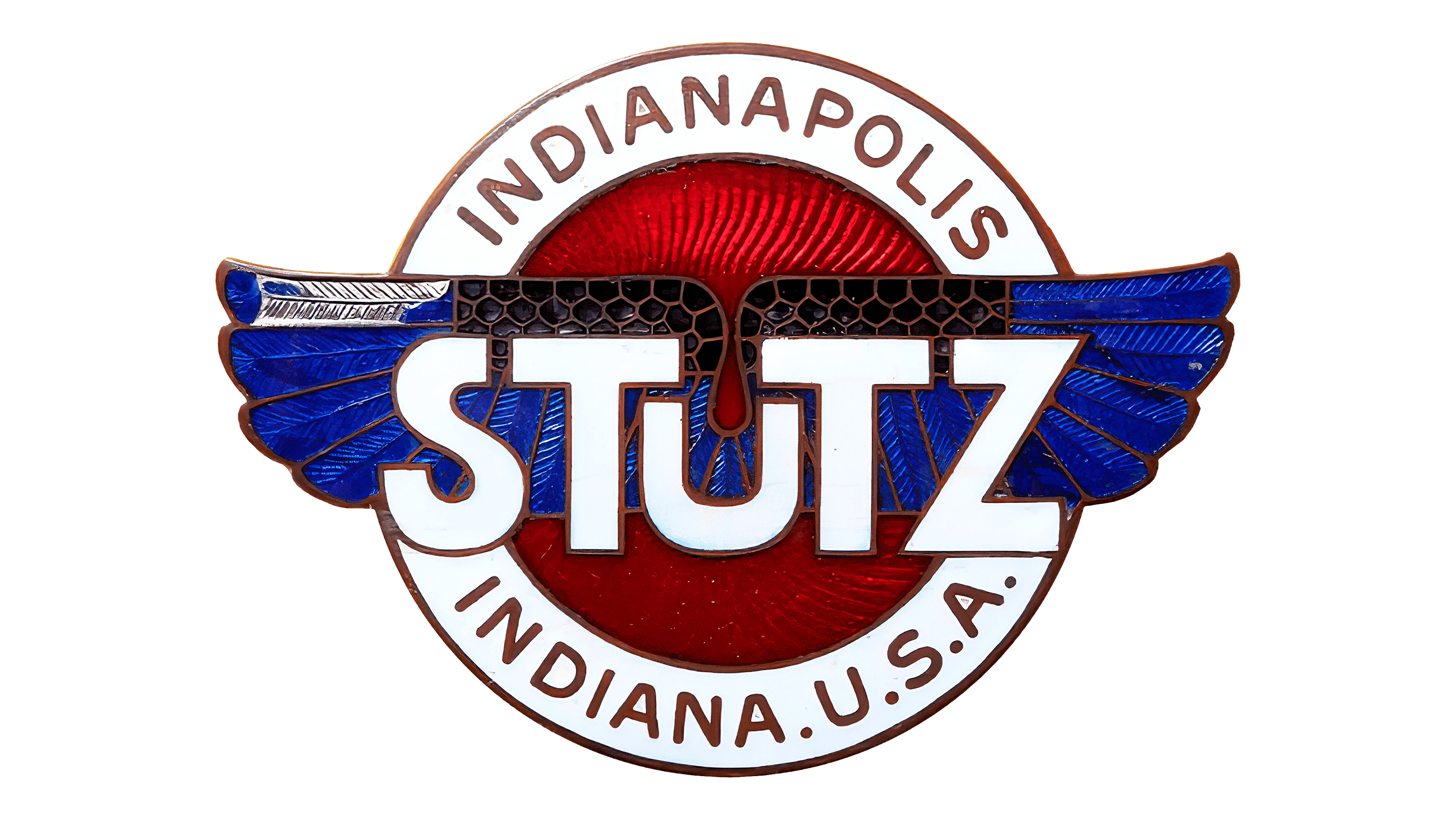
Originally from the United States, the Stutz automobile brand emerged in 1911 and carved out a niche by crafting luxury cars of impeccable quality. Over time, these cars became not only a means of transportation but also a symbol of prestige and luxury. The brand emblem features bright colors and traditional motifs characteristic of automotive insignia.
An intriguing element of the Stutz emblem is the racing flag set against a background of azure wings. This design choice is not merely decorative but carries a deeper meaning. With its emblem, Stutz enshrines its heritage in the annals of automotive history and embodies the essence of an era when luxury and performance went hand in hand.
Peerless
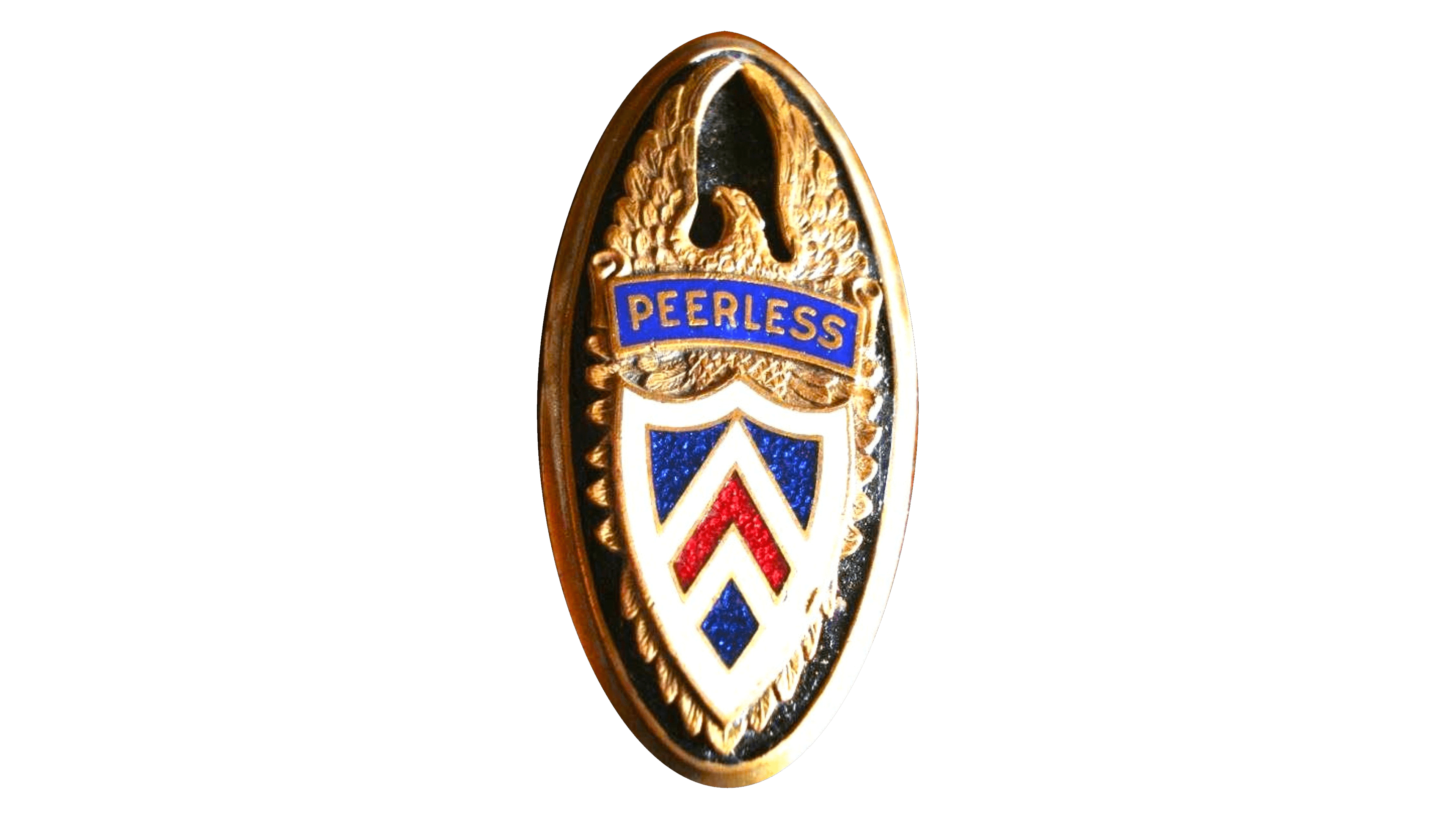
There have been many noteworthy names in automotive history, including Peerless Motor Car Company. Part of the famous trio of the “three P’s,” along with Packard and Pierce-Arrow, Peerless carved out a special niche in the automotive market.
The company introduced revolutionary technologies that became integral to automobiles worldwide. For example, drum brakes were a significant leap in automotive safety, and Peerless was at the forefront of this evolution. The move to closed-body cars changed the aesthetics of the automobile, providing drivers and passengers with increased comfort and a more streamlined appearance.
The company’s emblem, an imposing eagle, testified to its American roots and symbolized its ambitions. The eagle’s widespread golden wings symbolized freedom, majesty, and the promise of uncharted horizons. The legacy of Peerless and its emblematic eagle remains a testament to an era when innovation and luxury went hand in hand, changing the contours of the automotive world.
Cole
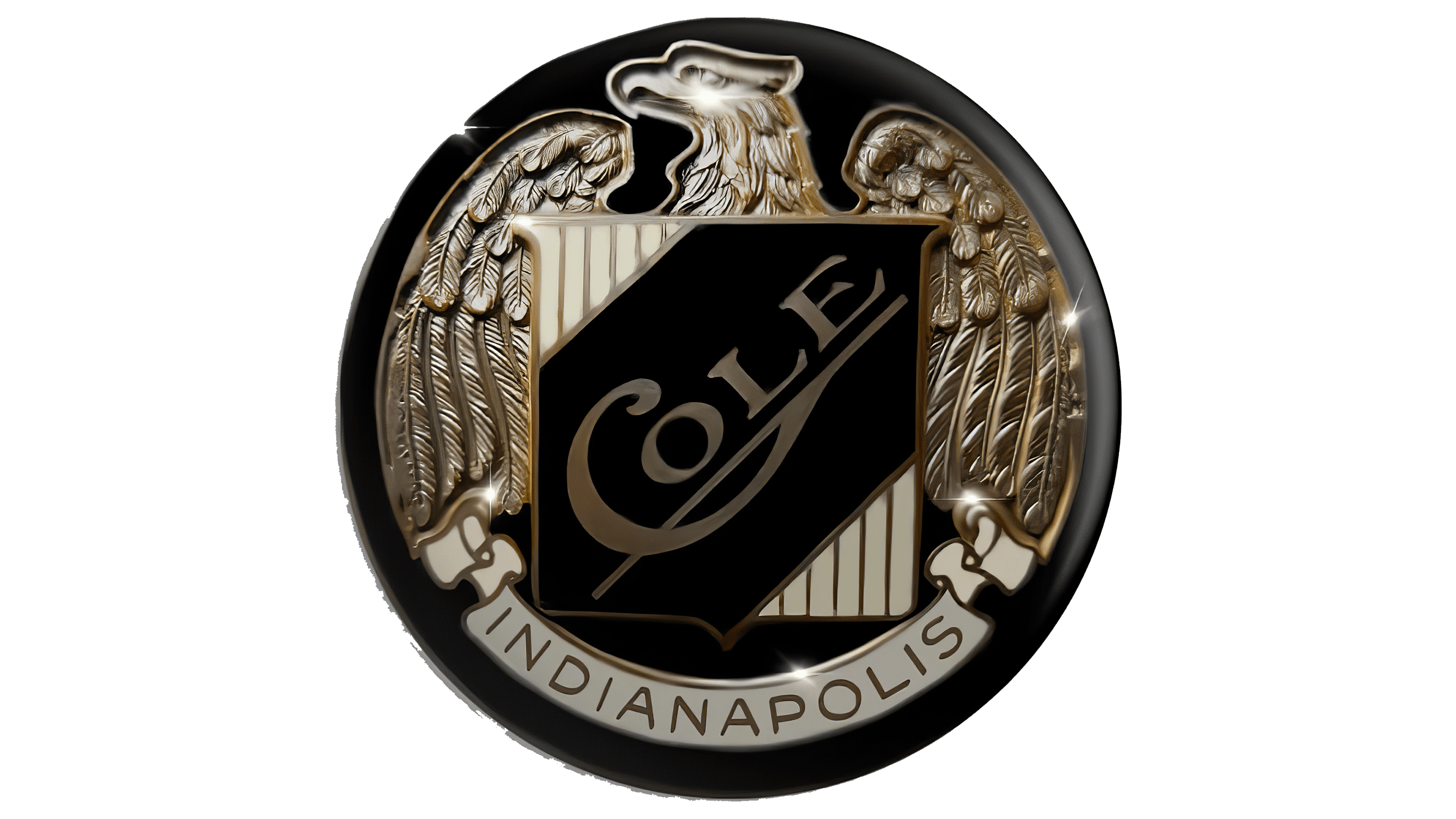
Established at the beginning of the 20th century, the Cole Motor Car Company occupied the luxury-car niche. During its two decades of operation, from 1909 to 1929, the brand became synonymous with luxury and sophistication in the automotive sector. But it wasn’t just luxury that distinguished the brand; it was also instrumental in the early introduction of the V8 engine.
The Cole Motor Car Company’s emblem was as prominent as its cars. One memorable badge featured a pair of majestic silver wings, perhaps signifying speed, elegance, and a desire to soar above the competition.
Although the company’s journey was relatively short compared to other automotive giants, its history, represented in part by those gleaming wings, continues to resonate with classic car enthusiasts and historians.
Durant

Founded in 1921 in Lansing, Michigan, Durant Motors carved out a niche in automotive history despite not being as well-known as some of its contemporaries. Among automotive giants, this company has shown a flair for branding, as reflected in its emblem choices over the years.
Among the company’s various symbols, one in particular stands out. The emblem depicted a dragon-like creature, reminiscent of mythical tales, perched on a shining star. The choice of this symbol was no accident, as Durant had consistently used the mythical creature motif in many of his coats of arms.
The creature’s placement above the star hints at the company’s desire to shine brightly in the automotive world, striving for excellence and distinction. Through its emblem, Durant Motors subtly conveyed the values and attitudes it held in the highly competitive automotive industry of its time.
Biddle
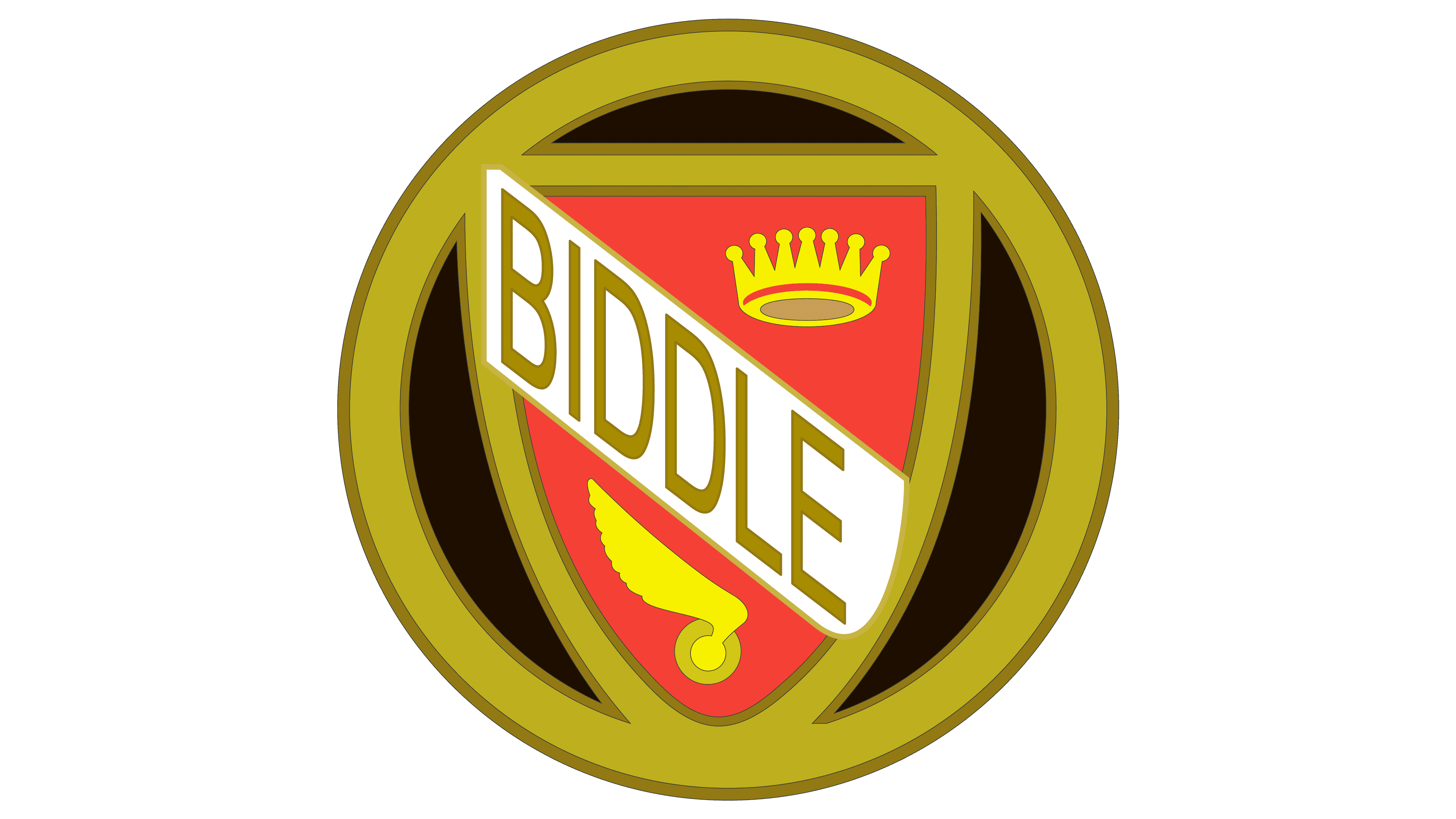
Biddle, which manufactured automobiles from 1915 to 1922, displayed an emblem that uniquely combined several elements to convey luxury and elegance. Biddle’s emblem, which did not last long in the automobile industry, remained distinctive and memorable.
The emblem embodied the brand’s essence, serving as a shield that symbolized protection and durability. In the center of the shield was a banner, symbolizing the brand’s pursuit of perfection and its regal aspirations. The shield is crowned with a richly decorated crown, indicating the luxury and premium nature of the brand’s cars. The lower left corner of the shield was decorated with a pair of graceful wings, symbolizing speed, agility, and freedom.
Although the company Biddle has only a short history in the automotive world, the intricacy and thoughtfulness of its emblem’s design continue to spark interest among fans of automotive history.
Bignan
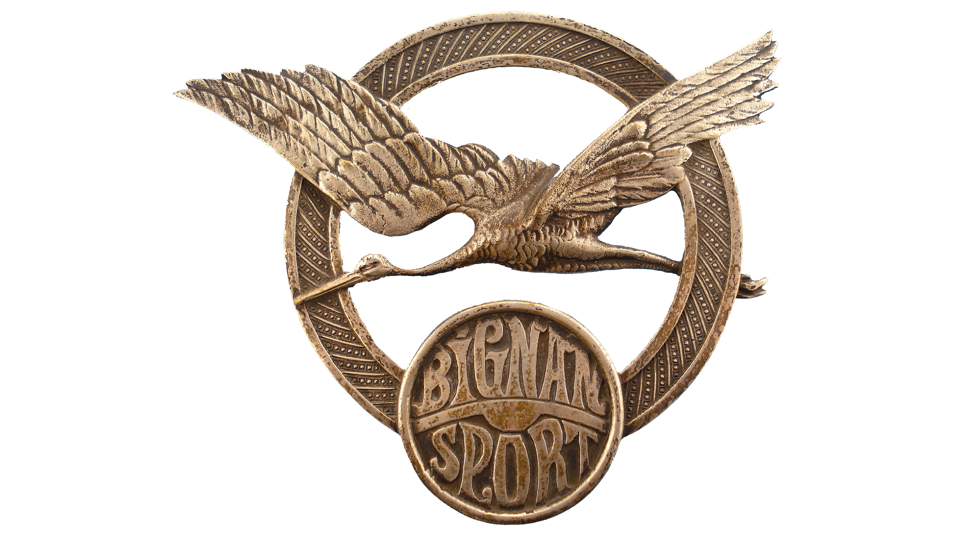
Originally from France, Bignan is a testament to the rich automotive history of the early 20th century. From 1918 to 1931, this brand carved out a niche in the country’s domestic market, offering cars with a distinctive “torpedo-shaped” body and four-cylinder engines.
Although Bignan’s involvement in the automobile industry was relatively short-lived, its winged emblem made a lasting impression. This emblem, which gracefully embodies the brand’s desire for speed and freedom, remains recognizable among vintage car enthusiasts and historians. Although Bignan ceased operations many years ago, its history has been preserved through this emblem and the memories of those classic cars.
Avion Voisin
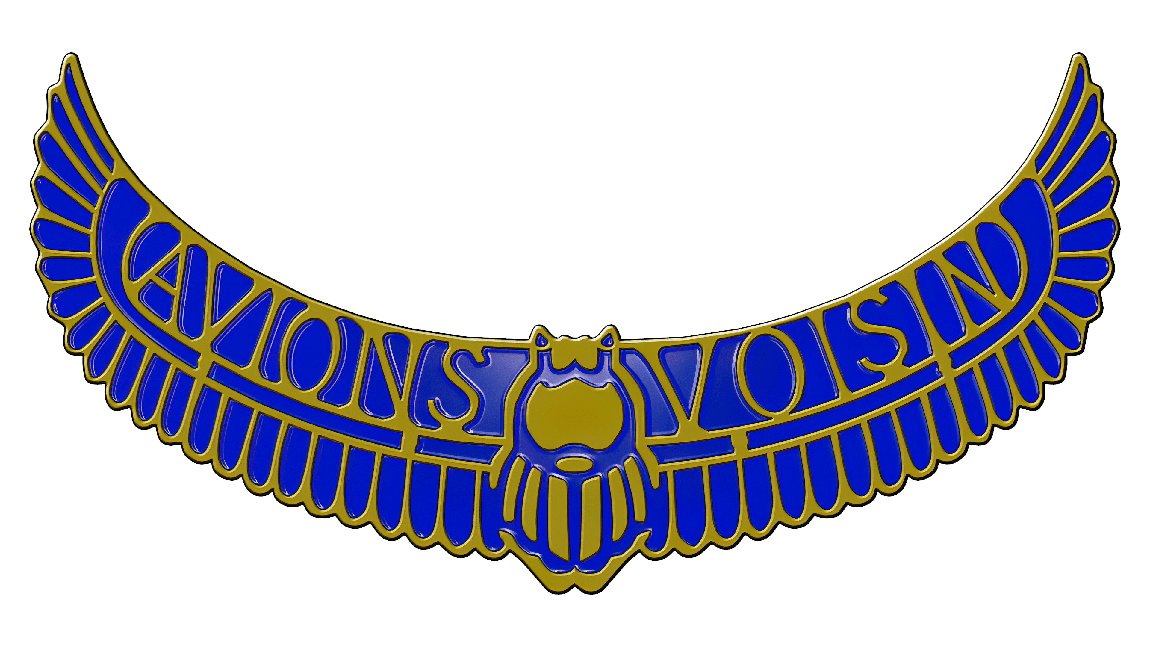
Founded in France, Avion Voisin was a famous automobile manufacturer that operated from 1905 to 1946. The company’s emblem was instantly recognizable for its striking winged design. The wings, in an elegant combination of gold and blue, stretched across the badge more widely than was common on other automobile badges of the era. This bold, unique badge choice allowed Avion Voisin automobiles to stand out, attract attention, and distinguish the brand from its contemporaries.
American LaFrance

In the history of the automobile industry, some brands specialize in different niches. One such specialized brand was American LaFrance, often abbreviated as ALF. This American manufacturer was characterized by a concentrated approach to production, dedicating its product lines primarily to emergency and rescue vehicles. Over a significant period from 1873 to 2014, the brand adopted an eagle as its emblem, symbolizing strength and elegance. The silver logos on the vehicles not only bore the company name but also featured the majestic image of an eagle with outstretched wings, signifying protection and vigilance.
American Austin
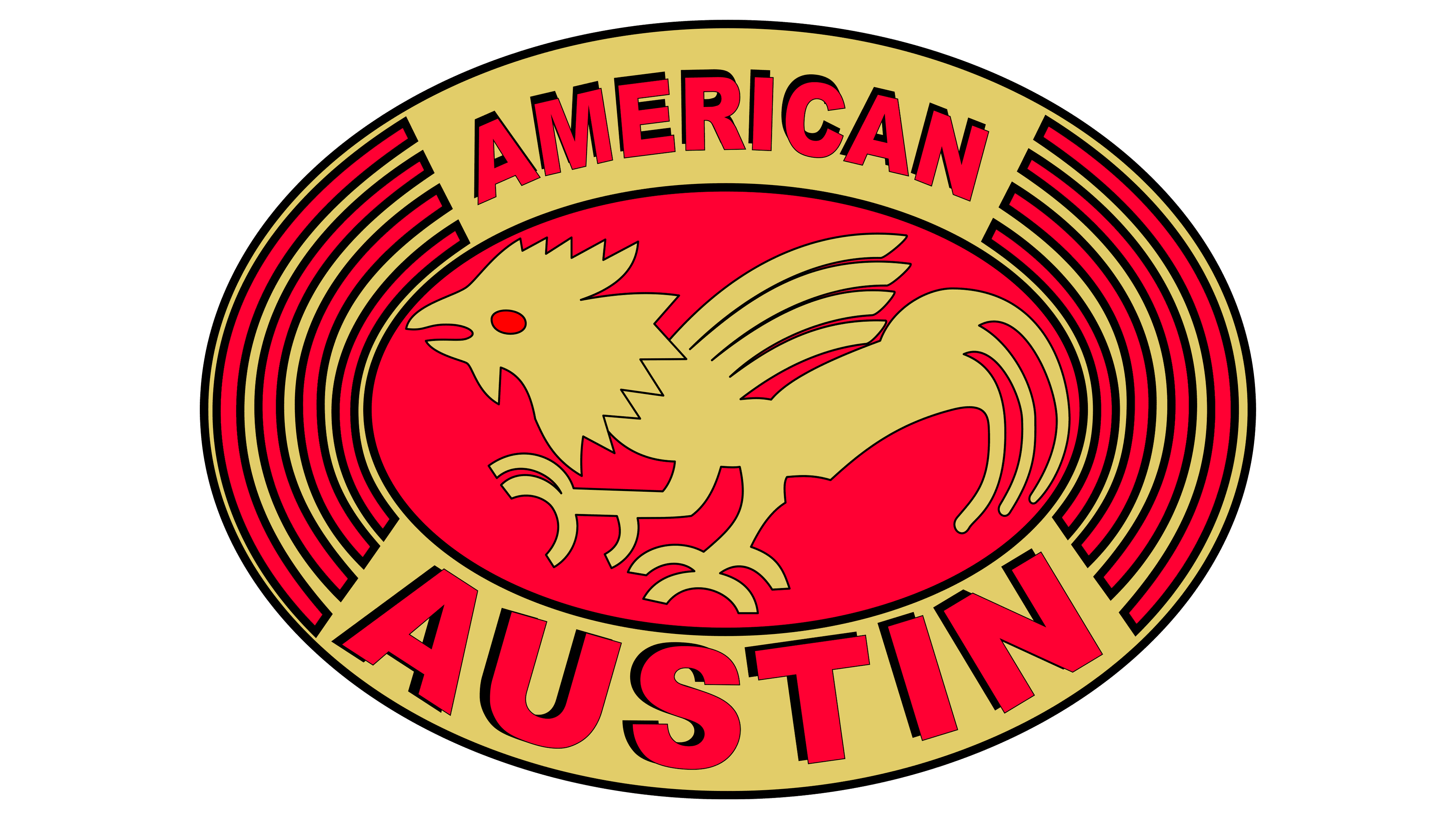
The annals of the automobile industry are replete with brands that have left an indelible mark. American Austin is one such brand that, despite being produced between 1929 and 1956, has left an indelible legacy in the industry.
The emblem chosen by American Austin was both striking and symbolic. The logo was dominated by a rich red-and-gold palette, with an eye-catching red oval serving as the background. The central element of the design was the griffin, a mythical creature that symbolizes strength, power, and protection. This mythical beast was adorned with a pair of glittering golden wings, which gave the design majesty and grandiosity. The choice of such a beast and color scheme underlines the brand’s desire to combine tradition and innovation.
Alta

The automotive industry has witnessed the rise and fall of many brands throughout its history, and one such brand is Alta. Originating from Greece, this brand made its name between 1962 and 1978. Over the years, the Alta logo has undergone several transformations. One of the most notable emblems had a striking resemblance to a bat’s wings, with the brand name “Alta” written on it. Such winged emblems are unique to automobile brands, making them an interesting object of study.
Anteros

Among the many automobile manufacturers, there are unique brands that, despite limited production, leave a significant mark on the industry. One such brand is Anteros Coachworks. Based in the vibrant state of California, this company may not have had a wide product line, but it created a car that left enthusiasts in awe.
The only car it produced was an impressive marvel modeled after the C6 Corvette. This was no ordinary car: under its hood, an engine produced over 500 supercharged horsepower, a testament to the company’s commitment to power and performance.
Founded in 2005, Anteros Coachworks’ corporate identity was as unique as its cars. The emblem featured a bull, an animal that symbolizes strength and endurance. Complementing this image were sleek black wings that added mystery and a sense of freedom to the design.
While Anteros Coachworks may not be a household name today, its small but significant contribution to the automotive industry is a story worth telling.
Rossion

The emblem of Rossion, an up-and-coming automotive brand, blends tradition with modernity. At the center of the emblem is a gracefully soaring hawk or falcon perched on a strict black shield-shaped background. The emblem is distinguished by the elaborate bird design and the choice of a modern font for the brand name.
This design demonstrates the brand’s ability to incorporate the age-old symbols of power and freedom wings into the context of the 21st century. The careful balance of classic and modern elements in the emblem reflects Rossion’s commitment to innovation while respecting the rich heritage of automotive aesthetics. By combining the timeless appeal of winged emblems with modern design elements, Rossion connects to the past while confidently looking to the future.
Hawk Cars

Based in the heart of the UK, Hawk Cars is a distinctive automotive brand specializing in bespoke vehicles. The emblem depicts a hawk in flight, gliding effortlessly over a gleaming, circular silver frame.
The emblem of this British automaker has left a distinctive mark. The choice of the hawk symbolizes precision, foresight, and agility, attributes crucial to the production of bespoke cars. The circle, symbolizing unity and completeness, perhaps reflects the brand’s commitment to design and performance excellence. The Hawk Cars logo eloquently conveys its dedication to craftsmanship, attention to detail, and spirit of flight and freedom.
Car logos with wings
Tracing the history of automobile emblems reveals that wing motifs feature prominently in many car logos. This list includes a few well-recognized brands that have used wings in their branding, but lesser-known companies have also used this symbol in their emblems.
A winged car logo is more than just a visual appeal to potential customers. Wings carry a deep symbolic meaning. In the context of car branding, these symbols often represent speed, freedom, and innovation. Whether it’s a full set of wings, a single wing, or even a design that hints at flight, such elements lend vitality and dynamism to an automotive brand.
Outside of the automotive sector, wings have found their way into industries ranging from aviation to healthcare and science. In the automotive sector, however, emblematic wings evoke a unique sense of wonder and aspiration. Through this prism, the study of winged automotive emblems is not just a design but a celebration of the aspirations and promises each brand intends to realize.
Video