Careernet is a platform with unique talent identification capabilities. It provides opportunities for learning in various areas – new fast-growing industries, public services, innovative educational areas, and much more. Carrying out individual training in accordance with the requirements of the world-class, Careernet today expanded its capabilities and offerings, which it tried to reflect by launching a new corporate identity. The rebranding included a logo change and the creation of a new, more attractive, and informative website. The company’s new motto is We Make it Happen, which is confirmed by action – the brand always finds the right talent thanks to its experience, perseverance, and used innovations. The success of a brand in its field is determined by the depth of “immersion” in the needs of the client, its features, which makes it easier to search and makes it more effective.
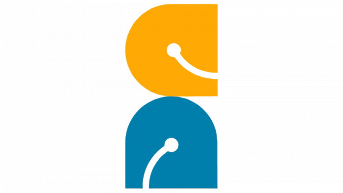
The new logo was made in compliance with the requirements of the digital display field and the peculiarities of the present. It is terse and simple in visual perception, despite its multi-layered nature. The image of a smiling yellow emoticon has a visual reminder of the shape of the letter “C,” which is the first letter of the brand name. The blue element is also a smiley but expanded so that it immediately gives the impression of a stylized execution of the letter “n,” which is the beginning of the second word combined in the title into a single text. This composition presentation provides a visual representation of the importance of the human connection to the brand.
In the formation of the text part of the logo, a positioning font of the type ZT Grafton Thin by Zeune Type Foundry was used, in which all letters are the same in size, demonstrating the same importance of each client to the brand. At the same time, this typeface ensures the attractiveness of the logo, ease of remembering, and recognizability in combination with any form in print or on digital media. Its peculiarity is readability in any size design of the logo. The visual combination with emoticons effectively transfers the emphasis to the sign, creating the impression that the text flows directly from the sign evenly and symmetrically. The general perception of the logo ensures its easy reading both in a single composition and each element separately.
Given the scale of the brand, such a presentation of its visualization to the viewer inspires confidence in the latter, making its services, especially in demand.


