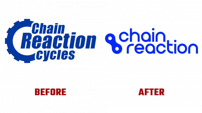
The world’s largest online market for modern bicycles has changed its appearance. Sporting goods, accessories, specialized apparel, and equipment, including running, triathlon, and cyclocross equipment, are available in the Chain Reaction online store. The brand has earned universal love and popularity in all corners of the globe with its dedication to its beloved work, corporate values, attention, and respect for customers.
As before, the brand has a positive attitude, looks to the future with hope, and continues to love its micro-world – a community of sports and outdoor enthusiasts. Several bright colors, a new font, and a change in the logo’s overall shape formed the basis of the brand’s redesign.
The idea of uniting bicycle lovers in a “chain” resonates with consumers very strongly. The fact is that representatives of sports culture and seekers of adrenaline adventures always unite in groups of enthusiasts for the sake of conquering peaks, difficult distances, and interesting races. When there is a like-minded person, it’s good when there is a team – super. When some support not just individual athletes and lovers of active leisure but also whole teams, aerobatics, this is valuable; it is encouraging.
A chain reaction occurs, the domino principle is triggered. In psychology, this effect is possibly partly explained by the principle of “infection.” When one person is dominated by positive emotion, he spreads positive vibes around him, and those around him feel this joyful atmosphere and are unconsciously involved in the process of living in positive moods.
Sport, undoubtedly, can become a lever for “turning on” pleasant emotions, experiencing new expectations, to be a “sponsor” of events, acquaintances, life plans.
The Chain Reaction brand eagerly maintains contact with numerous partners, interacts with various sports organizations. This maintains the authority of the companies, helps to expand and strengthen the business. Now, when the question of rebranding has arisen, professional designers immediately pick up and confidently implement the task.
Starting from the description with color, it is worth emphasizing that the current logo has become brighter and, if I may say so, has a more “burning” bright and juicy blue tint. It is close to a blue-blue hue, while the old logo has a muted, dark hazy color.
The concept of a massive part, a mechanism, no longer looks so innovative and simple. The tendency towards minimalism forced the initiators of the redesign to reconsider translating ideas. Therefore, the old chain element has sunk into oblivion, and the font has changed completely without preserving any elements. The title emphasizes the interconnectedness of all elements in the sports system; therefore, the inscription was previously inscribed in the graphic element. The simplest soft, elongated font won’t be the hallmark of a cool modern store. The designers followed a modern innovation trend – simplification – making the new logo a real cool feature. Today, it is connected as part of a bicycle body, and the font is rounded to match the symbol. The location of the brand name in two rows is also characteristic and stepwise when one part is presented at the top of the detail, and the second is below.
The logo unambiguously conveys the brand’s philosophy – chain reactions, interconnections, and involvement in sports life. The audience enthusiastically receives an excellent selection of fonts and graphic elements, which increases interest and demand for the brand’s products.


