True connoisseurs of wine are familiar with the original selection of luxury elite sparkling wines from Chandon. This year the company presented several new unique bouquets on the market, combining their presentation with a new corporate identity. The renowned French brand was founded in 1959 by Robert-Jean de Vogüé, President of Moët & Chandon. Today, the company’s wineries are located worldwide in the best parts of the planet for growing grapes – in Argentina, California, Brazil, China. And in 2014, production was opened in India. This is done to obtain a unique and inimitable bouquet, which forms each region in its way due to the difference in climatic conditions of ripening of vines and berries.
The new image was entrusted to the renowned London design studio MadeThought. Her task was not just to change the visualization of the brand that had already become too familiar but to bring fresh notes into it. The new image should remain relevant for many years to come while maintaining brand awareness, taking into account the peculiarities of the modern perception of information and its presentation to the consumer. For this, there were all the prerequisites associated with the rich history of the creation and development of Chandon, which is characterized by a constant presence of optimism and an adventurous spirit. This spirit has been transferred to the new future of French winemakers thanks to the deep elaboration of a new corporate identity from MadeThought. Their creative approach is reflected in the visual implementation of each advertising element of the famous brand – its logo, packaging, and packaging design, at the same time increasing the confidence in the product, being able to share the feeling of celebration and the spirit of adventure with true connoisseurs of sparkling wines.
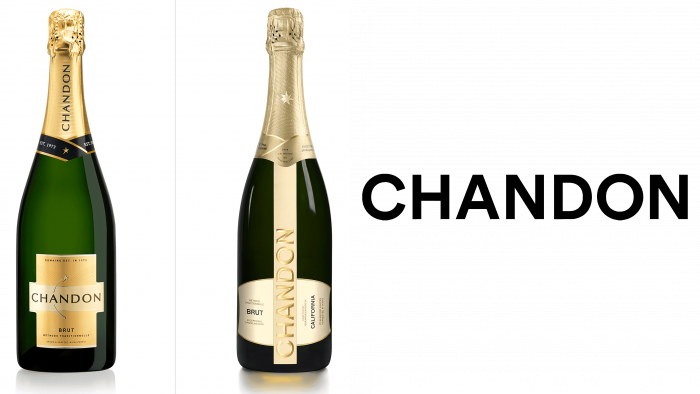
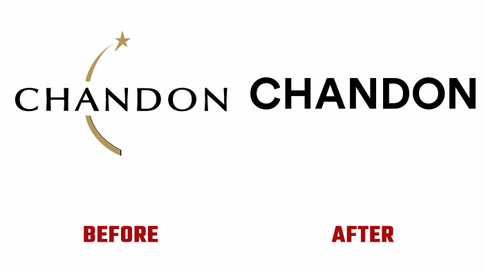
An important distinction of the new brand was the rejection of the shooting star symbol, which no longer corresponded to the modern goals and objectives of the company. Growth, not fall, constant burning, not burning, eternity, not fleeting – this is the future of Chandon and its wines. Now Chandon is a rising star with seven new points ready to open, located on all world continents. The logo has retained its main symbol – the name of the company, executed in an “imperturbable” capital sans serif typeface. Its performance in iridescent “gold” and vertical placement on the front label of bottles and packaging provided a refined sophistication and luxury of individual visualization. The choice of location directs the gaze of the wine connoisseur up into the night sky to see the new but well-known rising star Chandon.


