The desire to comply with modern trends and to be always popular in the modern consumer society has become the reason for the change in the external identity of the GSL company. The largest Euroset network General Logistic Systems, part of Royal Mail, as the leading European parcel delivery service, has undergone a rebranding. To strengthen its role in the international market, which has significantly expanded its presence in targeted and wholesale delivery. At the same time, it is an effective way to demonstrate the success of a brand, which can ensure a change in corporate identity. Founded back in 1989 under the German name Parcel and based on a German freight forwarding company, the brand now offers services in more than 40 countries based in Amsterdam, delivering almost 840 million parcels a year.
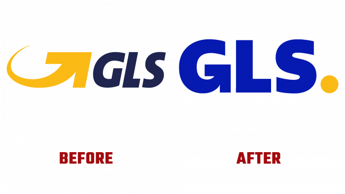
After 20 years, the company made the first radical rebranding, which changed the logo, corporate colors, making the new corporate identity more consistent with the aspirations and spirit of service. Its execution brought freshness and dynamism, made it possible to create an identity that meets the modern requirements of visual perception and digital display technologies. In the logo and text visualization, the brand has changed its corporate colors, type, and graphic design of the font.
The vibrant yellow and blue hues provided a visual identity with appeal and memorability. The rejection of the sign – the yellow arrow that preceded the logo and represented the company for many years allowed to make the composition more compact and reorient attention to the company itself and not its symbol. But nobody abandoned the company’s history, making this arrow a continuation of the letter “G.” A dynamic, bright yellow square dot has appeared in the logo, which has retained its historical abbreviation of the company name – GSL. It has become an effective way of symbolizing, using modern digital technologies, the point-to-point mission of the enterprise, demonstrating its close connection with customers – senders/recipients and partners.
The text of the abbreviation is made in bold lowercase type Galvani BlackbyHoftype, which is distinguished by its easy readability in all versions and a combination of variously designed surfaces. It has undergone a slight change. The letter “G” is for graphics processing, and kerning has been slightly increased for readability. Its bright blue color contrasts with the bright yellow dot, making the composition stand out against any background and attract attention.
A clear and simple visual language that is witty, cheerful and stylish, only enhances the impact on the viewer, making the logo memorable and especially interesting.


