One of the important news of the day was the leaked information about the ongoing preparations for the rebranding of the Volvo corporation. The brand is one of the oldest European car manufacturers. It was founded in 1927 in Gothenburg as a subsidiary of SKF. The main focus of the company was the production of cars, which began in the same year. On April 14, the first model leaving the company’s assembly line will leave the factory gates. The main philosophy of the brand was to ensure absolute safety for all road users, which the company complies with to this day. Another characteristic of the company was the obligatory high quality of products and their unsurpassed aesthetics and adherence to tradition.
But today, it seems that the brand, which belonged to the most conservative in the automotive industry, has changed some of its rules for a long time. Over the past five years, the Volvo Group will change its visual identity for the 7th time. Part of it – the car division Volvo Personvagnar became the property of the Chinese Geely. The sale brought in much-needed funds for a complete brand reorganization. The capacities and model lines have been updated, and technologies in safety and environmental friendliness have been improved. However, the problem of identity was never fully resolved. The search for a new look that could unite all nine areas and 11 divisions has not yet been completed. Here and the production of freight and bus transport, construction equipment and components for marine vehicles, power plants, elements of space systems, and even financial services.
The department gave the reason to talk about the “secret” rebranding to produce passenger cars. Without any additional announcements, releases, there has already been a change in the logo on its sites, social networks, blogs, and printed printing. Moreover, this does not happen everywhere. On the equipment itself, due to the technological timing of the production of cars, it will not be possible to see the new emblem until 2023.
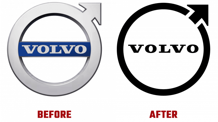
The new solution is to try to make a logo that doesn’t highlight any profile individually. This variation pays tribute to the brand’s history while retaining the elements of visual identity that are familiar to everyone. The sign “lost” its 3D visualization and was simplified as much as possible in terms of color – it became one color. An arrow directed outside the circle, crossing the border, “breaks” it. In terms of its length, this element is much shorter than the earlier one, starting from the inner boundary of the circle. This design makes the logo more effective when visually influencing the viewer. Especially when using the icon on a wide variety of load-bearing surfaces, from a website to a printed poster or a car radiator.
Laconicism and minimalism, which are in trend today and have been successfully applied in their identity for BMW, General Motors, Kia, Renault, and Volkswagen, have become characteristic of Volvo. For each product division, the logo will be presented in one distinct color. The rest of the composition will be identical for everyone. The applied graphic solution fully complies with the modern requirements of digital visual display. It fully ensured the preservation of recognition while demonstrating the obligatory consideration of the conditions dictated by the present and respect for the peculiarities of processing visual information received by young participants in the modern market.


