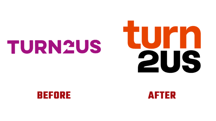
Established in 1897, Elizabeth Finn Care, a UK-based charity, has been helping people living below the poverty line for 125 years. Under its brand name, Turn2us, the company reaches out to the poor in England, Wales, and Scotland with its services. The company informs and supports people about the possibility of receiving benefits charitable grants through an easy-to-use website or a toll-free telephone line. Having united in 2015 with the parent charity foundation, both brands began to use a single name – Turn2us. Today, the brand continues to work in this service sector, expanding the number of those who are assisted and expanding the list of its goals, which the entire activity of the organization is dedicated to achieving. Against the backdrop of current modern changes in business and society, such important changes for the brand itself required changes to be made to its visual identity.
The brand developed its new strategy during the redesign process, which aims to achieve its goals quickly. The new design managed to draw even more attention to the company, providing its voice to the people to serve which the brand was created. The entire brand identity has taken on an inclusive look, humanity, and assertiveness. It successfully combines the great historical experience of the company and the latest achievements. The new logo also represents the full name of the combined brand. But it has become more attractive, easy to read, and easy to remember. A sans-serif font was used to write the text, which visually divided the name into two parts, using its lowercase and uppercase versions. This division was strengthened by using two colors for each of the parts – bright orange to display “turn” and strictly black, in which “2us” is performed. The architecture of the logo provides a simple visual perception of the entire composition as a whole by placing the words one above the other and aligning them to the right.
At the same time, the identity was built on the use of dynamic animation, which increased the attractiveness of the brand, making it more alive and human. The two primary identification colors run through all visualization elements. Their influence on the viewer is enhanced by additional shades that are thoughtfully used as a background and with other graphic solutions. The use of an album of photographs and a system of lively and energetic icons made it possible to make the brand truly in line with the spirit and direction of the company.


