The soccer club from the USA: Chicago Fire FC’s top professional league has introduced its new emblem to its fans and members of the football league. Such an event for more than 20,000 fans of the club has been anticipated for a long time. Their opinions and wishes and the results of a survey of residents of the city of Chicago, which represents the club, were taken into account when developing a new design and advertising concept for the team.
Renowned rebranding specialist Matthew Wolf was brought in to design the new logo. The idea of a new coat of arms was implemented based on the results obtained during the “round tables,” blitz-polls in social networks, after determining the optimal variant from several presented by the developer on the websites.
The work was carried out for more than six months in close contact with the team members and its fans. An important role in shaping the logo’s appearance was played by the overdue renewal of the spirit and method of direct cooperation directly with fans of Chicago Fire FC. It is expected that the result fully meets the wishes of the survey participants and will become exactly the symbol that the club itself can adequately represent, demonstrate a tribute to its Great City of Chicago, and will be proudly worn by all players and fans of the team.
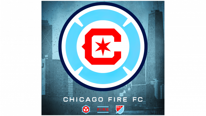
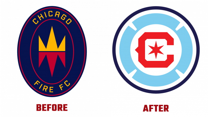
The logo consists of several main elements – a central red letter “C” (the initial name of the club), which encloses a red six-pointed star. The Florian cross frames these symbols in light blue in some free interpretation of the figure. All colors used in the symbolism were applied in strict accordance with their shades on the flag of the city of Chicago, the need for which was indicated by almost everyone who took part in the survey.
In addition to the coat of arms, a text symbol and two signs were prepared – one includes the stylization of municipal affiliation, and the second – the word “fire,” which is separated by blue stripes. In the creation of the second sign, the theme of Pattrick Stanton’s tattoo was used.
Thus, the team was able to satisfy the tastes of its fans, who were left unsatisfied after the application of the Fire Crown emblem in 2019 and reflect the idea of striving for victory in common unity with the city and its fans.
As announced by the club, a completely new design will be used already in the preseason of 2022. At the same time, it was guaranteed that if any of the signs provoked rejection among supporters, it would be immediately changed to a more appropriate one.


