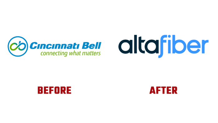
 Founded in 1873 as Cincinnati Bell, the now leading regional telecommunications provider in Cincinnati, Ohio, United States, has rebranded and changed its name to Altafiber. The brand’s core business provides landline telephony, fiber-optic Internet, and IPTV. The company distributes its services through its subsidiaries, Cincinnati Bell Telephone and Hawaiian Telcom. They are located in Cincinnati, Dayton, and Hawaii. Beginning as a telegraph company as a Bell System franchisee, the company began to expand aggressively in the 1990s with advances in modern technology, offering mobile services and the Internet. But in 2014, the latter line of business was closed to emphasize its greater focus on corporate and fiber-optic services. The brand was bought by two businesses, Macquarie Infrastructure and Real Assets, which led to the renaming and complete rebranding of the company in 2022, which has consistently been at the forefront of innovation.
The new visualization reflected the brand’s core message that fiber is the future. The new design features a spectacular demonstration of the speed, power, and sustainability of fiber, which is becoming the best way to transmit information for all the needs of tomorrow’s day. At the core of the identity is the idea of fiber optic power and equitable access to the Internet, creating smart cities and pioneering breakthroughs in education, healthcare, and business. The brand name is a compound word that became the basis of the word mark. Its first part, Alta, means “sublime,” reflecting the brand’s commitment to applying elevated standards in all its activities. The identity demonstrates a redefinition of its approach to customer service and an increased commitment to the community. The second part of the word fiber sends the viewer to the material by which the brand functions.
The wordmark in the logo is in circular lowercase sans serif typeface, whose semantic separation is ensured by the separation of the two parts using two colors. The first part is in contrasting black, and the second in light blue, which effectively forms the required visual perception of the logo. The clarity of execution and well-thought-out kerning create the necessary conditions for the logo to be easily read at any size, both typographically and digitally. Minimalistic style – the absence of overloaded images with redundant elements ensured the ease of remembering and recognizing the brand among the graphic versions of the logos of similar companies.


