Cinemark, a familiar name for all movie enthusiasts, has just entered the future with a brand-new logo and identity. Changing the emblem’s design is Cinemark’s statement that they are committed to providing you with the latest and best amenities and technologies for movie viewing.
Sprawling across the U.S. and parts of South and Central America, Cinemark’s theaters are where technology meets comfort. Think of sitting in a chair that moves with the movie or watching scenes unfold with unbeatable clarity. That’s the Cinemark experience.
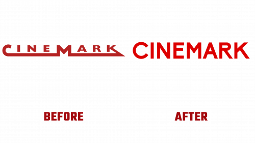
Cinemark decided to update the old logo with stretched letters and a somewhat outdated appearance. Enter the new logo: it’s modern, has flair, and perfectly captures the spirit of today’s Cinemark. They’ve spiced up the typeface, giving it a unique character as dynamic as the movies they show. The new Cinemark logo is cooler and quirky, making it more interesting. They tweaked the Biko typeface to make it, giving it a lively vibe. For the rest of their stuff, like ads and popcorn bags, they use a different font next to the logo that looks good. The colors are simple – just reds, black, and white – but it looks pretty fancy, especially when you see it on the movie popcorn bags.
But Cinemark’s makeover isn’t just about the logo. It’s a total revamp of the vibe you get when you step into a Cinemark theater. Everything’s getting updated, from the popcorn bags to the decor, to make your movie nights even more memorable.
Cinemark’s putting a lot of thought into how they talk to us, their audience. They want to ensure we know we’re in for something special when planning a movie night. That’s why they’re dialing up the charm with messages that connect us more closely to the magic of cinema.
What does all this mean for movie lovers like us? Cinemark is upping its game, ensuring that a night at the movies is more than just watching a screen. It’s about luxury, technology, and a little bit of that movie magic we all love.


